A Fox Creek home is renovated in a minimalist, mountain-modern style to integrate the stunning natural setting.
When Patsy Nickum drove up the weathered driveway to a property just north of Ketchum in April 2015, she had a feeling this house might be the one. After walking through the cramped entry, she ambled through the 3,800-square-foot home, taking in the 12-foot by 12-foot dark timber frame beams and large open living area, and noting the classic 1970s sunflower-yellow kitchen. The view was spectacular, as was the prime, secluded location in Fox Creek. She recognized the good bones necessary for a remodel, and—more important—she felt that, with the right team, the home could maintain the integrity of the original build, yet radiate a clean, mountain-modern vibe.
“From the beginning our vision was to assemble a team,”
says her son and business partner, Christian Nickum. At this inviting location, perfectly sited to take advantage of the serenity of the surrounding mountains, the Nickums agreed on the ideal combination of architect Jason Spalten, interior designer Jennifer Hoey of Jennifer Hoey Interior Design, project manager Chase Gouley of Ben Young Landscape Architecture, and builder Preston Ziegler of Sawtooth Construction. “This was a simple process for us because we knew Jason and Jennifer. They have fantastic vision and taste, and they’re consummate professionals,” Christian Nickum says, adding that one of the highlights of this project was the continuous inspiration and collaboration among team members throughout the transformative process.
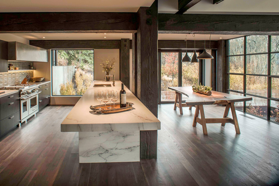
Combining the team’s love for simplicity, minimalism, and sophistication, the remodel started as a meaningful and memorable experience when everyone agreed on the singular element worth retaining in its entirety: the massive 12-foot by 12-foot beams running throughout the home would stay. “What was so unique about this project was that it was a true timber frame, so we treated the renovation as almost an installation,” Spalten says. “The concept was to create an intentional strong contrast with the chunky, twisted timber frame beams.”
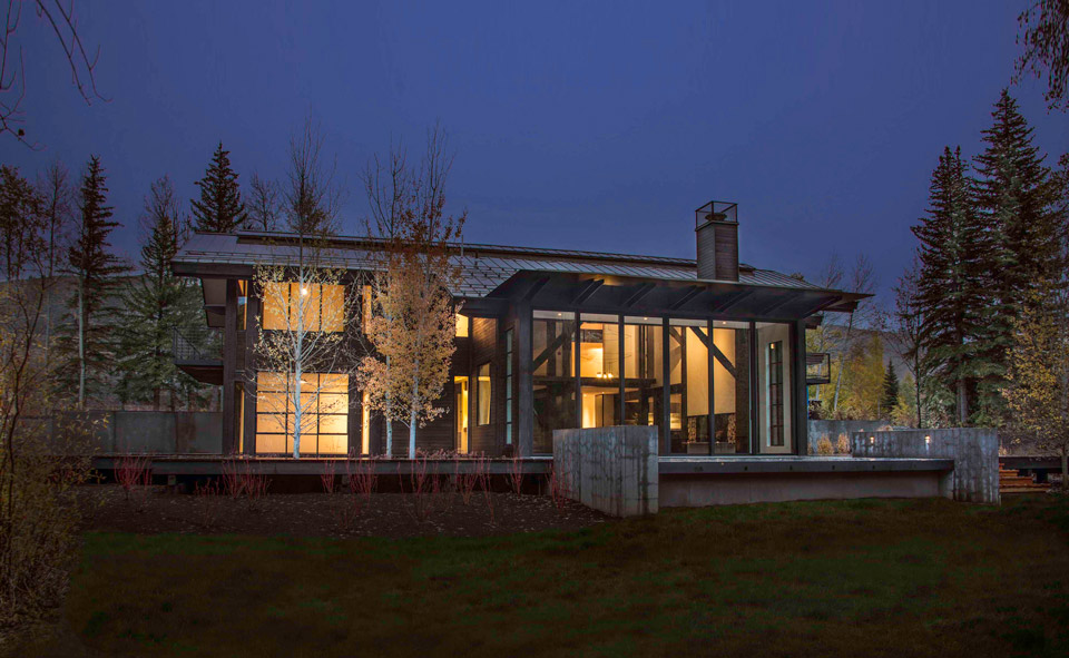
With no exterior structural changes to the original footprint, the most significant alteration was to cultivate an interaction between the home and the stunning natural setting by replacing the existing windows. “As I worked through the layout, it was clear to me that we could integrate the house with the surrounding landscape if we opened up the windows and walls,” Spalten says.
Echoing this goal was the decision to remove a majority of the roof, as the existing pitch blocked the quintessential view looking up Fox Creek. “If you were standing further back in the house, you’d miss the view,” Christian Nickum says. After solving that issue by installing a flat roof, Spalten then elected to extend the home’s exterior doors leading to the patio from the floor to the ceiling to further establish the sleek, modern look and expose more of the outdoor space upon opening.
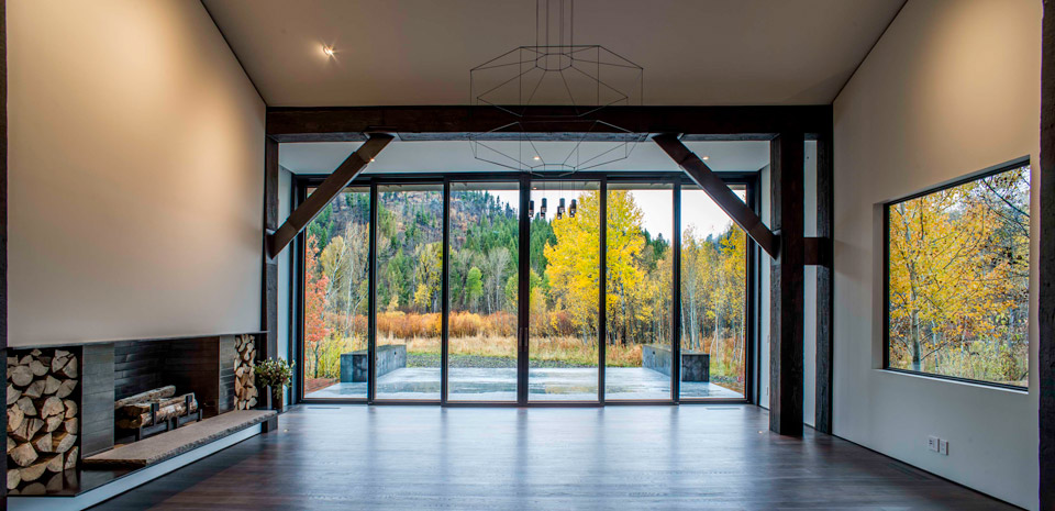
Spalten bestowed upon the vast opening the largest steel lift and slide door package manufactured by Dynamic® to date. At 14 feet tall and 30 feet wide, the door and window package created an essential balance between nature and structure. “For the longest time, there was a perception that a modern aesthetic didn’t belong in the mountains. But the reality is that the aesthetic allows us to create a much stronger connection to the environment because we’re not confined by our window placements,” Spalten says. “Now we can fully open up the living space and let the air flow through on a regular basis. It’s refreshing and rewarding.”
Having made the decision to maintain the integrity of the original home by retaining the defining timber beams, both Spalten and Hoey then applied their expertise and penchant for details to update the space. “I actually recommended Jason for this project because of his attention to detail,” Hoey says. “He’s incredibly focused, and the intricacy he brings to the design of stairways and connections between wall panels is exactly the type of creativity necessary for the juxtaposition we strived to accomplish here—that feeling of thick and thin, heavy and light, and an extended relationship with the outdoors.” The ability to carry that focus throughout the project is key, Hoey says, “It’s about the detailing and taking the vision from the very beginning to the end.”
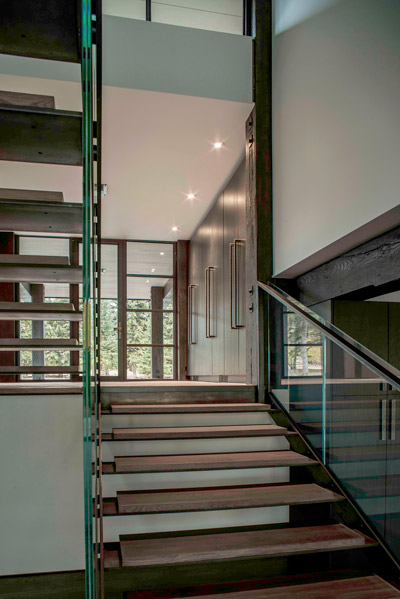
Spalten agrees, and he notes that, in this project, inspiration for the connections Hoey describes was right at hand: “The bridge at the Fox Creek trailhead inspired the stair and bridge concept, which led to using wood planks inset from the edges so as to mimic the floating bridge.” The resulting stunning staircase and bridge spanning the living room are dominant modern statements in the home.
Spalten’s idea of “renovation as installation” continued with the decision to balance the existing timber frame of the original build with fixtures and hardware from the Trousdale Collection—a collaboration between Idaho-based Rocky Mountain Hardware and New York-based Kravitz Design Inc. The collection reflects the artistic sensibility of musical genius cum major interior design force Lenny Kravitz, whose early childhood in Los Angeles led to an infatuation with the mid-century modern aesthetic, reflected in the “sleek architectural elements with angular profiles and a strong textural effect” that define the collection. The striking design appeals to the current trend of sumptuous detailing in door and cabinet hardware.
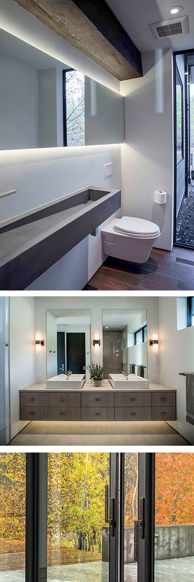
Hoey chose to complement the bronze hardware of the Trousdale collection in the master bath—and further her minimalist design approach—by using Lucite legs in the cabinetry. “I wanted to create a lightweight transparency with a little bit of sparkle so that it would play well with the hardware,” she says. “I wanted to keep it fun and slightly dressy without going overboard.” In the guest suite bath, she installed three Rocky Mountain Hardware “Charlie” sconces and appointed the face of the cabinets with Trousdale hardware. By cantilevering the vanity and adding light below, she sought to lighten the effect of the hardware in both locations.
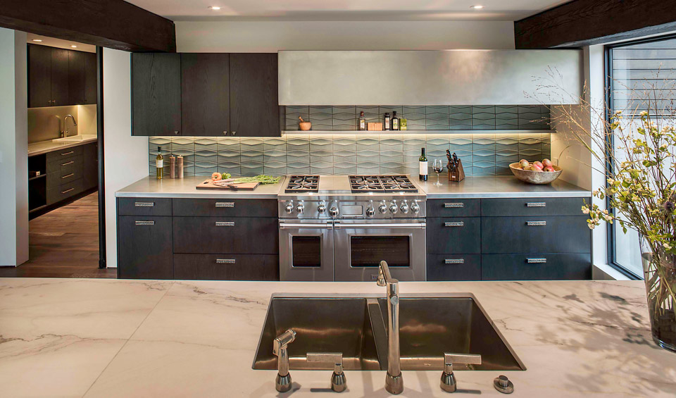
In the kitchen, Hoey created a similar effect. A “gigantic peninsula of marble” was cantilevered to again elicit that sense of openness and minimalism. The galley-style kitchen, dictated by the existing timber support posts, highlights the push and pull between the gleaming white and gray Calacatta Colorado marble and the heavy, dark timber. Hoey acknowledges the resulting design “defies the eye a little bit.” A floor-to-ceiling window at the edge of the kitchen extends the dynamic of the space with views of the expansive patio and landscape beyond.
“It’s about the detailing and taking the vision from the very beginning to the end.”
Another floor-to-ceiling window—this one quite narrow—provides balance in the powder bathroom, where it juxtaposes the long concrete trough sink. Given the space constraints of the room, Hoey determined that a simple mirror and two strips of LED would provide adequate indirect lighting, foregoing the need for decorative light fixtures and furthering the minimalist design. The result is a streamlined space that makes the most of scale and proportion.
This small room is one of many spaces in the home that highlight the team’s focus on detail and their collaborative approach. “I think we are finally seeing a shift toward more interesting spaces and quality detailing over just adding square footage,” Spalten says. “Rather than having rooms for the sake of having extra rooms, it’s truly about making the rooms special and focusing on the details.” Hoey agrees, noting the benefit to the overall design of the team’s diverse skill set and ability to work in unison: “We were able to do our best work because we were coming at this project with each of our angles,” she says.
The collaborative effort is evident throughout the home, in overall design and smaller elements, including in the fireplace. When Christian Nickum suggested repurposing bronze tiles from another project, both Spalten and Hoey were challenged with integrating the tiles somewhere in the home. The fireplace was chosen as a place to incorporate that request and both love the result of the contrast between the bronze tiles and the steel hearth.
As the renovation came together, an essential element of the overall look and feel of the home was the role of light in the space, countering the grounding density of existing materials and illuminating the design throughout. Hoey says that lighting designer Lori Robinson of Elements Lighting + Design in Bozeman, Montana, was key in making this aspect of the project a success: “Lori produced beautiful results by sizing and placing the fixtures that express the refined vision of the home and accentuate the overall design.”
Alongside design decisions, the home underwent a thorough energy evaluation to ensure long-term energy efficiency, which was especially important given the large-scale installation of glass throughout the home. The HVAC was completely replaced, and insulation and energy efficiency was addressed for all windows, walls, floors, ceilings, and appliances.
Throughout the renovation, integrating the home’s natural setting was a priority. Ultimately, the hallmark of this home, and what sets it apart—inside and out—is the unification of nature and structure. In opening up the home to the vast Fox Creek views through the addition of windows and doors, nature’s story became the centerpiece. “I can’t emphasize enough how important it is to feel connected to the landscape,” says Chase Gouley, project manager from Ben Young Landscape Architecture, who was contacted at the outset of the remodel to become part of the team.
Before & After Pictures Tell the Story
“Rather than having rooms for the sake of having extra rooms, it’s truly about making the rooms special and focusing on
the details.”
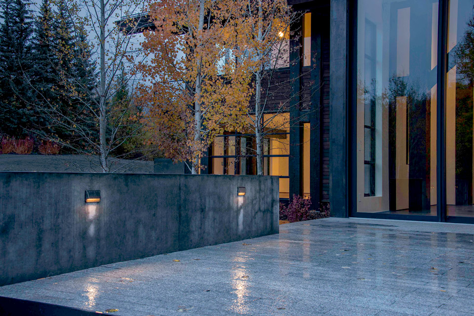
“During my first look at the property, what I really enjoyed about the site was its native landscape. It was serene and pure and I knew not to take away from what already existed,” Gouley says. “The home was tucked in an aspen and willow forest, and we wanted to create the sense that the house rose up from the ground.” To that end, one of the first issues Gouley adressed was the home’s entrance: “The entry initially felt like a cave,” he says. “We proposed lowering the grade and opening up the area by creating a steel planter to establish more of a grand entry.” By removing gnarled and overgrown plants leading to and from the entry, a spacious, airy feeling was created around the entrance. Granite pavers, repurposed from another project, were utilized in a running bond pattern at the entrance and again on the patio.
Flanking the patio, smooth-formed, cantilevered concrete walls serve as bench seats, creating an opportunity to literally hang out. “Because of the cantilever, you are able to sit on the edge of the patio and swing your feet underneath you while taking in the views. With the house behind you, all you see are native grasses, aspens, and willows, and views to the river and the wetlands,” Gouley says. “It’s about the land and grounding yourself to the site. It’s breathtaking.”
The patio’s granite pavers transition to wood decking for the boardwalk, which travels from the patio to the private master deck facing the Boulder Mountains. The boardwalk offers up an enticing invitation: “It’s kind of like a secret,” Gouley says, which inspires anyone on the property to wonder, “Where does this go?” Surrounding the path and the patio spaces are large plants, mainly aspens, to maintain the native landscape. “This wasn’t a typical design where we might create extravagant patios with different outdoor rooms,” Gouley says. “I wanted to highlight the calm of the property, not fussy it up.”
In reflecting on the comprehensive remodeling process, which took about 18 months start to finish, Christian Nickum remains enamored of the successful collaboration within the team and calls out the skill of the project’s foreman, specifically: “Greg Strong, our foreman, contributed significantly to the spirit of our hands-on approach to design. Moving the fireplace, removing part of the roof, and merging the variety of materials—were all possible as a result of his knowledge and experience,” he says. “Together, our team realized their commitment to quality, attention to detail, and an outpouring of creativity.”
