
Written by: Lori Currie | Photos by: Gabe Border
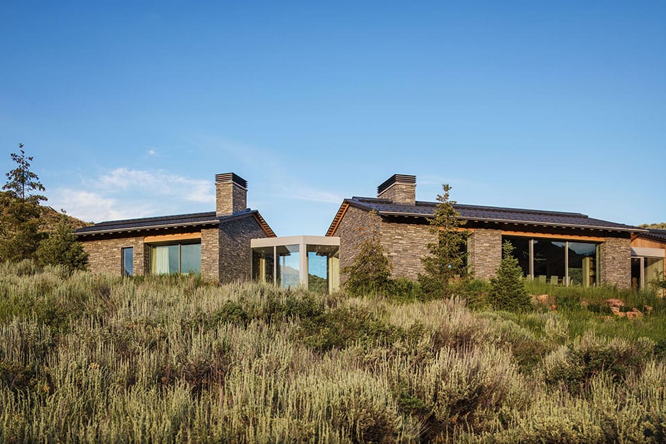
GREAT HOUSES RARELY HAVE A SINGLE AUTHOR. THE HOME ON LAVA STREET IN KETCHUM, IDAHO—NEARLY 8,000 SQUARE FEET OF MOUNTAIN MODERN ARCHITECTURE SET ON 10 PRIVATE ACRES ABOVE DOWNTOWN—IS THE PRODUCT OF THREE YEARS OF COLLABORATION BETWEEN ARCHITECT JIM MCLAUGHLIN, BUILDER BRIAN POSTER, AND INTERIOR DESIGNER SARAH LATHAM. EACH BROUGHT A DISTINCT EXPERTISE. MCLAUGHLIN SOLVED THE SITE. POSTER BUILT IT AGAINST FORMIDABLE ODDS. AND LATHAM—WHOSE FIRM HELD THE DESIGN THREAD LONG AFTER THE ARCHITECTURAL PHASE WOUND DOWN—MADE IT A HOME.
A DREAM HOME WITH UNAPOLOGETICALLY SUBLIME VIEWS RISES FROM THE SAGEBRUSH
The project began around 2020 and unfolded over three to four years of iterative design, budget recalibrations, and evolving client vision. What started as a home that might have reached 12,000 square feet was gradually, thoughtfully edited down to something more honest and enduring. What started as a spare Nordic vision eventually found its way to something richer, warmer, and unmistakably personal.
“Everything was meant to be quiet, yet elegant. Natural, not overwhelming—understated,” says Sarah Latham, founder and principal designer of Latham Interiors. “It was a very intentional home.”
A Vision Takes Shape
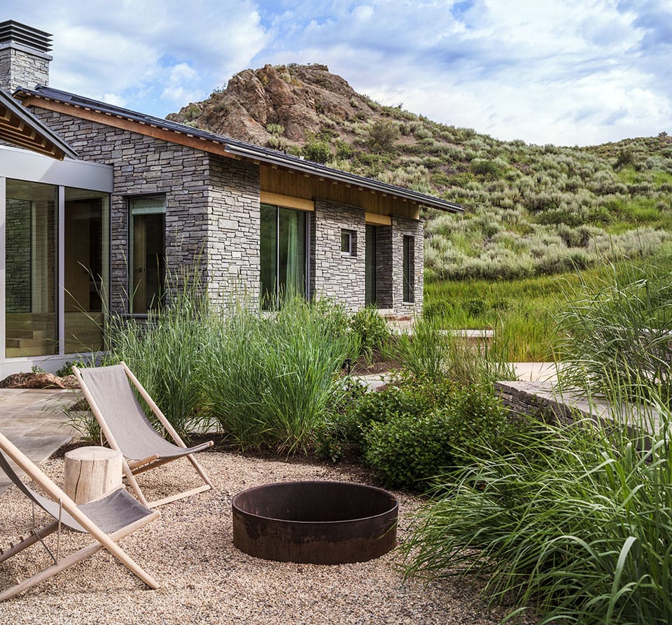
The clients came to the project with strong instincts and deep environmental convictions. One of the owners is closely involved in environmental advocacy, and the desire for a low-impact home—respectful of the sagebrush landscape, mindful of a public hiking trail that runs through the property, and conscious of building materials—was woven into every decision from the start.
“There was a lot of forethought into how the architecture as well as the building materials helped this home fit perfectly within the landscape,” says Latham. As the project evolved, Latham Interiors took on an expanded role in carrying the design vision forward, collaborating closely with the client to visualize and develop many of the interior details that ultimately defined the finished space.
For architect Jim McLaughlin, the site was already familiar territory—literally. “There is a public trail that goes right through the middle of this property, which I hike probably five days a week, almost year-round,” he says. “So I knew the site pretty well.” That familiarity proved invaluable. McLaughlin recognized from the outset the formidable constraints the property presented: avalanche designations, a 25% slope across portions of the lot, and a 14% driveway grade that required negotiation with the fire department. His solution to the avalanche challenge was characteristically methodical.
The hazard maps on file were based on a broad, subdivision-level assessment.
“WE WERE DELIBERATE WITH THE PITCH THE ROOF SO THAT THE SCALE WAS RIGHT FOR THE SIZE OF THE SPACES.”
-Jim McLaughlin, McLaughlin Architects
“I suggested we have a site-specific avalanche study done,” McLaughlin explains. “And it gave a different shape to the avalanche area—we were able to take that and figure out how to place a home within those restrictions.”
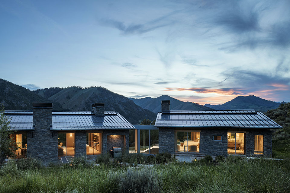
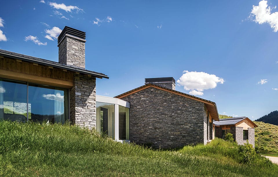
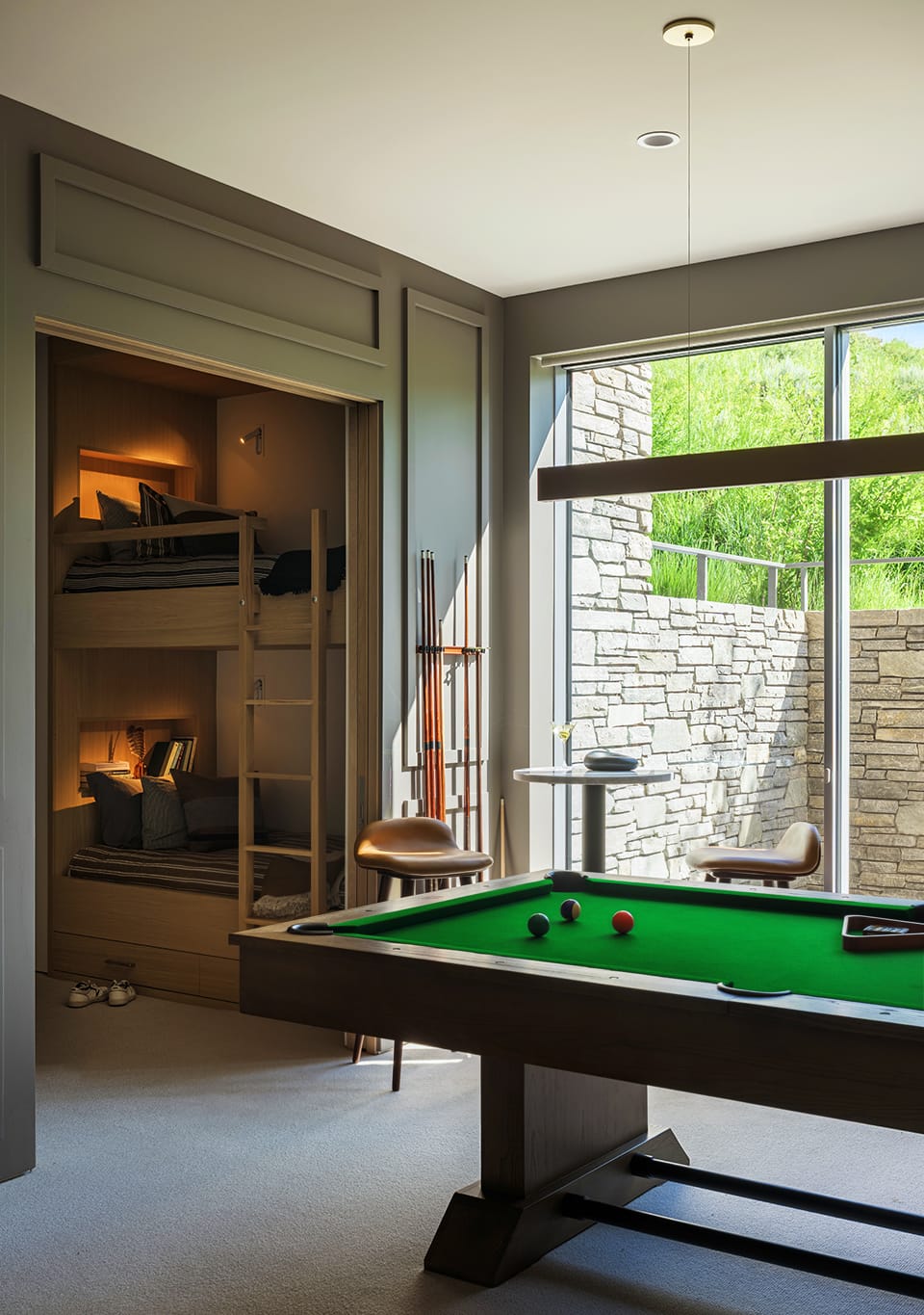
What emerged was a tripartite design: three distinct structures, each slightly offset and rotated to fit the irregular building envelope, connected by glass bridges. “The challenge when designing the home was that in order to fit it into this irregular building envelope, I came up with the idea of three different buildings, and then adjusting them slightly in order to wrap it into the site,” McLaughlin says. The logic was also deeply familial: one wing for the children and grandchildren—guest suites, game room, bunk room, and garage—separated by a glass connector. An office occupying a kind of neutral territory between generations. And a master suite as its own private structure. The roof pitch and overhang depth were calibrated with equal care: deep enough to manage solar exposure and shallow enough not to obstruct the panoramic views that make the property extraordinary. “We were deliberate with the pitch of the roof so that the scale was right for the size of the spaces,” McLaughlin says. “It was a balance.”
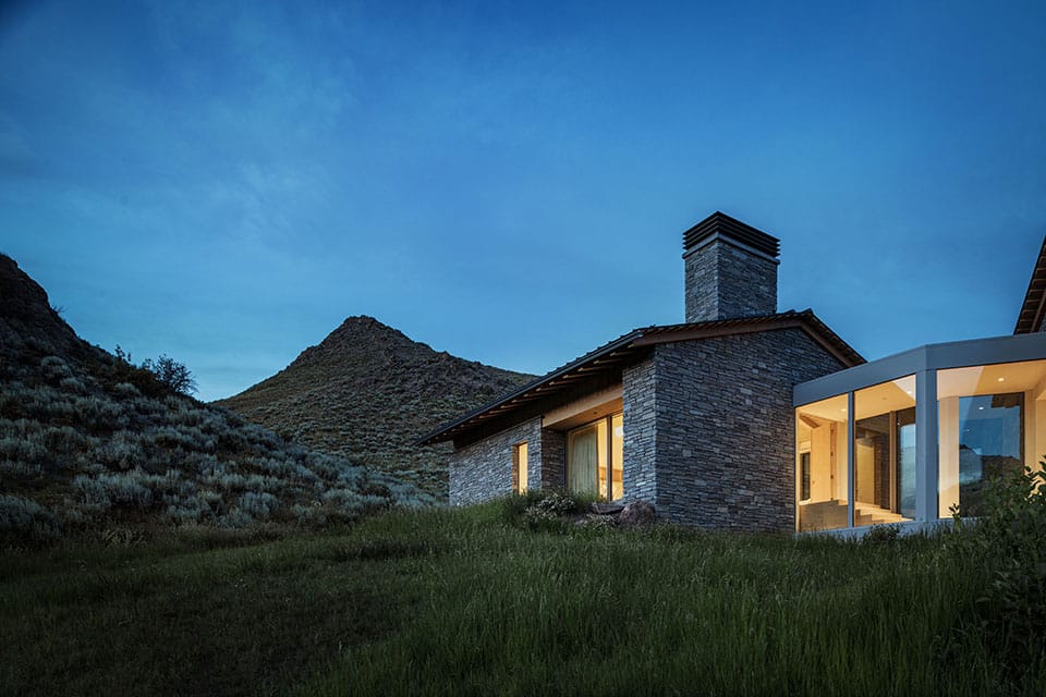
Brian Poster, owner of Poster Construction and a 25-year volunteer Ketchum firefighter, brought to the project both a craftsman’s exacting standards and a first responder’s instinct for safety. Working with McLaughlin, he helped develop a fire-resistant exterior strategy that addressed the site’s access challenges head-on. “That house is extremely resilient and fire-resistant,” Poster says, the product of a firewise exterior, an interior sprinkler system, and a snowmelt driveway ensuring year-round emergency access. The build began in 2021 and immediately tested his team: excavation hit a mass of unusually hard bedrock on the south side of the site, requiring a rock hammer and setting the schedule back a month just as winter approached. Then came the 2022–2023 season—262 inches of snow at Sun Valley, more than double the prior year—which buried the construction site. An onsite tower crane had been previously placed and proved to be an invaluable resource to maintain workflow and schedule. For all the trials, the team kept their eye on the prize.
“The goal,” Poster says, “was to make the house look like it fell out of the sky and landed right there—without disturbing too much of the landscape.”
“THE GOAL. WAS TO MAKE THE HOUSE LOOK LIKE IT FELL OUT OF THE SKY AND RIGHT THERE— WITHOUT DISTURBING TOO MUCH OF THE LANDSCAPE.”
As the architectural phase wound down, Latham’s role deepened as she helped the clients see not just what the spaces would look like, but how they would feel. “Our process combines renderings, detailed drawings, material palettes, and ongoing design studies to help the clients clearly visualize how each space will come together,” she says. Rather than a single decisive moment of approval, alignment built gradually. “As conversations become more specific and decisions more intuitive, we could feel when there was real alignment and confidence in the direction.”
The original design language was clean and restrained—what Latham describes as “very Scandi modern.” Low-profile windows to maximize views. Natural wood throughout. Quiet color, minimal pattern. Then, over the course of the project’s long arc, something shifted. One of the owners discovered Kit Kemp, the celebrated British hotelier and designer known for bold pattern, layered color, and joyful irreverence. “That was a departure from simple, quiet, not a lot of color, not a lot of pattern,” Latham says. “But I think it suits it well. It does lend itself back to the environment and the property.” The result is a home that holds both impulses in equilibrium: the grounded restraint of the Idaho mountains and the warmth of a designer unafraid of personality. “What the project became feels less about a specific style and more about a mood,” Latham reflects. “Something calm, grounded, and closely tied to its surroundings. In many ways, it reads as a minimalist ski chalet: warm, restrained, and quietly integrated into the landscape.”
The Material Language
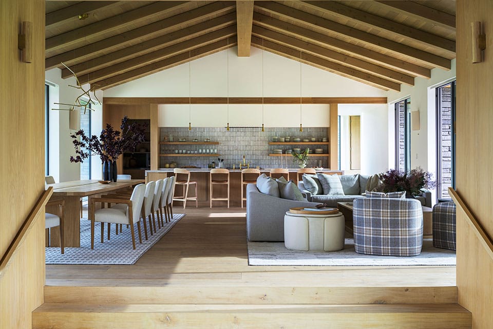
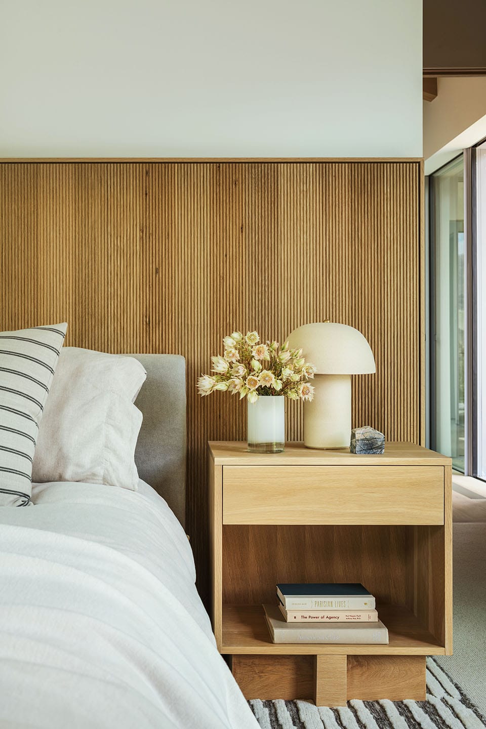
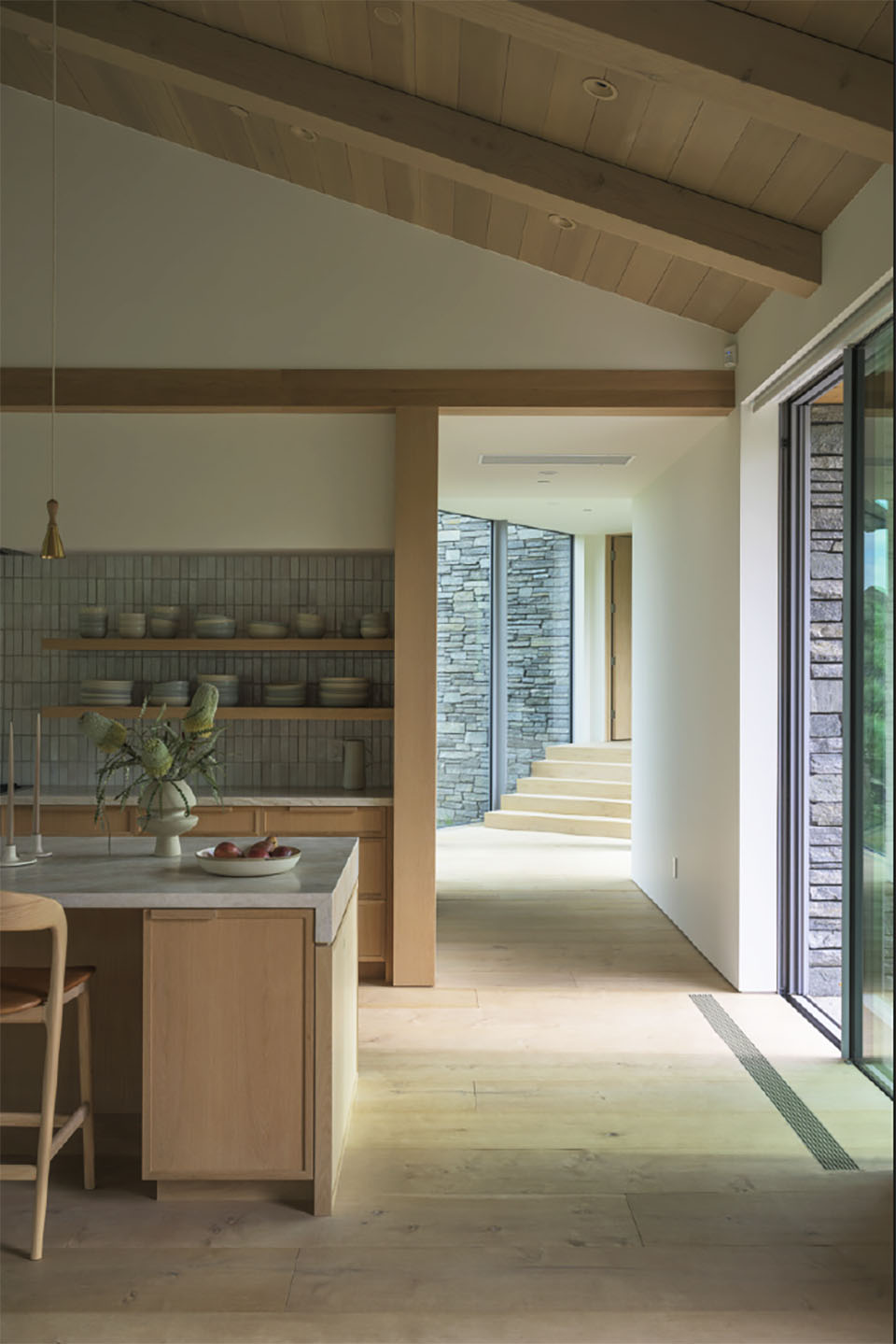
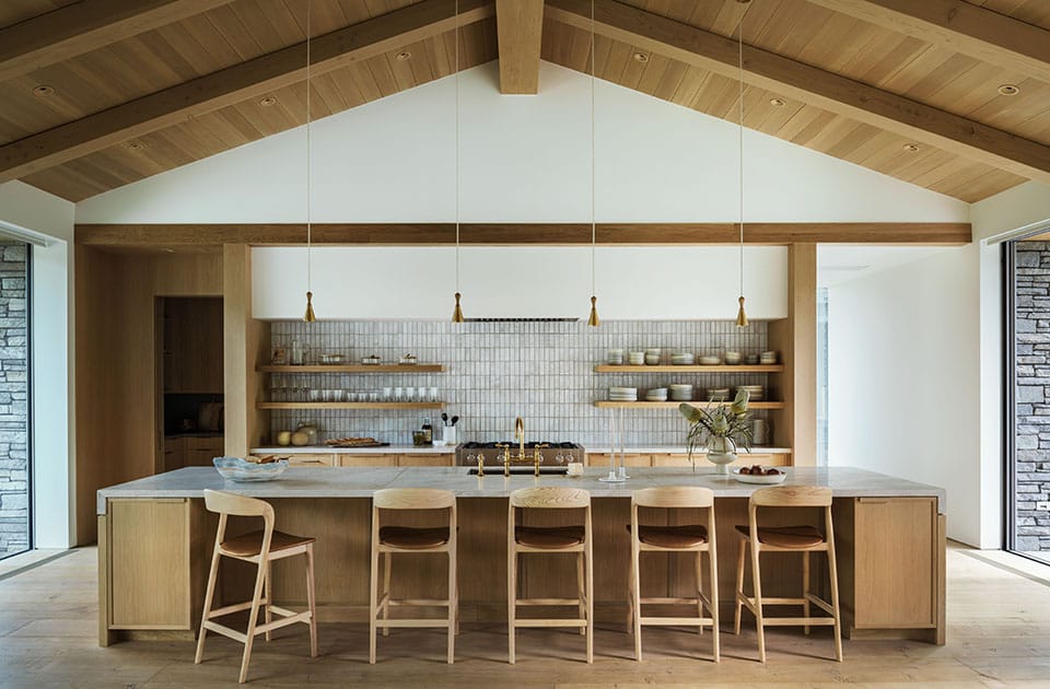
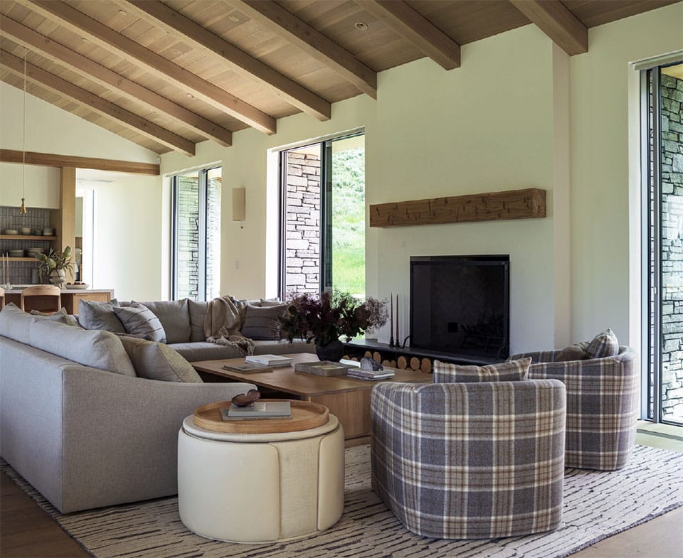
For Latham, materials are never incidental—they are the argument. And in a home where the clients wanted everything to feel natural, connected to the landscape, and quietly luxurious, every surface choice had to earn its place. “That consistency was very intentional,” she says of the material strategy. “The primary living spaces are rooted in a Scandinavian Modern sensibility—restrained, material-driven, and cohesive. We focused on a palette of light oak, warm neutrals, and natural stone to create a calm, continuous backdrop.
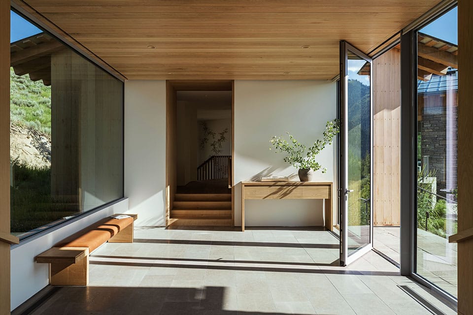
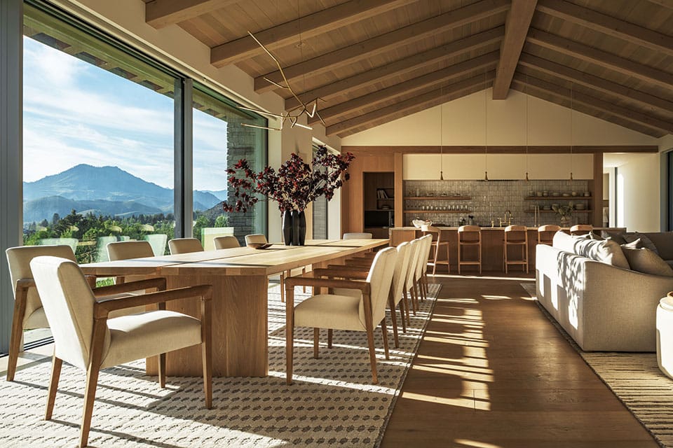
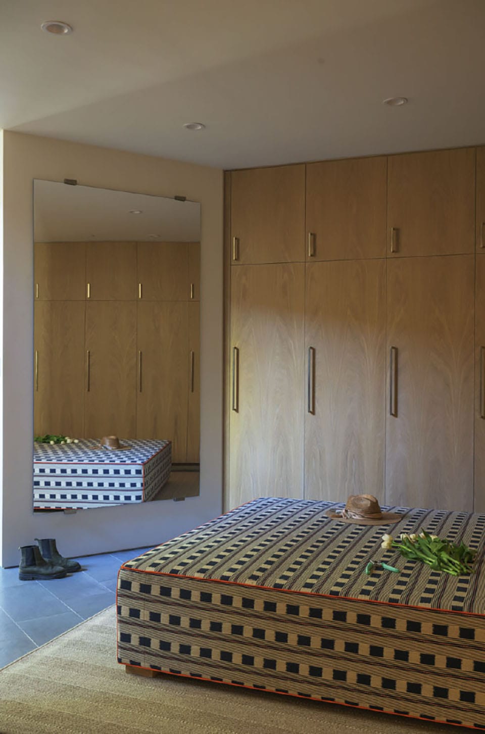
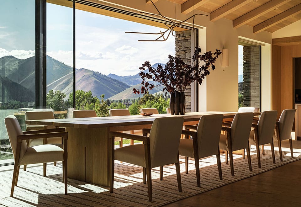
The floors throughout the main living areas are wide-plank French oak—live-sawn and engineered by the Hudson Company in a character-grade, shrunk-face profile called Ditch Plains. The ceilings are clad in stained wood to match. Benjamin Moore White Dove on the walls keeps the volumes luminous. McLaughlin’s intent was legible from the start: “We wanted to have a very light and airy feeling inside, so we used wood in the ceilings and wood on the floors—it really warmed things up, and yet the space feels very spacious.” Together, the effect is warm without being heavy and spacious without feeling cold.
“THAT CONSISTENCY WAS VERY INTENTIONAL. THE PRIMARY LIVING SPACES ARE ROOTED IN A SCANDINAVIAN MODERN SENSIBILITY—RESTRAINED, MATERIALDRIVEN, AND COHESIVE. WE FOCUSED ON A PALETTE OF LIGHT OAK, WARM NEUTRALS, AND NATURAL STONE TO CREATE A CALM, CONTINUOUS BACKDROP.”
In the kitchen, Latham’s material choices reveal her instinct for turning constraints into character. The island countertop is honed Perla Venata quartzite—a stone with veining too beautiful and too bold to install without a seam. Rather than try to hide the join, she highlighted it. “Because of the scale and mandatory seams, instead of trying to hide them we created this metal detail to separate and actually call out the seams instead of trying to hide them,” she says. A Cle Zellige Moroccan Sea Salt backsplash adds hand-made warmth and subtle irregularity. The surrounding Sub-Zero and Wolf appliances, all panel-ready, disappear behind the cabinetry. “The owners wanted almost invisible hardware on the cabinets,” Latham notes, a wish fulfilled by Poster, with customized wooden pulls built directly into the cabinets. Hardware duties in the kitchen and pantry are shared between Rocky Mountain Hardware and Emtek. A Wa-terworks Easton Vintage bridge faucet in brass at the kitchen sink introduces a quiet antique note.
The fireplace surround in the living room is Limestrong plaster in Dove White—a matte, mineral finish that reads almost like limestone. The hearth below is Gris Catalon honed limestone. The millwork—bookcase, floating shelves, cabinet faces—is a subtle white oak provided by cabinet and millwork vendor Ketchum Kustom, with rift white oak and flat oak panels varying by room to introduce subtle texture without noise. It’s also a strategy consciously calibrated against the mountain-home cliche. “We were very aware of the typical visual language of mountain homes and wanted to move away from anything that felt overly literal or expected,” Latham says. “Instead, we focused on a more minimal and timeless approach, letting proportion, material, and light do the work rather than relying on rustic cues. Whenever possible, we incorporated natural and locally sourced materials, not just for their aesthetic, but for the authenticity they bring to the project.” The stone on the exterior—Oakley Stone from a quarry in Oakley, Idaho—and the cedar siding speak to the same conviction.
A Retreat Within a Retreat
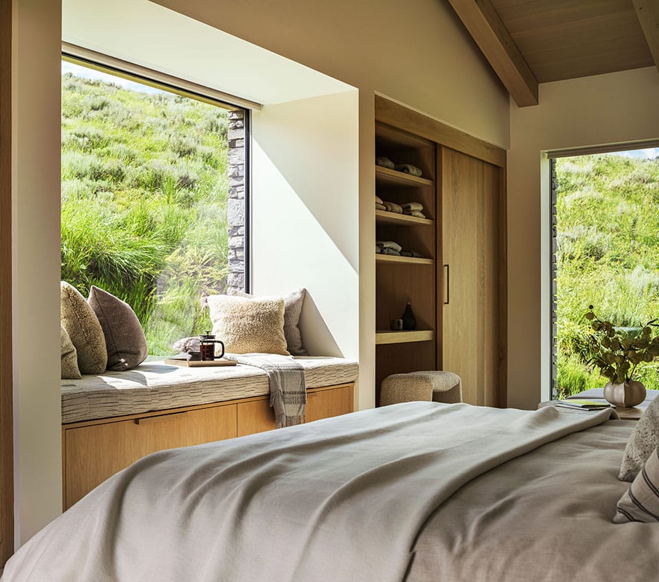
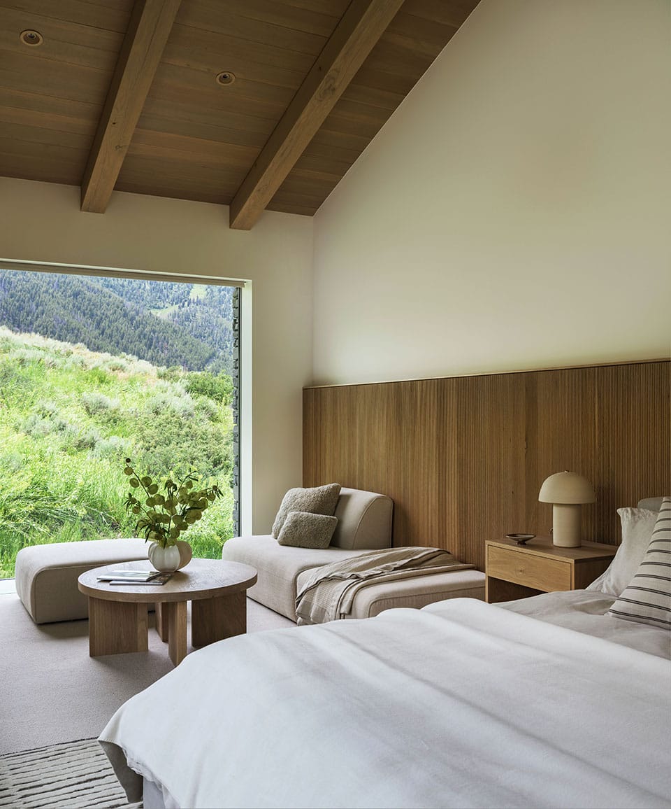
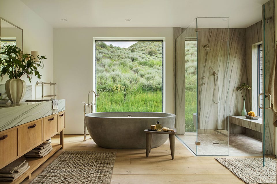
The primary suite occupies its own wing, a deliberate act of architectural separation that gives the owners genuine privacy from the home’s more social volumes. And from the bed, the view is the whole point: unobstructed sightlines to the summit of Bald Mountain. The headboard is upholstered in sumptuous mohair, a fabric Latham championed. “There was some concern when we first installed it that it was different colors,” she recalls. “But mohair is one of those fabrics that, depending on the light and the direction of the nap, you’re going to see different colors. I told them: just let it settle for a minute.” The richness of the material—its depth, its shift—is now one of the suite’s defining pleasures.
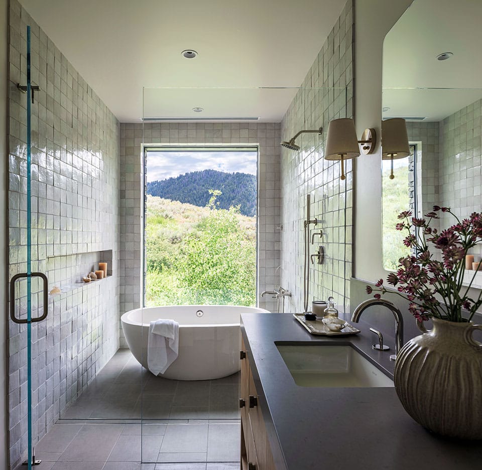
The primary bath is anchored by a Native Trails Avalon freestanding concrete tub in a warm ash finish, served by a floor-mounted Waterworks Henry tub filler in nickel. The double vanity features a countertop and integrated sinks carved from honed Chantilly quartzite, with a 10-inch stone backsplash to match, a material with soft, veined luminosity. A heated British towel bar adds a note of elegance. Wall-mounted Waterworks Henry lavatory faucets, a rain shower head, hand-held sprayer, and thermostatic controls—all in polished nickel—complete the suite with unmatched restraint.
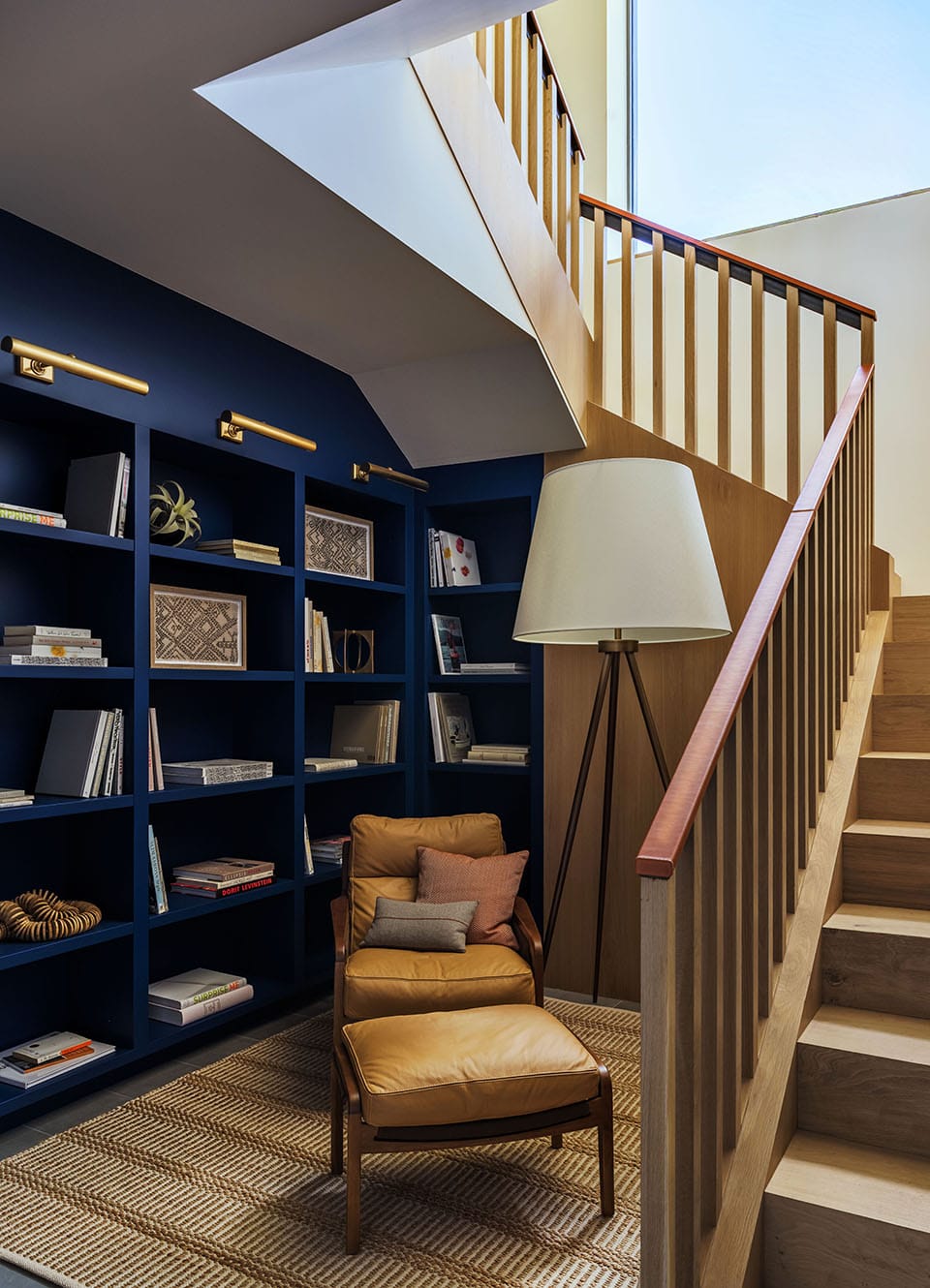
“CERTAIN ELEMENTS NATURALLY CALLED FOR DEEPER EXPLORATION, ESPECIALLY THE STAIRS. WE SAW IT AS MORE THAN JUST CIRCULATION BUT AS AN OPPORTUNITY TO INTRODUCE A SENSE OF CRAFTSMANSHIP AND TACTILITY. AFTER STUDYING SEVERAL APPROACHES, WE DEVELOPED A CUSTOM SOLUTION WITH A LEATHER-WRAPPED HANDRAIL THAT ADDS BOTH WARMTH AND A MORE HUMAN, TOUCHABLE QUALITY.”
If there is one element in the Lava Street house that encapsulates Latham’s process—the long deliberation, the collaborative push-and-pull, the arrival at something better than what anyone originally imagined—it is the staircase. “We went round and round on the stair rail design,” she says. The clients had initially wanted tempered glass, an almost invisible railing that would dissolve into the view. Latham suggested an alternative option. “Certain elements naturally called for deeper exploration, especially the stairs. We saw it as more than just circulation but as an opportunity to introduce a sense of craftsmanship and tactility. After studying several approaches, we developed a custom solution with a leather-wrapped handrail that adds both warmth and a more human, touchable quality.” The solution that emerged was collaborative: Poster Construction master carpenters built the stair structure and templated the handrails onsite, Latham then shipped them to New York for the leather work—a burnished, Hermes-leather tone wrapping that gives the rail a tactile warmth no glass could offer. “The owner wanted a crafted look,” Latham says. “And again, the windows take over.”
For Poster, the staircase stands as one of the project’s signature achievements. “That was all parts and pieces that we purchased and assembled in the field,” he says. “It’s one of my favorite details in the house.” Another favorite? The ceiling in the great room. Approximately 150 nonstructural beams were installed with blind fasteners and precision joinery, their tails running both inside and outside the building in a choreography that required painstaking matching to appear effortless. “A lot of that oak is veneered, which isn’t solid—it’s a thin layer, and trying to miter that and put it together was really challenging. We are extremely proud of the end result,” Poster says.
Rooms With Character
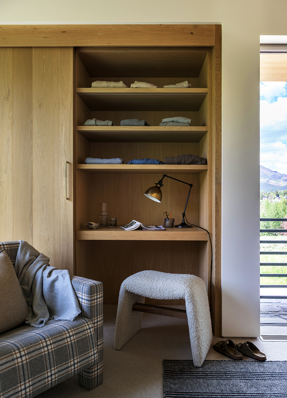
The secondary spaces are where the design’s grammar becomes most visible, and most playful. “We allowed more flexibility in the secondary and private spaces,” Latham explains. “Introducing color in areas like the office and lower level added dimension and a sense of personality, moments that feel a bit more relaxed and expressive within the overall framework.” The Manhattan background of the clients informed this too: “They’re accustomed to maximizing smaller footprints, so spaces like the office became an opportunity to layer functionality, integrating multiple uses without compromising clarity or comfort.”
The office is where Kit Kemp’s influence arrives most overtly. One of the owners landed on Farrow & Ball Plummett on the walls, a moody blue-gray that deepens at night while keeping its connection to the mountain palette outside. After numerous iterations on layout and seating, the room landed somewhere that surprised even the clients: wood paneling, layered textiles, bold pattern, and a chair arrangement that makes you want to stay.
“A LOT OF THAT OAK IS VENEERED, WHICH ISN’T SOLID—IT’S A THIN LAYER, AND TRYING TO MITER THAT AND PUT IT TOGETHER WAS REALLY CHALLENGING. WE ARE EXTREMELY PROUD OF THE END RESULT.”
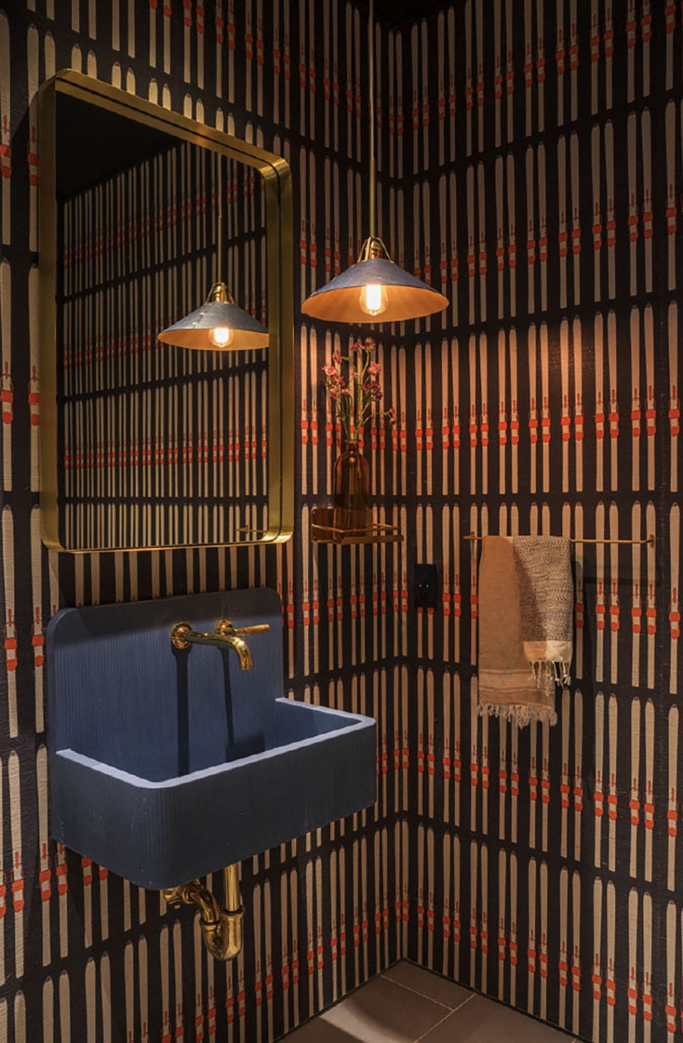
The powder room on the main level is a study in what Latham does best: using a small space to tell a complete story.
The owner arrived with a non-negotiable: a Kast Kern B1 sink in Thistle, a pale violet-toned ceramic wall-mount with the kind of handmade presence that tends to polarize. “The owner was certain she wanted this sink,” Latham says. But the sink alone, in a neutral room, felt marooned. “This cute, adorable little lavender sink just felt so lost until we added context to it.” Latham’s solution was layering: Mark Alexander grasscloth wall covering, a wood surround, enveloping color. A wall-mounted Waterworks Henry faucet in brass completes the fixture.
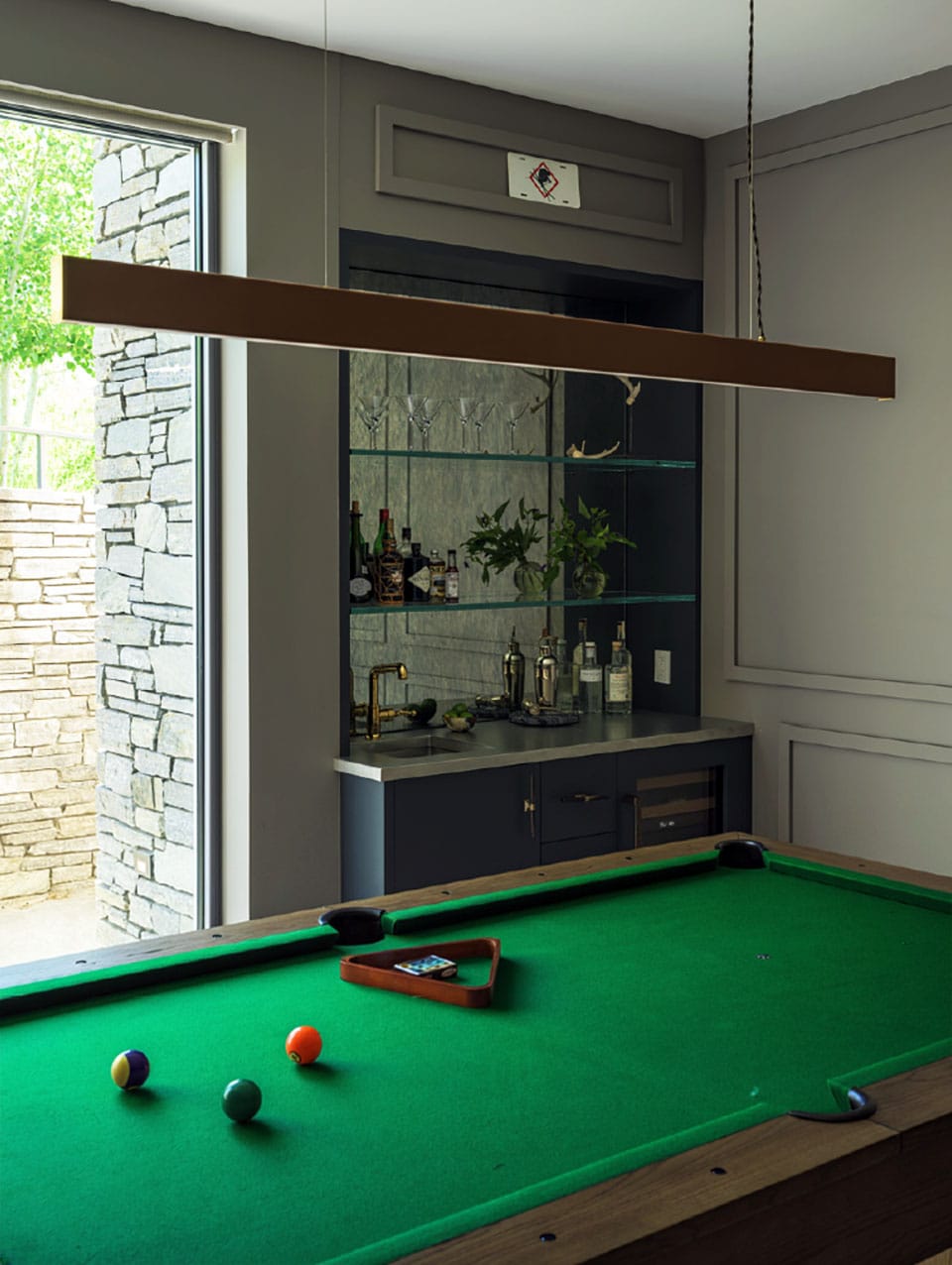
Downstairs, the children’s wing is designed for the glorious chaos of a large family at play. The rec room walls are painted in Farrow & Ball Moles Breath—warm, grounding gray—and anchored by a wet bar with a polished pewter countertop, antique mirror backsplash running the full height of the wall, and clear glass shelving. A Waterworks Dash faucet in brass nods to the metallic thread running through the house.
The bunk room sleeps eight in custom-built beds—fabricated entirely by Poster Construction’s own finish carpenters and faced in Shinnoki prefinished Ivory Oak veneer panels. Each bunk is fitted with a recessed Marset reading light. “It gives the user intimacy when they’re reading,” Latham ex-plains, “their own little space.” In the Mountain West, bunk rooms are non-negotiable. “It’s all about heads in beds to get all your friends and family up here to ski or hang out for the summer,” Latham says.
Returning the Land to Itself
“INTRODUCING COLOR IN AREAS LIKE THE OFFICE AND LOWER LEVEL ADDED DIMENSION AND A SENSE OF PERSONALITY, MOMENTS THAT FEEL A BIT MORE RELAXED AND EXPRESSIVE WITHIN THE OVERALL FRAMEWORK.”
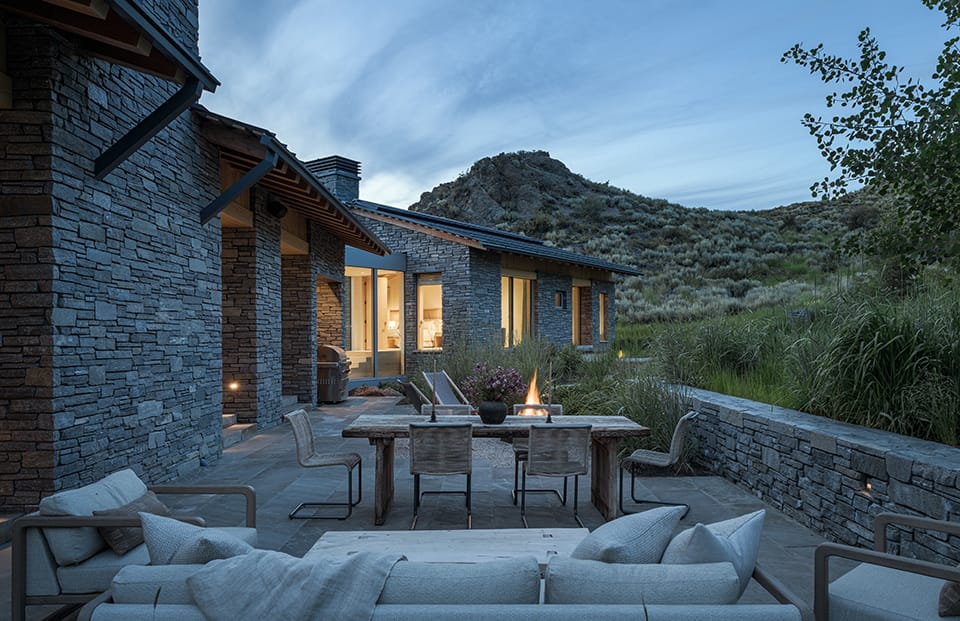
The site that challenged every discipline—architect, builder, designer—had one aspect that everyone agreed was worth protecting: its landscape. The clients were clear from the outset: they did not want to lose the feeling of a home set within nature when construction was complete. The landscaping plan was built around a single commitment: feature the meadow, not fight it. Low walls contain the built spaces and then step aside, allowing native Basin Rye to embrace and wrap around the terraces and patios. Where paving meets the site, crushed stone borders dissolve the hard edge into the surrounding ground. The hiking trail that once ran through the heart of the property was carefully rerouted, providing continued public access to Dollar Mountain and the hills beyond.
“I think most people who see the home appreciate the fact that it is broken up and that it seems more in scale with the site than it could have been,” McLaughlin reflects. “We were conscious of the fact that we didn’t want a large impact. It’s meant to just blend into the site. We really tried to respect that.” It is, in miniature, the spirit of the entire project: something taken from the landscape, but something thoughtfully given back.
The View is The Room
Throughout the design process, one principle held constant: the views should steal the show. Sweeping sightlines to Bald Mountain, Griffin Butte, the Boulder Mountains, and downtown Ketchum demanded that every design decision—from the roof pitch to the overhang depth to the placement of each piece of furniture—serve the glass rather than compete with it. The windows themselves were ordered from a European manufacturer specializing in large-format glazing; in the kitchen and living area, a series of floor-to-ceiling panels spans approximately 25 feet, framing Bald Mountain in a composition that changes by the hour.
“I THINK MOST PEOPLE WHO SEE THE HOME APPRECIATE THE FACT THAT IT IS BROKEN UP AND THAT IT SEEMS MORE IN SCALE WITH THE SITE THAN IT COULD HAVE BEEN.”
-Jim McLaughlin, McLaughlin Architects
“Low-profile windows were critical to them because the views are stunning,” Latham says. On clear mornings, the summit catches the first light. By afternoon, the shadows have shifted, and the whole tableau has transformed. For Latham, the windows resolved a question that bedevils most mountain homes: what to put on the walls. “Artwork isn’t really needed—to me, the artwork is the views,” she says. It’s a conviction that shaped every room. The restraint isn’t absence. It’s deference—a designer confident enough to know when to step back and let the mountain do the work.
Poster, who has spent a career building some of the most demanding homes in the Wood River Valley, puts it simply: “That view of Baldy is unsurpassed.” Then he pauses. “But I think the back of the house and the backyard is very competitive with the front. The rock in the background and the soft hill coming off the backside of Dollar is extraordinary.”
Four years is a long time to hold a vision. Budgets shift. Tastes evolve. Excavations hit unexpected rock. Record snowfalls bury construction sites. Clients fall in love with British designers mid-project. Through all of it, Latham kept finding the thread—the quiet, natural, intentional home that was always underneath, even as it grew richer and more layered with time.
In the end, the home is exactly what the clients asked for: a place that looks like it always belonged here. A place where a big family can fill every room and still feel the mountains at the edges. A place where the most important thing on any wall is the view through the glass.
“ARTWORK ISN’T REALLY NEEDED—TO ME, THE ARTWORK IS THE V IEWS.”
whj COVER FEATURE