Sun Peak Afterglow
A timeless renovation from Blackdog Builders
by Lori Williams
The sun has long set on the sleepy sage and beige style of 1990s interior design. It is hard to believe that was three decades ago. When a Texas client was ready to breathe new life into the tired, dated look of their Sun Peak vacation home, Blackdog Builders went to work to transform the interior and capture the trendy modern style of a new decade and a new century. The renovation objective was to bring about a new timeless design in a major way, with the motivation that the home would eventually become the family’s full-time residence. This four-bedroom, 3,800-sq-foot traditional mountain retreat would wake from its slumber to become the home of their dreams, a space for family and guests to enjoy, centrally located within the Park City area.
“The client’s main goal was to lighten and brighten the space, create depth and contrast, make it more of an open and inviting floor plan, and above all, modernize,”
–Amanda Evans, Designer
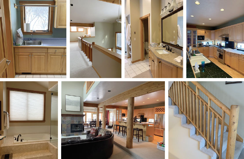
“The client’s main goal was to lighten and brighten the space, create depth and contrast, make it more of an open and inviting floor plan, and above all, modernize,” says in-house designer, Amanda Evans, daughter of Blackdog’s owner, Todd Evans. Heavy styling permeated the interior—a dated sunken living room, four intrusive log supports, natural stained baseboard trim, doors, and cabinets, all set against lackluster beige carpet, tile, and walls. The space cried out for revitalization. It was ‘90s in the mountains for sure, but mountain living no longer dictates that rustic reigns.
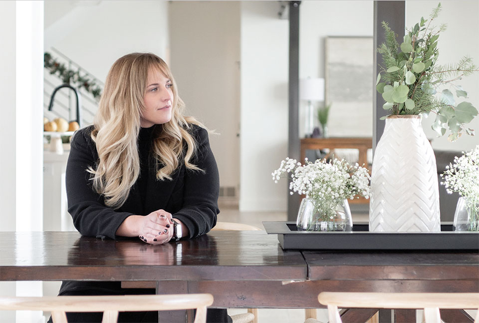
Amanda likes to hear her clients’ perspectives before jumping in with her own ideas. “I want to get a feel for who they are, their vibe, what their goals are for the space,” she says. “It’s really important for me to create beautiful spaces, but also to ensure they are functional and long-lasting. I ask them for inspiration photos, which is super helpful to get a feel for their style. From there, I create electronic design-books with different options for each area of the home, from plumbing and lighting fixtures to cabinet paint colors. The design-book can be sent to them via email. This process works well with our clients, the majority of whom are out of town.”
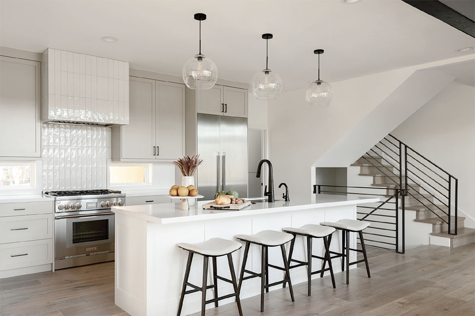
This Sun Peak home, situated close to The Canyons Resort, was blessed with natural light through large windows in both the living and dining rooms, but because the compounded beige and brown elements throughout contributed to the dim atmosphere, it was essential for the natural light to thrive. An all-white interior—they used Benjamin Moore Simply White—was the perfect conduit for a timeless vibe. White and natural light worked covertly and magically, ushering the outdoor hues in and making the entire living area sparkle, highlighting fixtures, textures, furniture, and art.
The remodel included the interior main and upper floors set above a first-floor garage level. Nothing was done to the exterior except for a small addition over the garage to incorporate an ensuite bathroom in one of the upstairs bedrooms.
“We first made some structural changes to the main level between the living room, kitchen, and dining room, replacing four heavy log posts with two structural steel posts, simplifying and opening the space to the heart of the home,” says Amanda. “We wanted to give the client as much space there as they could utilize. To create depth and contrast, we added steel along the sides of the existing glulam beam, and then had our painter apply a black gel stain finish to it, as well as to the smaller dining room glulam and the new steel support posts. That was one area we could save on cost, but still accomplish the look we were going for.”
They also raised the dated sunken living room floor and moved an under-utilized corner fireplace to center it on the main wall, framed it in square steel plates, and switched out the old crown molding mantel for a matching I-beam to coordinate with the steel support posts. This contributed to a happier open-living space, providing more opportunity to congregate around the fireplace with different furniture configurations.
To break up the white of the walls, interior doors and frames were painted a shade of greige—taupe/beige/warm gray—to add warmth, interest, and character, yet also to remain grounded with the outdoor environment. This is most evident in the dining room where natural light now sweeps into the corners once hidden by dark, floor-length drapes.
Dated interior prior to blackdog builders remodel
“We first made some structural changes to the main level between the living room, kitchen, and dining room, replacing four heavy log posts with two structural steel posts, simplifying and opening the space to the heart of the home,”
–Amanda Evans, Designer
What once was a closed-in landing above the living room, with only a small section of log rail and pickets to borrow light from, is now exposed with a custom designed and welded modern railing system, continued down through the stairway. Amanda added warmth and comfort with furniture pieces. Gone is an underutilized bookcase in a recessed area of the landing, replaced with a beautiful dark wood console table. “It’s still the mountains and you want to embrace the idea of bringing the outside in,” she says.
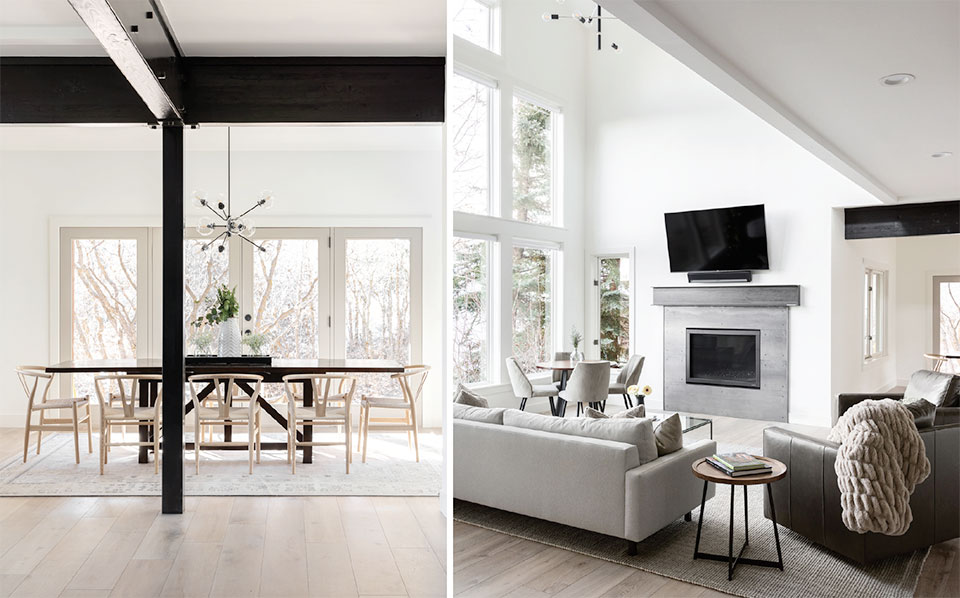
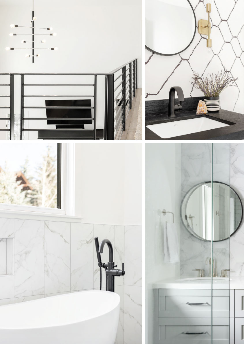
Depth and contrast permeated the renovation to bring about a trendy modern vibe. Amanda also used dark materials for accents—black plumbing fixtures, mirrors, and hardware, as well as modern and unusual light fixtures, complementing the bright, neutral tone of the home. What was beige carpet throughout the house is now pre-finished veneered white oak plank flooring—with knots—for character, warmth, and beauty.
A kitchen that before appeared dark and recessed, even with a fenestration of windows in what would be the backsplash area, is now an inviting entertainment space. “We used high-end appliances as the client loves to cook and entertain, so creating a space where she felt comfortable, where gathering was encouraged, was important.” The two-tiered island was leveled with one beautiful slab of slightly veined quartz for movement, and that same quartz was continued as trim around the backsplash windows. “Behind the range we did a vertically-stacked tile, crafted to appear as if handmade, to show more movement and texture, then for a different and fun element, continued it around the hood, rather than a stand-alone stainless-steel hood,” says Amanda.
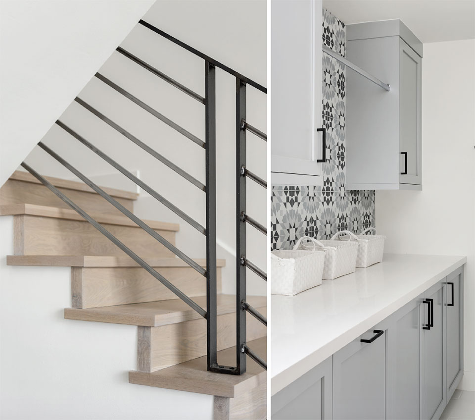
Tile play with charismatic texture was an enjoyable treat for Amanda, and the client gave her free reign to experiment with modern choices. From the living room you catch a peek at the walls of the laundry room off the kitchen, completely updated with a fun, geometric, quilt-like pattern of tile. In the bathrooms, gleaming-white quartz vanity tops replaced dated speckled granite.
“We really weren’t living by the rule of matching metals and hardware, but we kept consistent, incorporating fun light fixtures and mirrors and plumbing fixtures with the same vibes.”
–Amanda Evans, Designer
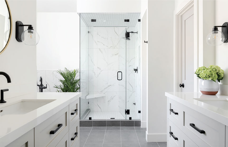
Amanda added interest by mixing metal fixtures throughout the entire house. Some of the bathrooms have polished nickel or champagne bronze plumbing fixtures, while mirrors, light fixtures, and cabinet hardware are matte black.
“We really weren’t living by the rule of matching metals and hardware, but we kept consistent, incorporating fun light fixtures and mirrors and plumbing fixtures with the same vibes,” she says. Yet the effect doesn’t feel hodge-podge. It creates a sense of connectedness through the collection, without obligation to one style.
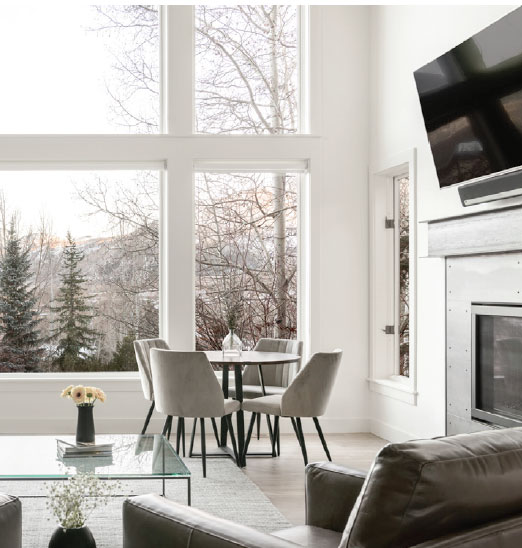
As light pours into the living room, intensifying views of the outdoors—Snyderville Basin and the beautiful canyon neighborhood of Sun Peak—the renovation afterglow is dazzling and dreamy. Choosing white and light with visual interest and warmth, contrast and texture, woke up this beautiful home to a relevant and modern new day.
“It’s still the mountains and you want to em-brace the idea of bringing the outside in.”
–Amanda Evans, Designer
