Remodeling For the Future
By Jennifer Walton
Our mountain town lives are a perpetual blend of work and play, friends and family, planned and unplanned events inside and outside of our homes. There’s always a home where everyone feels welcome and where a casual “bring the kids by for snacks” transforms into sunset cocktails on the deck followed by a gathering in the kitchen to prep dinner and later, s’mores and stargazing in the backyard. This home’s renovation and transformation set it on a path for all of those scenarios and more with ease and comfort. And, that’s why it feels like you’d want to move in at first glance.
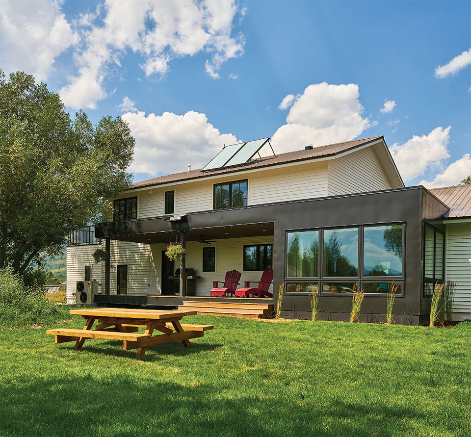
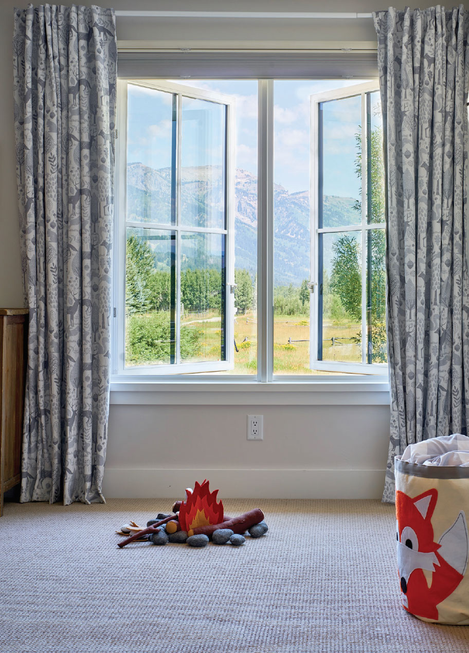
Those blissfully long summer days and beautiful cool eve-nings can be experienced from any room in this home be-cause of three major elements that the homeowners, architects, and builders chose to focus upon: a mindful design that embraced a working family with children; a non-traditional placement of operable energy-efficient windows that capitalized on the spectacular Teton views while providing important airflow; and a timeless mash-up of farmhouse and contemporary styles that pushed boundaries and created an innovative approach to adding more space to the home while enhancing the overall design project.
“PART OF WHAT MADE THIS REMODEL AND ITS PROCESS SO ENJOYABLE WAS THAT IT WASN’T JUST ABOUT REDOING AND REPAINTING IT. THE HOMEOWNERS AND ARCHITECTS DID NOT LET THE ORIGINAL PARAMETERS OF THE HOUSE RESTRICT THEM AND WERE WILLING TO ADD ROOMS AND SPACE THAT CONTRIBUTED TO BRINGING THEIR IDEAS TO LIFE.”
–Mike Wilson, Co-owner, JH Builders
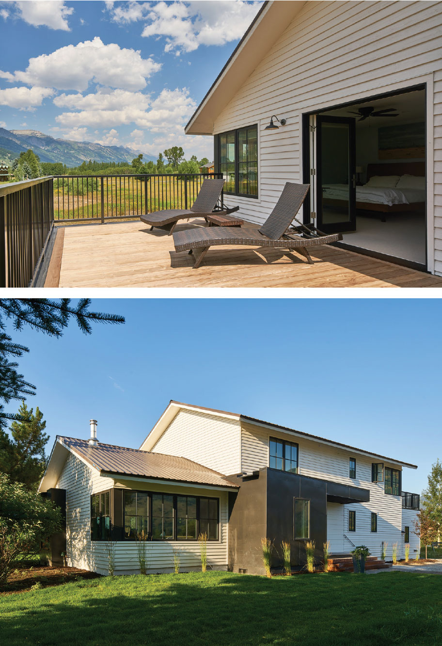
“Part of what made this remodel and its process so enjoyable was that it wasn’t just about redoing and repainting it. The homeowners and architects did not let the original parameters of the house restrict them and were willing to add rooms and space that contributed to bringing their ideas to life,” states Mike Wilson, co-owner of JH Builders in Jackson, Wyoming. “For example, the entry. The entry before and after is quite different.” The addition established dimension and relief where formerly there was none. And, by choosing metal and recessed siding, an inviting entry was born that personifies balance and beauty.
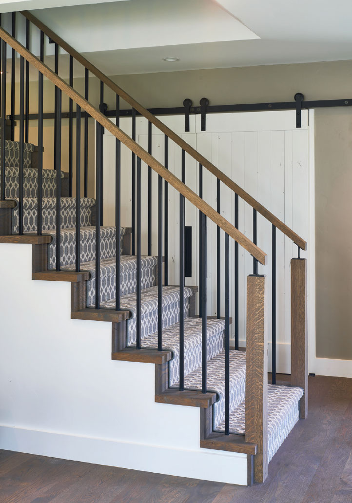
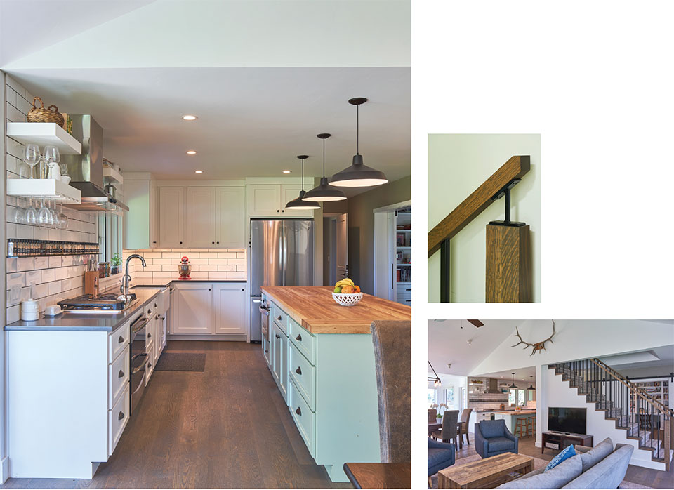
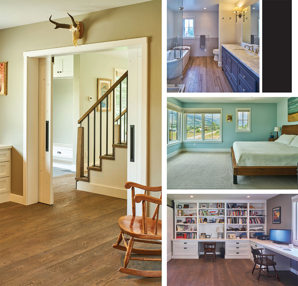
Inside the entry, the staircase’s location remained the same, however its design, which eliminated the skirt board giving prominence to the stair stepping, was an uncommon detail, as was the chamfer in the posts, which was hand-sketched by this project’s architect, Peggy Gilday, principal of GYDE Architects. Its implementation succeeded as a structural component and also resulted in an attractive visual element. Gilday, an architect whose passionate work is evidenced across all sectors of Jackson’s residential, commercial, and community architecture, expertly illustrates with this detail what makes design fresh and appealing.
The living and dining area in breezy shades of navy, gray, and brown is simple and pleasing, while the kitchen incorporates painted cabinetry in a soothing celadon. The counter-to-ceiling white subway tile and open shelving evokes a fresh, uncluttered feeling suitable for dressing up with mounds of just-picked vegetables in the summer or a cluster of wildflowers in early fall. But the detail here is the long, singular spice ledge whose metal angle was put in place and then hidden by the tile. The butcher-block topped island softens the space with contrast and texture as does the oak floor, which was stained for a very matte finish.
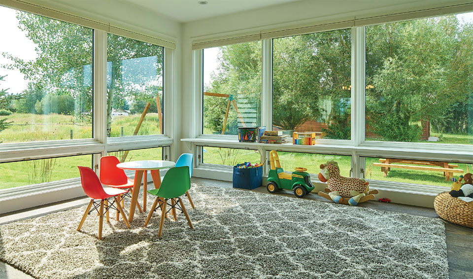
The second of three additions (the first being the entry) was a sunroom. This unadorned space with large south-facing windows provides a sunny locale for two young children and their friends for hours of play. Whether nature presents a lush, green lawn or snow-laden swings, this view removes the need for technology and prompts its young souls to read, paint, and puzzle make. The windows below open for “wait for me” hollers and the sole shelf is perfect for coloring or homework projects.
“THERE WAS DEFINITELY A FAMILY-TYPE RELATIONSHIP BETWEEN THE THREE OF US (HOMEOWNER, ARCHITECT, AND BUILDER). WE LOVE WHEN PEOPLE RELY ON US TO MAKE LINES ON DRAWINGS HAPPEN IN THE EXPECTED WAY AND WE MEET THE EXPECTATIONS OF BOTH CLIENT AND ARCHITECT.”
–Mike Wilson
The third addition came in the form of a “bumped out” garage. By taking up seven feet of space in the existing garage, the family acquired a laundry room and then promptly added another 10’ to the new garage. That extension translated into a sundeck outside their master bedroom. In the master, a corner window frames the Teton Range. Great care was taken with the placement of this window. The mullions are traditional but the placement is not. Respect for the mullion plan was discernible. Windows sans mullions speak to the modern aesthetic, while windows with mullions are a reflection of the farmhouses of the past. This adjacency demonstrates the combination of styles that defines what is so desirable about this home. Further attention was paid to the layout of the siding. The siding details change. Notice the entry siding is recessed and the siding to the right of the entry is lapped. The lines directly relate to the top and bottom trim of the windows. As Wilson describes, “There are no odd moments.” This call-out to a new section of the home relates to both wall and window.
“One aspect of this project that made it successful is that we were able to utilize what was there and build upon it,” states John Stennis, associate at GYDE Architects. “Part of that success was the experience of working with the owners who were so trusting. And then to have the home turn out so well was also due in part to JH Builders. Since it was a remodel and there are always challenges with remodels, they were really wonderful in rolling with the challenges and helping problem-solve.”
A sense of wellness, of familiarity, of safety, and of “home” permeates through this house. It’s personal without being showy and unique without being trendy. But most of all, it is the sum of its family and those who committed to this feeling. “There was definitely a family-type relationship between the three of us (homeowner, architect, and builder),” explains Wilson. “We love when people rely on us to make lines on drawings happen in the expected way and we meet the expectations of both client and architect.” Would it surprise you if your architect and builder became lifelong friends? With shared experiences, those friends become family, and family is what makes a house a home.
