The Lightness of Being
by Victoria Plasse
photos by Aaron Craft
Soft finishes in a rugged environment embody the Jackson lifestyle. The abrasive environment of weather and granite can be a challenge for the homeowner looking to utilize a delicate touch in their living space. But a south-of-town residence found the perfect balance in durability and luxury when they contracted
with Design Associates Architects for their new guest house.
“I can see the clients lounging on the grass while the kids and dogs play around the pond.”
–Chris Mientjes, Project Manager, Design Associates Architects
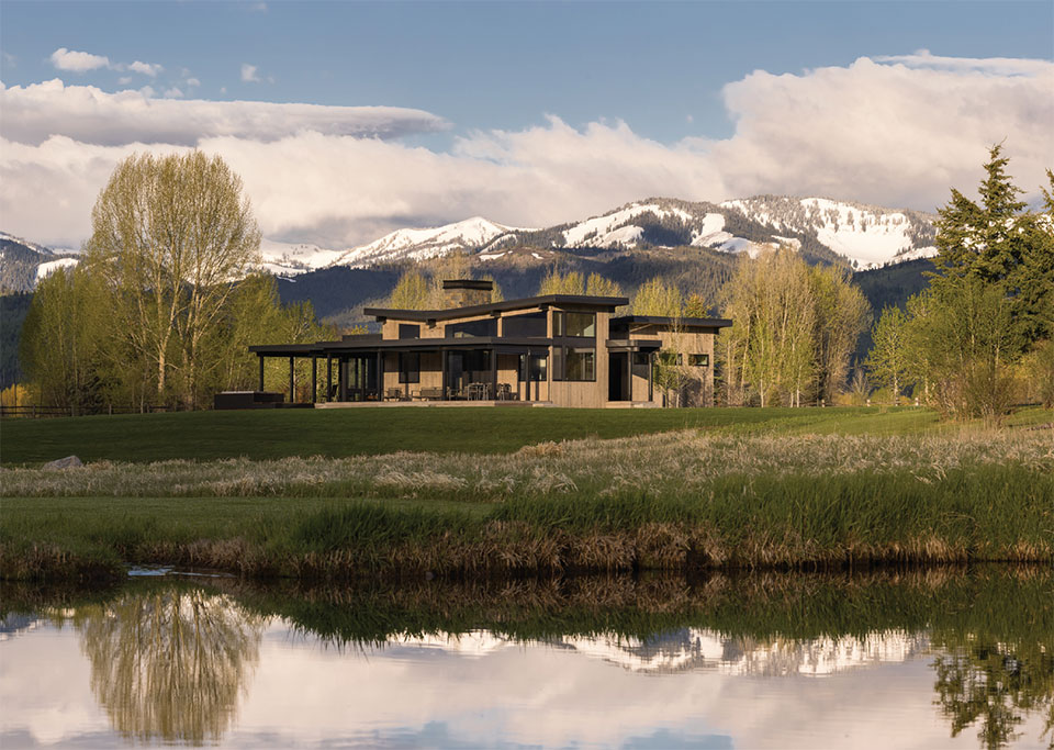
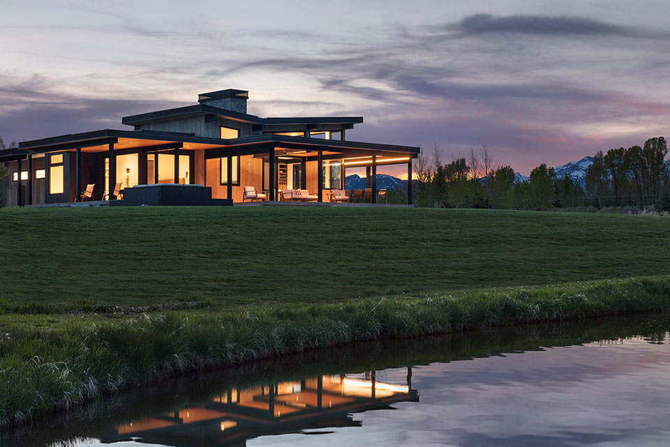
The 20-acre parcel has a view from every point of the property, even the garage. A water ditch crosses through the property, feeding the pond adjacent to the guest house. The pond is stocked with native trout and deep enough for the fish to survive the winter and is the focal point of the ranchette.
“We were fortunate that there was a natural bench adjacent to the pond so that not much grade was manipulated to place the house. There is a fantastic amphitheater that leads down to the pond and ditch. In fact, the future main house will utilize this as well. I can see the clients lounging on the grass while the kids and dogs play around the pond,” says Chris Mientjes, project manager at Design Associates Architects.
The guest house features a master bedroom with an ensuite and bunk room, making it a short-term but impressive solution to the down-the-line construction project.
“We devised a plan with the owners to create a small compound focused on their pond, the mountains, and a really nice and long valley view.”
–Chris Lee, Project Architect, Design Associates Architects
“And so, although the guest house’s long-term goal is to serve as a guest house, every consideration has been made to make this a liveable space for a family of four to enjoy their corner of the Jackson Valley,” says Mientjes.
“We devised a plan with the owners to create a small compound focused on their pond, the mountains, and a really nice and long valley view. There is an existing home on the property that will get replaced with the new residence. So that the family can start to enjoy their property sooner, we built the guest house first as a place for them to live during the second phase when we’ll build the main house,” says Chris Lee, Project Architect. “The two structures will ultimately work together to create a great outdoor space focused on the outdoor living area around the pond below and the views.”
The concept for the design came from the owners, who showed samples of what they liked. “I love it when a client shows us something that speaks to them; it gives us an inspiration and direction for the design that we know will please our clients, says Lee.” In this case, they liked the roof forms and style of the homes of the Martis Camp in Truckee, California, a style made up of voluminous, light spaces and shed roof forms. “It’s a great style that balances new and old, which feels appropriate for these guys and works well with their property,” Lee continues.
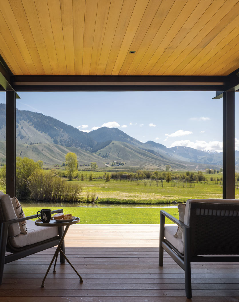
From Texas, the owners were looking forward to spending more time outside, something that’s getting harder to do in the Texas heat. “The outdoor features were a big part
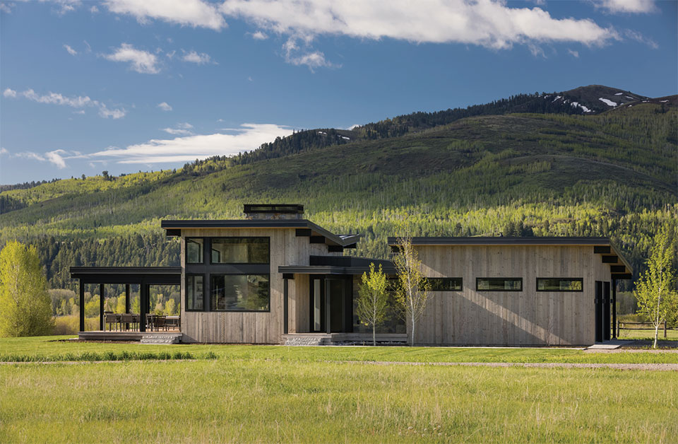
of the design and gave us an opportunity to expand the size of the small house,” says Lee.“By county standards, we’re limited to 1,000 square feet enclosed habitable space, so the added 1,000 square feet of the deck increased the livable space for the home considerably.” To enhance the relationship between outside and inside, Design Associates used huge accordion doors that can be opened on nice summer days to remove the wall between the deck and the living room.
The exposed steel throughout the interior and exterior spaces makes for an elegant continuity of design, and a hybrid of ranch and ranchero. It’s difficult to discern if the outdoor or the indoor living area is more prominent. And rightfully so, because the interior and the exterior square footage of the guest house are equal at 1,000 square feet each. The deck wraps the building on the west and south elevations.
The expansive and functional outdoor living area was a remarkable solution for the CCR codes of the subdivision where limits were set on guest house size. The deck itself is Ipe with a muted red tone to mirror the soffit above.“Ipe is a fantastic deck material as it is incredibly durable and weather resistant,” says Mientjes.
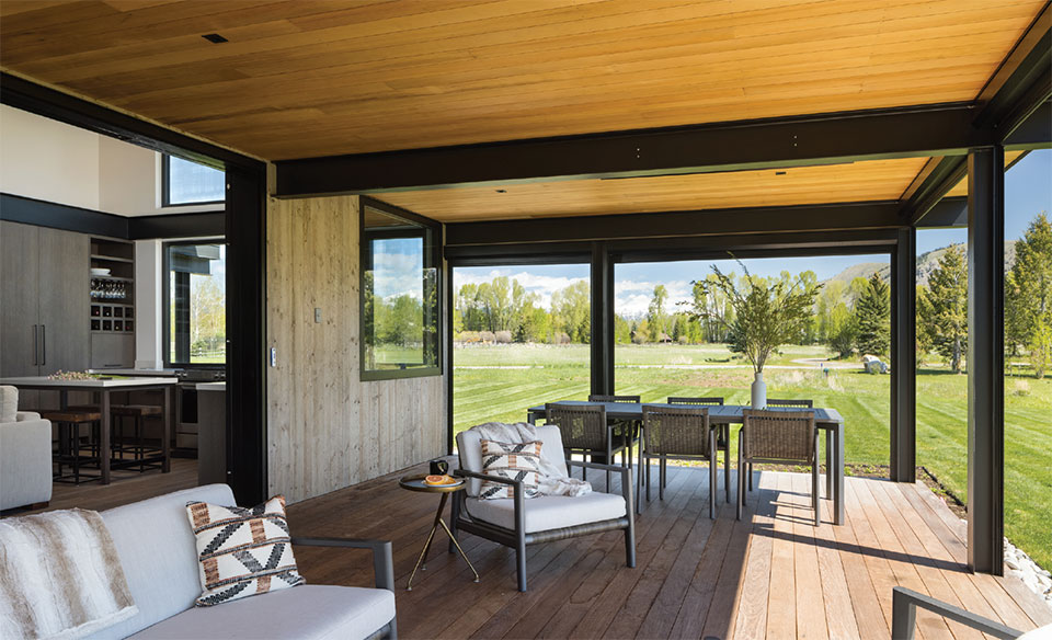
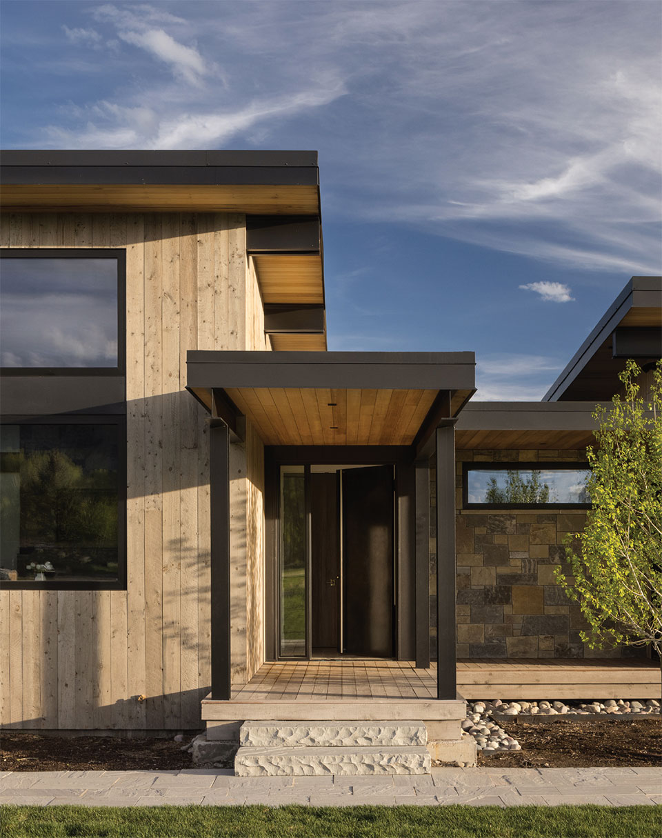
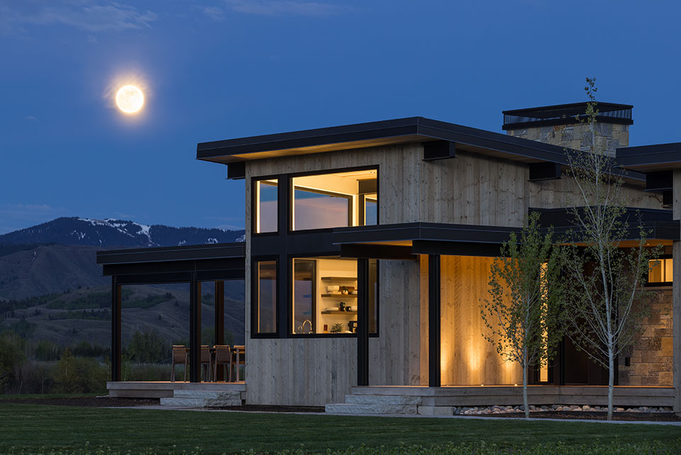
The outdoor siding is a recycled coral board with a milled edge. The boards were then butt-joined with an 1/8” ‘nickel gap’ providing clean lines against the rough texture of recycled wood.
The Design Associates team selected a matte black metal siding for some key bump-out spaces and the garage doors. The decision to extend that siding flows beautifully into the painted steel structure, roof beams, and black window frames.
Inside the guest house, Design Associates and JH Builders used a CVG (clear vertical grain) red cedar as the soffit material for both inside the main kitchen and main room as well as outside above the deck. Mientjes says, “We deliberately kept the interior and exterior soffit finish the same to help break down that indoor/outdoor threshold.”
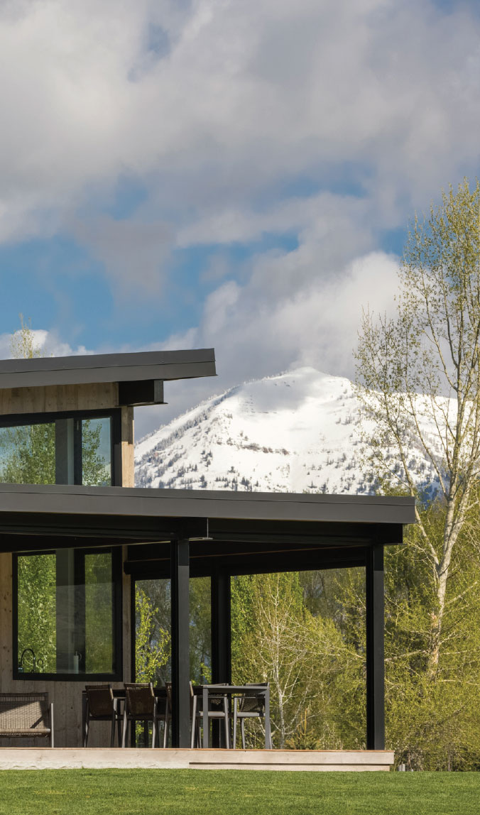
“The outdoor features were a big part ofwdesign and gave us an opportunity to expand the size of the small house.”
–Chris Lee, Project Architect, Design Associates Architects
The established aesthetic became a balance of dark and bright but also a structural conversation between soft and textured. That delicately balanced contrast continues throughout the building with framed glass, porcelain, countertops, and bathrooms.
“Adjacent to the entry we used a wall of stone, which really adds to the compression and cave-like space before you go through the front door threshold. The front door itself is a big burnished steel door, adding to the weight of the space,” says Lee.
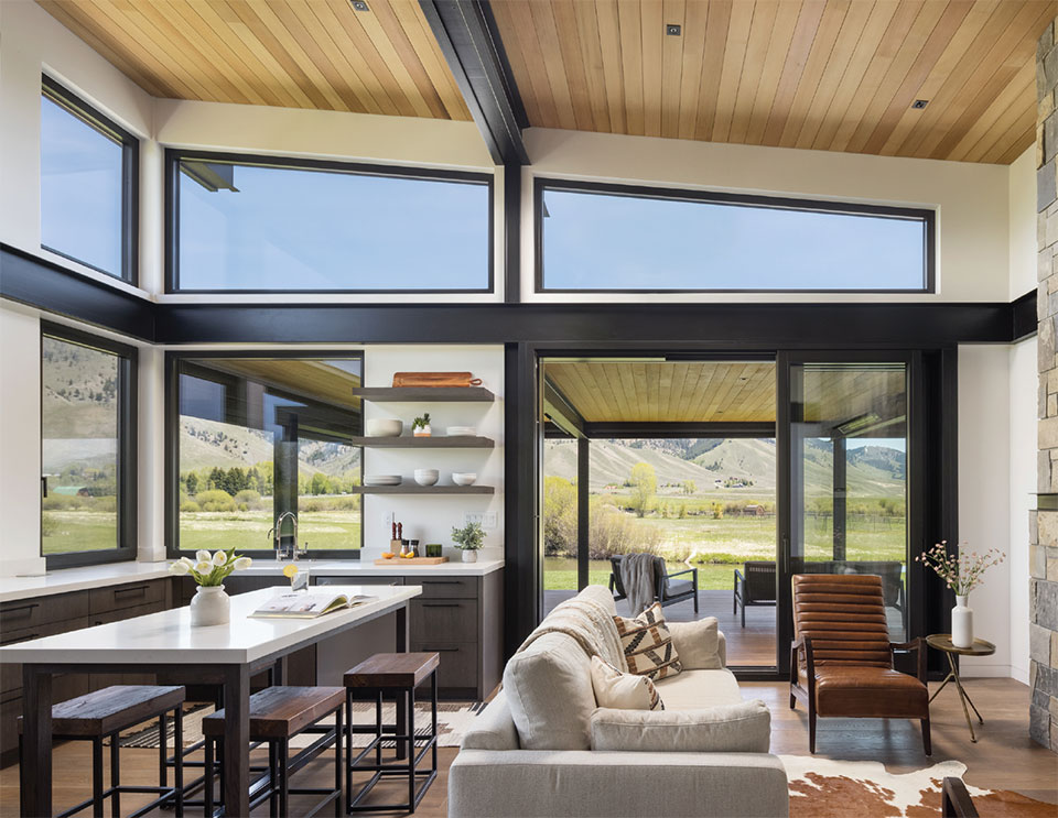
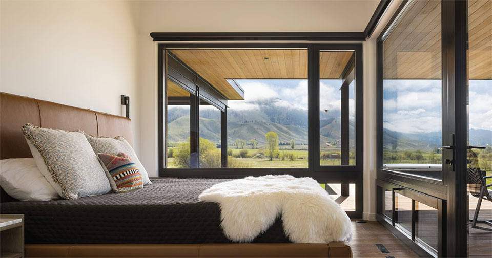
When you come through the cave-like space, the ceilings stretch to 15 feet in the living area and 10 feet in the master bedroom, enabling the eye to focus on the view of Munger Mountain as if it was just part of the house; or maybe, the house is part of the outdoors. Except for the entryway, the guest house provides a voluminous experience.
“Once you are through the front door, you immediately enter the tall and bright living room, creating a bit of playful drama as you move through the building,” describes Mientjes.
“Adjacent to the entry we used a wall of stone, which really adds to the compression and cave-like space before you go through the front door threshold. The front door itself is a big burnished steel door, adding to the weight of the space.”
–Chris Lee, Project Architect, Design Associates Architects
“The high windows in the living space add a lot of light as they are above the deck roof.”
–Chris Lee, Project Architect, Design Associates Architects
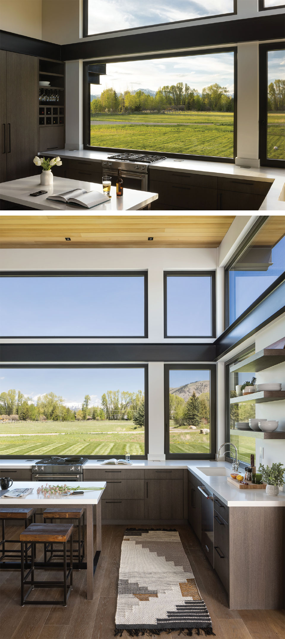
As there are no bad views in Jackson Hole, curating window locations is as important as curating an art collection. The Design Associates team, along with the clients, wanted to prioritize views of the pond and out to the surrounding hills.
“The high windows in the living space add a lot of light as they are above the deck roof, while the triple-panel stacking door maximizes the opening onto the deck,” explains Mientjes.
The massive kitchen window is made up of four separate units with a total size of 13 feet wide and 11 feet tall.“Because we split the units, it allows us to sneak in some interim structure and keep the glulam wood headers to a reasonable size,” Mientjes continues.
The additional interior light is cultivated through a recessed four-inch can throughout, along with strip lighting above the interior and exterior steel to create a softer ambient light on those beautiful summer Jackson evenings. On a full moon night, if the sky is clear, the house lights up with natural luminosity from all the southern exposure.
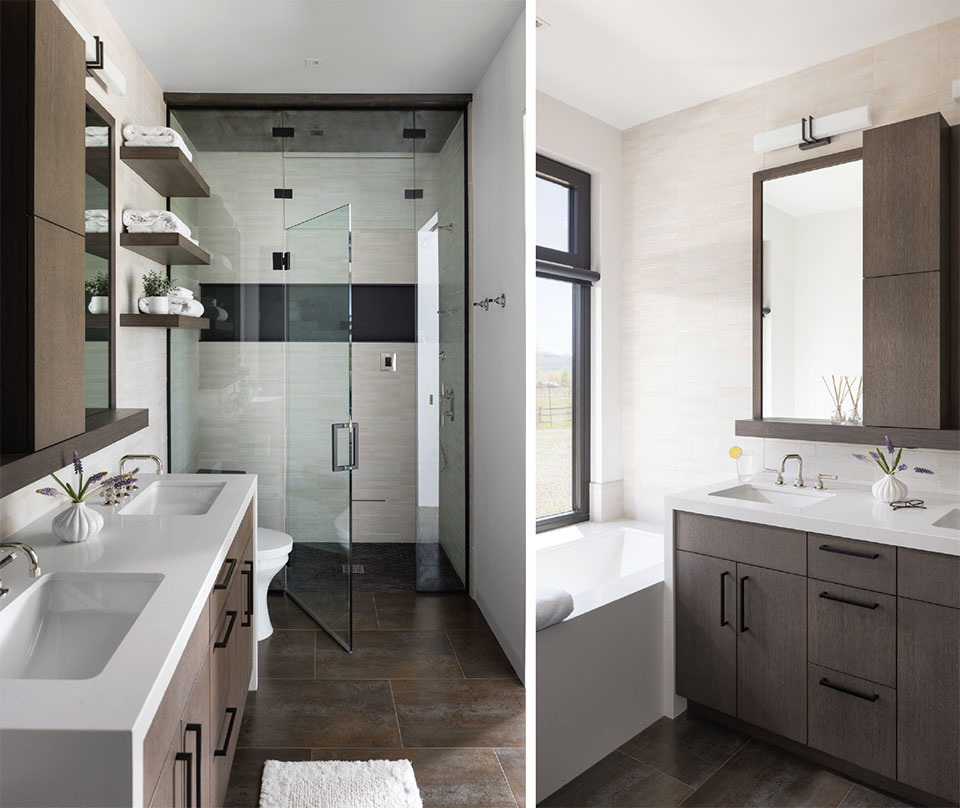
The dark and the bright contrast theme continues into the bathroom with the dramatic accent of the black frame around the glass.“Typically, clients love to see frameless glass and let the glass almost disappear. We opted to frame the glass instead as another call-back to the steel accents throughout the house,” says Mientjes.
JH Builders installed a ceramic tile fromPorcelanosaon both the floors and ceiling, giving the room a fantastic rusty stone look. The walls are porcelain tile. Each tile is 12”x24” but contains thinner slices stacked together, creating a unique variation for accentuating the tones and texture on seemingly flat surfaces. The countertops are a Caesar stone, which also wraps the bathtub. The bench seat and niche mimic the interior steel accents of the main living space and the steel deck structure with a dark porcelain tile.
“The 3D modeling services we provide were especially helpful …allowing us to test different materials with the clients first before committing to the final choices.”
Chris Mientjes, Project Manager, Design Associates Architects
Though the majority of the build was done while the clients were out of town, Design Associates’ capacity to provide a virtual and augmented reality of the build for the clients kept all team members on the same page at the same time throughout the entire process.
As Mientjes explains, “The 3D modeling services we provide were especially helpful during the interior design phase, allowing us to test different materials with the clients first before committing to the final choices.” JH Builders was also an integral part of the remote design strategy with weekly site meetings held over Zoom.
“Pauline Chu of Rooted Landscape Architecture did a fantastic job with the hardscape and vegetation design,” says Mientjes. Her choices in native species work double-time as ornamental landscaping and as a functional privacy barrier from the neighboring property to the south.
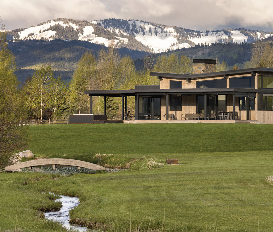
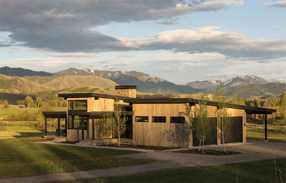
That attention to detail is what makes this guest house competitive with 7,000-square-foot chalets. There is not one inch of wasted space or a forfeited view. The goal to balance the structure with the natural landscape in its entirety, from the windows to the garden to the fireplace, certainly blurs the line between inside and outside.
