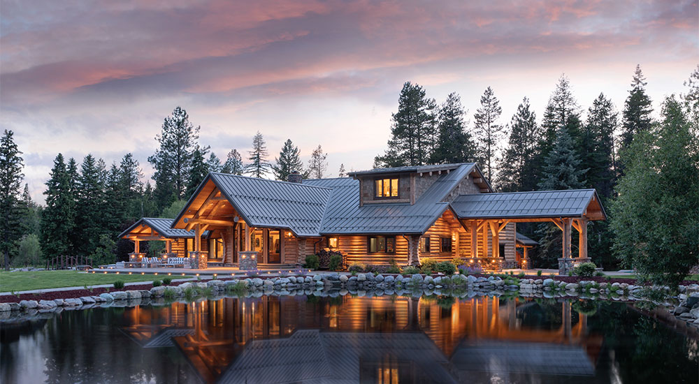
A Medley of Rooms With Three Interior Design Experts
by Cassidy Mantor
According to the most recent data from the National Association of Realtors’ 2020 Profile of Home Buyers and Sellers, Americans have been buying larger homes since COVID-19 hit. Jessica Lautz, VP of demographics and behavioral insights at NAR, explains that buyers want more rooms, more square footage, and more outdoor space. The reason is obvious with respect to the pandemic. It forced us into a new way of living and working from home. “Buyers… {desire} a home office or home gym,” she says. A larger home also, “allow{s} households to better accommodate older adult relatives or young adults who are now living within the residence.”
While we may have been holistically aware that we’re trending toward larger houses, it creates the question of what we will do with those rooms. How will we use our extra space and how are we going to make it look good?
In this feature, Western Home Journal will take you on a tour of three essential spaces designed by three different local interior designers. These spaces serve as inspiration for what a dream home can look like in the Flathead Valley:
1. Master bathroom by Camp Martini
2. Outdoor living pavilion by Tate Interiors
3. Home office by Hunter & Company Interior Design
A Curated Master
by Camp Martini
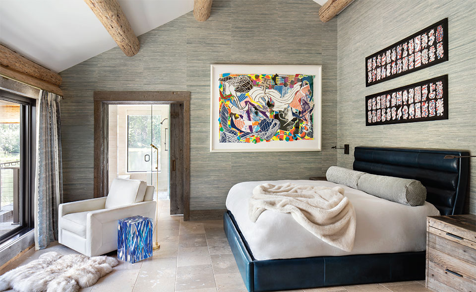
“They wanted it to become more contemporary. They have an extensive art collection that is vivid and eclectic.”
–Colton Martini, Owner, Camp Martini
If the kitchen is considered the heart of the home, the master bathroom is a place to find one’s zen. From infrared saunas to aromatherapy baths, master bathrooms are the epicenter of the home spa experience where intentional mindfulness and restoration happen. Colton Martini, owner of the interior design and lifestyle collective Camp Martini, takes us inside a gallery-inspired master bathroom in a fine art-forward home in Bigfork near the Swan River.
Martini recalls that the homeowners had been living full-time in Montana for quite a few years. Their children were grown, and they found themselves in that sweet spot of being able to design their dream home exactly as they envisioned without having to make compromises to factor in multigenerational living.
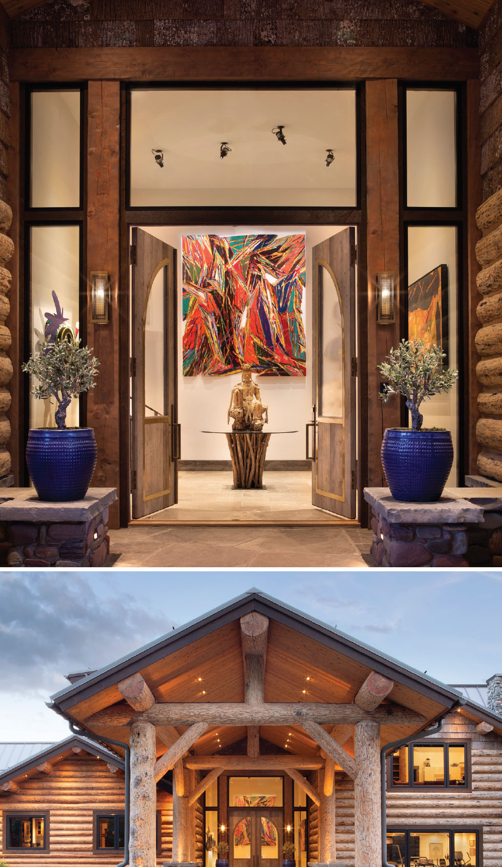
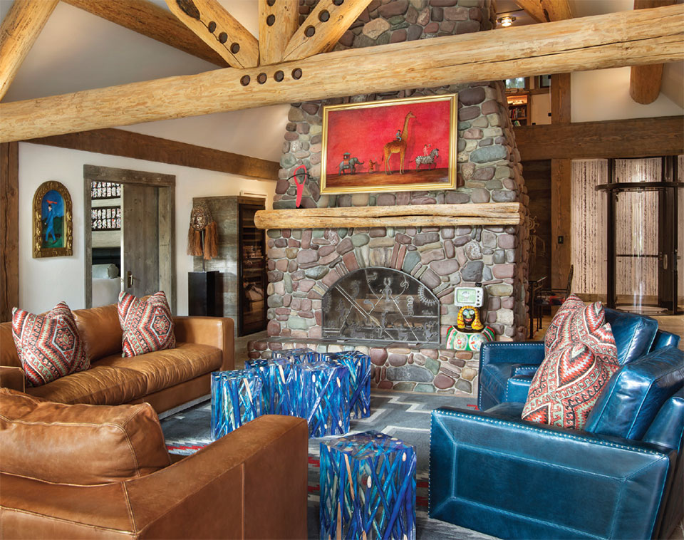
This project involved renovating an original log cabin that had been used as a family vacation home before permanently relocating to MT years ago. “They wanted it to become more contemporary,” explains Martini. “They have an extensive art collection that is vivid and eclectic. We designed the house around their favorite pieces that they have acquired from all over the world. It is a very clean take on rustic and is unique to them.”
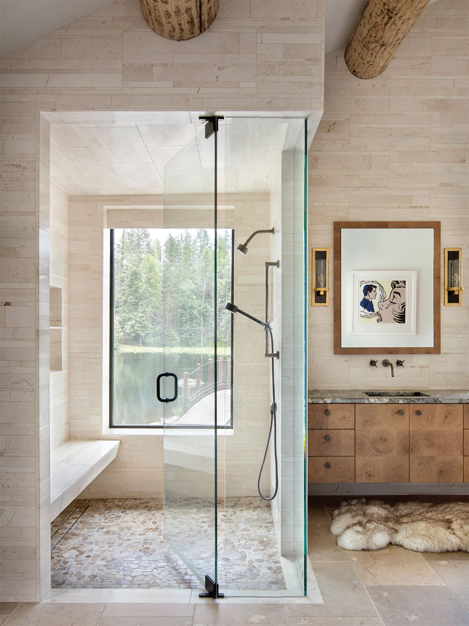
The homeowners have dogs and their interior space needed to be “bombproof.” In their case, that meant no hardwood floors. Instead, Camp Martini selected natural limestone that was both durable and still told a natural story for the space. They created continuity with a floor-to-walls concept by carrying the same stone used for flooring onto the walls of the master bathroom in the form of cut, stacked stone tiles. Camp Martini edited the color palette to keep the contrast minimal and creatively brought in wood in other places to pay homage to the log cabin exterior and traditional feelings of rustic coziness. “We found a cut end beam sample that we used for cabinet inspiration,” says Martini. “Where we didn’t do hardwood on the floor, we incorporated it in alternative areas to create warmth.”
The powder room countertop is one such area that showcases a wood slab Martini found in a local lumber yard. Everything was sourced from local showrooms, which created a unique sense of place juxtaposed against the homeowners’ globally-informed art collection. Martini says, “They collect what they like. We had moments where we were designing spaces to display Steuben glass adjacent to an African beaded piece. They have a very open aesthetic to art that we sought to enhance.”
Interior design is client-specific, and Martini reflects that these homeowners didn’t have one set idea. Instead, Camp Martini’s goal was to carry the current cabin feeling through the house and also elevate it to create a setting that would feel like an art gallery. That took shape in the form of assessing opportunities to hang art and then light it appropriately. Martini explains that even though the home’s envelope is that of a traditional log cabin, there isn’t a lot of dark wood inside because they wanted to feature the artwork.
“I like the ease of the master bathroom. It’s a beautiful space and its subtlety is what’s great about it. You have all these windows outside and can take in textures and the view toward the exterior, and it also is another opportunity to display artwork.”
–Colton Martini, Owner, Camp Martini
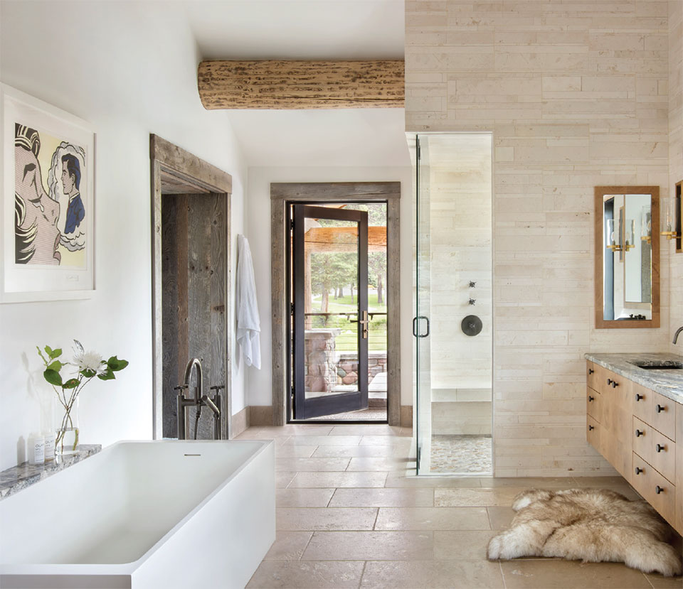
“There’s a Lichtenstein in the master bathroom,” Martini explains. “The house is so private and there is no concern for people walking by, so we were really able to capture this piece of art in the shower by putting in a massive window. The window frames great views of mountains, gigantic boulders, and a pond, and in and of itself is its own piece of artwork. It was another way we harkened back to the gallery-feel – by offering that framed landscape from the shower. We brought the outdoors in. The Lichtenstein also makes for a playful contrast against the natural landscape out the window.”
“I like the ease of the master bathroom,” Martini reflects. “It’s a beautiful space and its subtlety is what’s great about it. You have all these windows outside and can take in textures and the view toward the exterior, and it also is another opportunity to display artwork. That subtlety – especially in a log home – makes it unexpected.”
Camp Martini completed the design pre-pandemic in 2019. The space was somewhat of a harbinger for the past 18 months, where collectively we all have shifted our focus to prioritize self-care and good living. As more people move to Montana and seek open spaces and healthier lifestyles outside of the cities, Camp Martini’s design philosophy inspired by the natural landscape and the spirit for adventure has never been more on point.
Camp Martini offers straight-up design with a Montana twist. As a lifestyle collective, they curate a unique interior design style for each client by bringing together the talents of various local artisans and “makers” and define their clients’ reality of what home truly feels like. They cater to all lifestyles and environments, from ski chalets to boutique hotels and ranches, glamping tents to treehouse architecture. Their mission is to deliver design that is beautiful to the eyes, inspires the soul, and feeds the spirit for years to come.
For more information on designing with Camp Martini, visit coltonmartini.com or call 406.480.2375.
A Year-Round Outdoor Living Room
by Tate Interiors
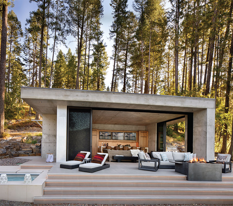
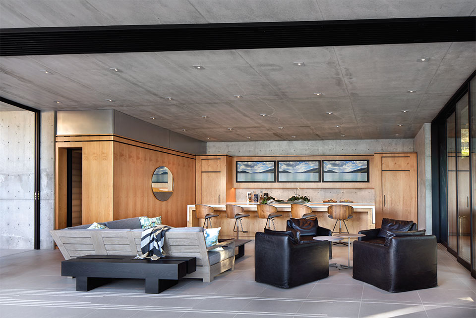
Modern home design frequently utilizes the concept of indoor/outdoor living, and this outdoor living room is no exception. All of the home’s walls are glass and open up for expansive views to the lake.
Montana is synonymous with outdoor living, but how does one create a space at home that is suitable for year-round outdoor living? Heidi Tate of Tate Interiors takes us through a modern outdoor living area that she designed for a house on Whitefish Lake in 2020.
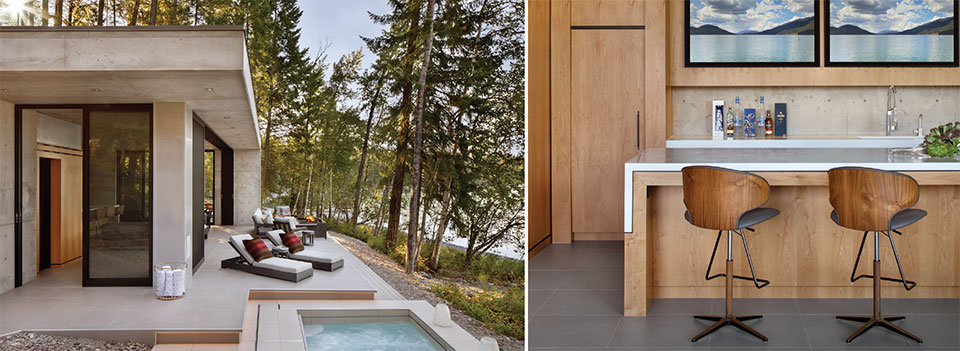
The homeowners had remodeled an original cabin a few years ago and were seeking more room to gather with their family and friends in Montana throughout the year. Tate explains that while the original cabin is quite cozy, this pavilion adds space to comfortably enjoy summers at the lake as well as apres-ski in the winter. The homeowners wanted to create a casual space where family and friends could watch games and sporting events, cook meals together, and enjoy the lake during both summer and winter seasons.
Modern home design frequently utilizes the concept of indoor/outdoor living, and this outdoor living room is no exception. All of the home’s walls are glass and open up for expansive views to the lake. That connection was supported by a neutral color palette and intentional choices of materials to further create continuity and flow across borders. The flooring material is the same inside and out and achieves a seamless look. Neutral tones encourage the eye to continue moving to the trees and lake, which builds more continuity from within the house.
Tate designed the pavilion to be tastefully comfortable. Durable materials that were used include porcelain floors, concrete counters, and stain-resistant fabrics. Many of Tate Interiors’ selections were made locally including the clear alder cabinets, concrete counters, and the custom firepit. Every finish is worry-free from water, spills, pets, and kids.
Although the primary use of the pavilion is during the summer months, Tate’s design direction enables an expansive awareness of a sense of place whether one is inside or outside. The connection to the outdoors is present when one is in the house even in the coldest months. It is a true indoor/outdoor living experience.
“The building is a little jewel that nestles right into the hillside. With all of the large homes going in that demand attention,
I love the subtle quietness it establishes on the lakeshore.”–Heidi Tate, Owner, Tate Interiors
The subtlety of the pavilion complements the sublime nature of lake life. Tate appreciates her partnership with the Vanderlay Group and regards Jason as a wealth of knowledge regarding different building practices. She also acknowledges that the clients were a joy to work with and always trusting in the process. “The building is a little jewel that nestles right into the hillside,” says Tate. “With all of the large homes going in that demand attention, I love the subtle quietness it establishes on the lakeshore.”
Tate Interiors has called Whitefish home since 2004. They are a full-service boutique interior design firm that tackles any project from new construction to quick makeovers. Their design philosophy creates harmony between modern and rustic styles, balancing warmth and coziness with clean lines and functionality. Their flawless design is inspired by the natural world, a place of order as well as great beauty. Tate Interiors sources locally wherever possible and serves clients from Hawaii to Florida.
For more information on how to design your dream outdoor living space, contact Heidi Tate, Tate Interiors at 406.862.5777 or visit tateinteriors.com.
A Private Home Office
by Hunter & Company Interior Design
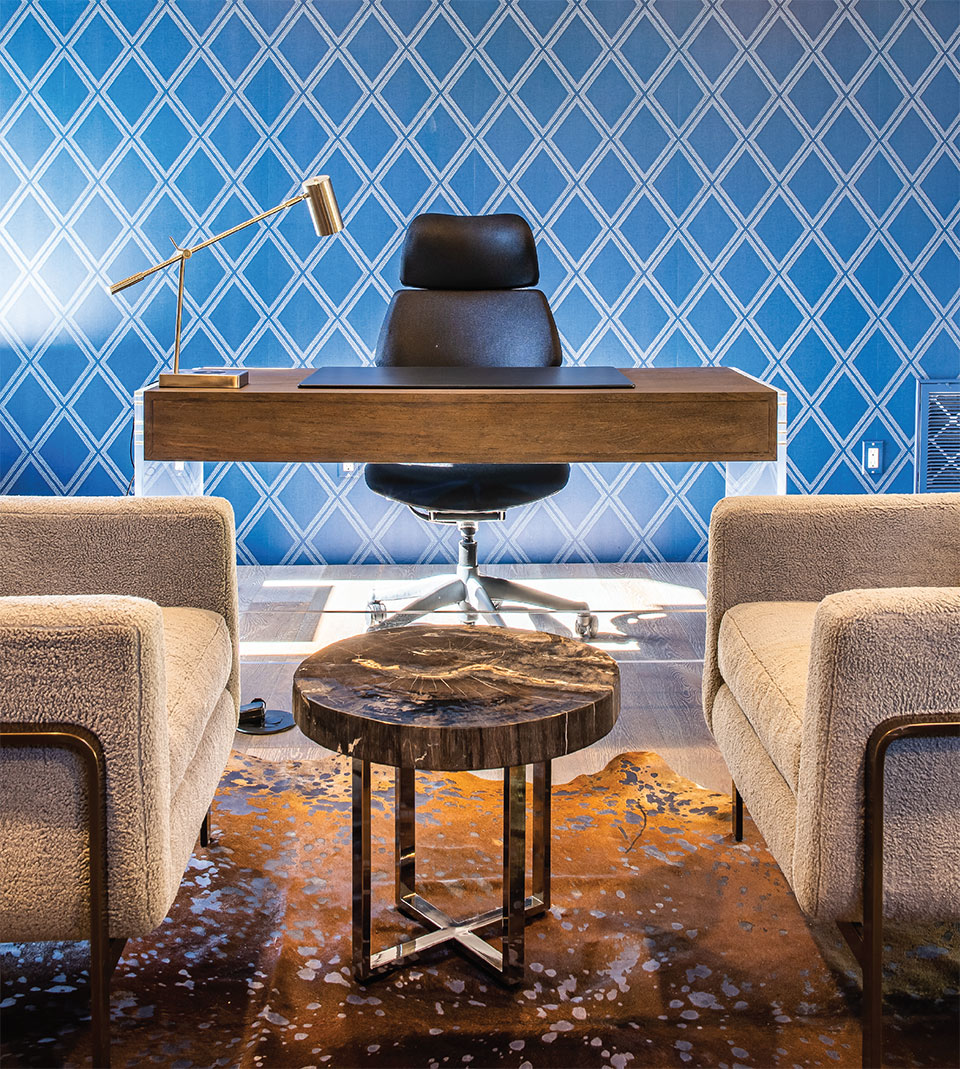
“Our goal was to capture the texture of wood floors. We brought in a cut hide rug that underwent a contemporary process that makes it look like it has been stained or washed. We selected nubby texture fabric on the chairs with metal suspension and houndstooth for the pillows that added texture.”
–Hunter Dominick, Founder, Hunter & Company Interior Design
Mountain modern homes are luxurious and clean, but where does one go when they need to close a door to work? Homeowners can create alcoves in the kitchen or mudroom, but the open flow of a contemporary home can pose a challenge when trying to take a private Zoom call or log into virtual school. Although modern floorplans support the ease of modern living, the pandemic unearthed a new need for a formal home office. Whitefish-based Hunter & Company Interior Design takes us through a contemporary one designed for productivity and warmth.
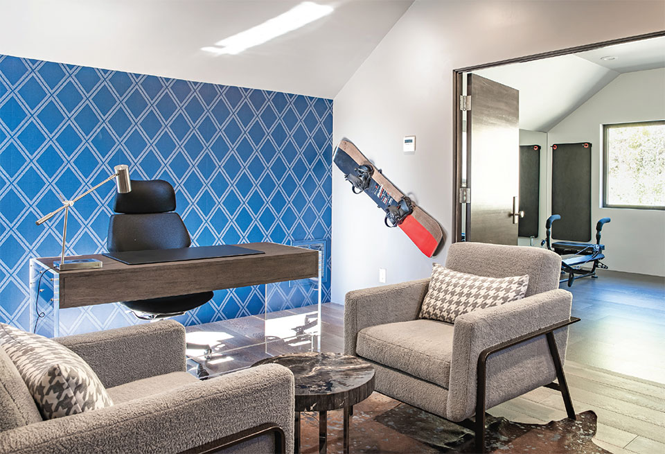
Nestled among the trees with views of Whitefish Lake, the overall vision for the home was inspired by bold patterns and clean lines. The style is contemporary mountain modern, but it departs from the traditional gray color palette with more adventurous colors. Wallpaper creates an individual identity for each room while also creating continuity and flow throughout the entire house. For the home office, the client desired a space away from the rest of the house that was quiet and where he could truly work. He also wanted to be able to have private conversations in a cozy space.
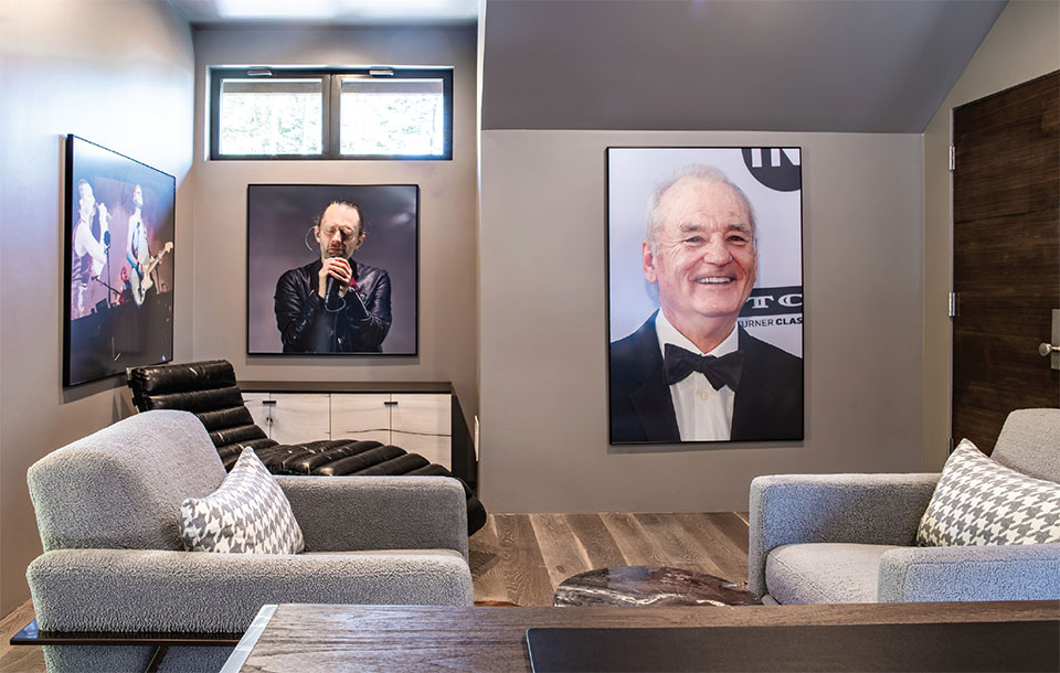
The goal for this particular home office was to design something visually clean but that did not feel too sterile. It needed to have some seating and a free-floating desk facing out. The homeowner also needed a television. Hunter & Co. brought in chairs and a chaise to create a warm space where people could gather and created continuity with a strong element of midnight blue wallpaper.
The home office is on the second level of the house, above the garage. “It’s like a treehouse in the woods,” says Hunter Dominick, founder and lead designer of Hunter & Co. “It has a lot of light and feels like a private getaway.” She continues, “Our goal was to capture the texture of wood floors. We brought in a cut hide rug that underwent a contemporary process that makes it look like it has been stained or washed. We selected nubby texture fabric on the chairs with metal suspension and houndstooth for the pillows that added texture. The wallpaper anchors the space and creates that feeling of coziness.” It is one of Hunter’s favorite parts of the room.
“Now more than ever, we’re renovating homes to have a space where someone can work remotely or help their child with online classes. the modern architecture and design movement over the past five years has focused on open, lifestyle-focused spaces. We’ve taken out walls to create larger environments for gathering, but there is no privacy in that model. We’ve seen that trend flip now, particularly since the pandemic.”
–Hunter Dominick, Founder, Hunter & Company Interior Design
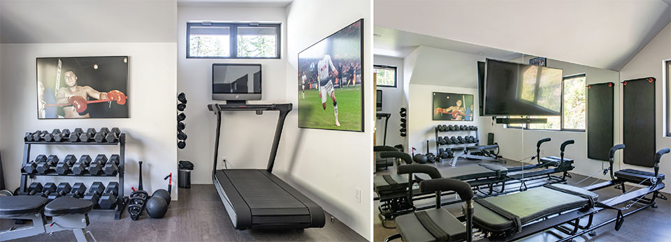
Although the house itself was originally intended as a vacation home, like many, COVID-19 propelled the homeowners into living there more than they’d initially planned. It went from being a space where theoretically work could be done to one where daily business had to happen. Hunter explains that the beauty of the space is that it is a home office, but it is also multifunctional. A lucite charging station sits adjacent to the desk because the client wanted a clean, uncluttered workspace. On the other side of the seating area are French doors that open up to a home gym.
“A home office that opens up to the home gym is a unique adjacency,” Hunter says. “It works well in this house, but it’s not a connection we frequently think of when we think of a home office.” Here, when the French doors are opened up, it expands the office and increases the functionality of the space.
The utilitarian nature of a home office cannot be overstated in today’s world. “Now more than ever, we’re renovating homes to have a space where someone can work remotely or help their child with online classes,” Hunter shares. “The modern architecture and design movement over the past five years has focused on open, lifestyle-focused spaces. We’ve taken out walls to create larger environments for gathering, but there is no privacy in that model. We’ve seen that trend flip now, particularly since the pandemic. Where we evolved from traditional homes to more open, mountain modern style homes, we’re now melding them back together. Kitchens have the option to open up, but they don’t instantly place you in the living room. Every family is different and every person has different preferences, but COVID-19 seems to have triggered a new trend where we’re seeing more defined rooms with doors you can close.”
Ultimately, the home office has to be a place of form and function. It has to flow with the rest of the home and also provide an environment where one can be inspired to excel professionally. In this home office, Hunter & Co. integrated color throughout for a refreshing take on mountain modern. The view focuses on the lake, and the lasting impression is sleek, clean, and organic.
Hunter & Co. has been providing full-service interior design to the Flathead Valley for over 20 years. Hunter finds inspiration from the environment around her. From Whitefish to Glacier National Park, to her love of eclectic and antique pieces, her style is a mixture of combining the old with the new. Hunter & Co.’s work fills the gap between interiors and architecture, creative and technical. The team gets to know their clients and their stories and brings it all to life through their interior architecture and design selections, texture, and color.
For more information, visit hunterinterior.com or call 406.862.1402.
