From Dated to Dreamy
Hunter & Co. Transforms A Whitefish Lake Cabin
by Jennifer Walton
Lakeside Living Redefined
A beautifully-sited cabin in the exclusive enclave of the Iron Horse Golf Community with an enviable view of Whitefish Lake held firmly onto its roots in the form of logs, dark paneling, ornate lighting, and an abundance of rugged materials and finishes. Although the style was popular in the past and defined as ‘rustic and cozy,’ Montana’s design firm, Hunter & Company Interior Design, quickly envisioned a bright and refined atmosphere for its new homeowner.
With a practiced eye and a charismatic approach to remodeling, interior designer Kay Sherman brought enthusiasm to the project. “We were on the same page from the start,” says Sherman. “Our clients are very sophisticated, knew what they liked, and loved being involved.”

BEFORE
‘Rustic and Cozy’ styling, featured logs, dark paneling, ornate lighting, and an abundance of rugged materials and finishes.
Despite its former furnishings, the 4,360-square-foot cabin with five bedrooms and six baths was in good condition. The primary design objective was to brighten, lighten, and infuse it with a contemporary feeling focused on family-friendly fresh-air living while retaining a slight nod to its history of raw wood and stone. Aiming for a refreshing and soothing look and balancing function and aesthetics, Sherman emphasized repurposing as much as possible and prioritizing which areas needed the most attention.

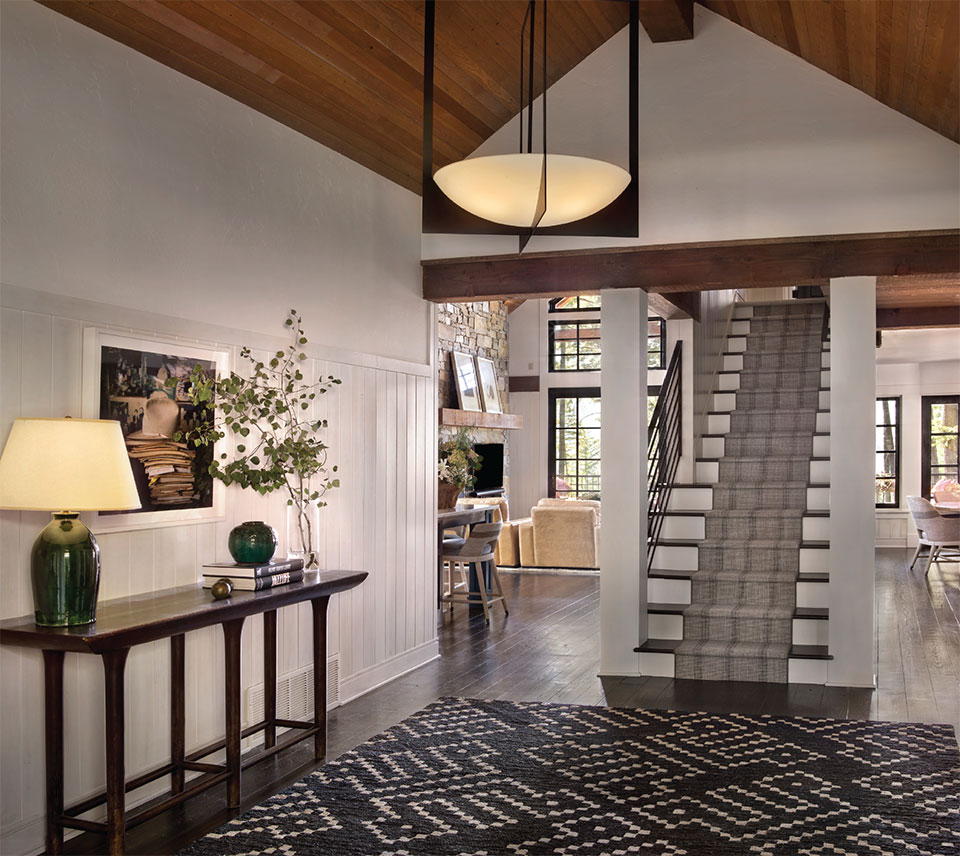
Sherman’s recommendation for tackling any project remains the same for those who face what can seem like an unsurmountable remodeling task: “Put the dollars in the places where you are the most likely to spend the most time.” The client surmised this would be the kitchen and bathroom, but first on her wish list was to stain the floors and open the cabin’s foyer. Sherman says, “In the entryway, it felt cavernous, so we removed the low ceiling, which made an enormous difference. Next, we removed the stairway’s log posts, painted the wood wainscoting a custom whitewash, painted the stairway white, the new metal banister black, and installed a svelte chandelier.” In addition to defining the color palette, the client found a navy graphic rug to complement the staircase’s classic Stanton Fine Weave runner; the result is a reception area that maximized its volume and set the tone for the rest of the home.

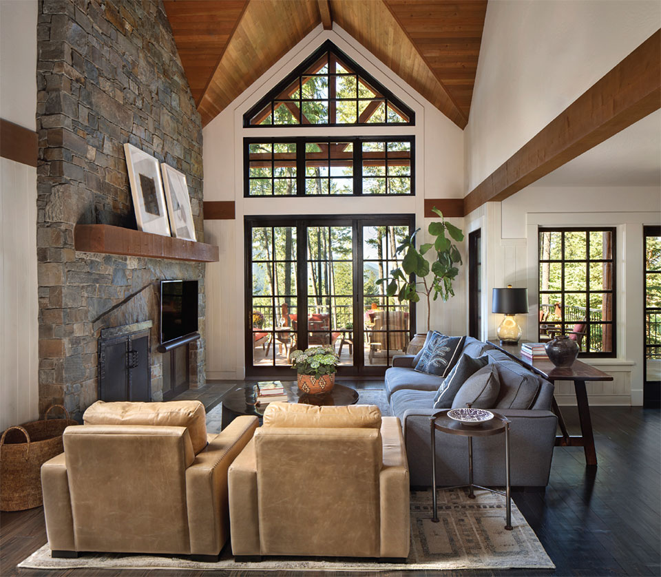
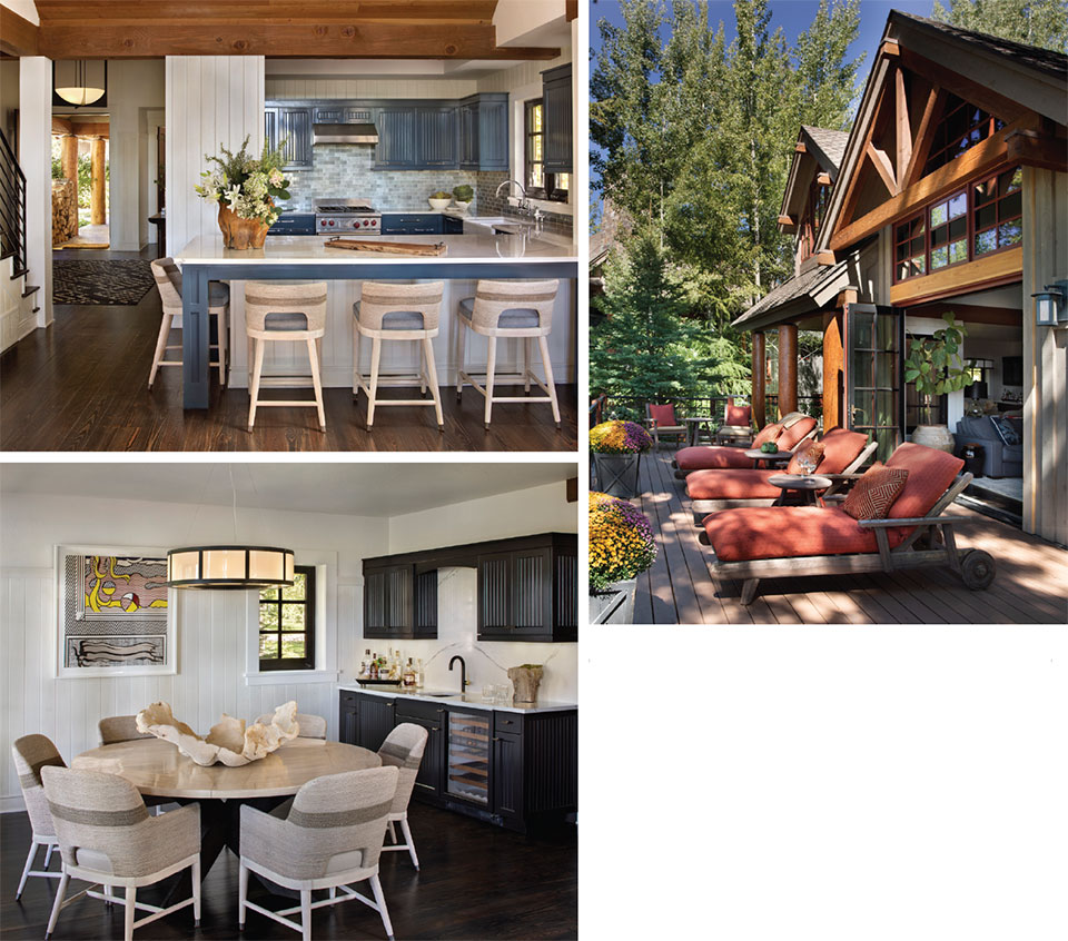
Next up, to alter the condensed and heavy feeling in the living room, the client requested an indoor-outdoor experience. This was delivered by replacing the windows with a sizeable bi-fold door, instantly opening the living space to Montana’s great outdoors. After the outdoor deck was extended by eight feet in diameter, allowing room for loungers and a seating area near the fireplace, the combined space hummed with harmonious lines and Hunter & Company’s impactful custom furniture, which featured a gray sofa with black leather piping and a set of deep-seated, whipstitched tan leather chairs. Replacing the fireplace mantel with a single beam sealed the deal. Then, with the decision to change the paint on the entire home’s window frames from scrubby brown to matte black, rather than replacing the wood frames with black metal—an expensive adventure—the look immediately eliminated the overly rustic, woodsy feel for one that oozes a blend of subtlety and simplicity.

In the adjacent dining room that previously housed a weighty dining table and carved chairs, a Formations round dining table and a set of Fritz Rope armchairs in fog white from the Kirk Nix Collection at Palacek reduce the visual weight of the previous furnishings. The spacious spirit is welcomed with slimmer profiles, more natural light, and the client’s Lichtenstein that commands and enhances the open space. The bar is luminous and inviting, with its lacquered cabinets, black and gold faucet, and quartzite backsplash.

“Repurpose whatever you can; however, you need to make it intentional because it can easily look like a mistake.”
–Kay Sherman, Interior Designer, Hunter & Co.
When remodeling, the impulse to replace kitchen cabinets can be strong, but because the cabinets were fine, lacquering them in a distinct blue upgraded the kitchen, especially with the glass tiles from MIR Mosaic in Graphite Linen that uniquely resemble textured fabric. The room conveys an uplifting yet peaceful feeling, with white countertops and Fritz Rope counter stools contributing to the main floor’s impression. Repurposing the cabinets and using the existing Waterworks fixtures throughout the home positively affected the budget. Sherman reiterates, “Repurpose whatever you can; however, you need to make it intentional because it can easily look like a mistake. It has to make sense. For instance, changing out the knobs. Some might think that a knob is not a big deal, but just changing out knobs is often so effective that it surprises a client because they believe you’ve done more.”

Sherman also faced a primary bathroom with a funky color palette, a bulky built-in tub, and near-extinct natural light. Its metamorphosis meant that it soon became one of the client’s favorite rooms, with another bathroom tying for that top prize. The room is airy, fresh, and pretty with its bold Ann Sacks Liaison by Kelly Wearstler Mulholland black and white graphic marble tile floor, Made Goods marble-framed mirrors, Kohler Memoirs free-standing tub, and new countertops. The atmosphere inspires well-being and a sense that rising and shining is something to look forward to.
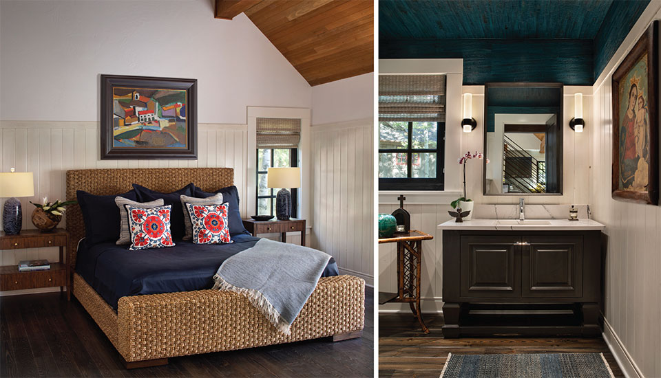
The main bedroom also suffered from a subdued and muddy palette. By continuing the contemporary style in the living areas, the room was painted white, the paneling was painted with the same custom whitewash color throughout the home, and the windows received natural woven roller blinds, while the art identified the room’s color pops and textures. “The trends are heading towards using more color. We like to incorporate color and texture, which can be more inviting, with clean lines and warmer hues,” says Sherman.
In the powder room, Sherman knew the client wanted to highlight a painting’s religious undertones, including a rich teal. Again, she treated the cabinet by lacquering; however, the client wished for extra impact, so she took the ceiling to new heights with York Wallcovering Grass Cloth in Lotus, which feels profoundly reverential and introspective. Artifacts from the client’s collection are displayed on an antique bamboo side table, and the lighting glows against the lustrous white paneling, making a dramatic and personal overall statement.

Some see remodeling as an experience to “brace yourself for anything—timelines, overages, supply chain snafus,” and that may be the case for many, but Hunter & Company remodeled this home in eight months, not two-plus years.
When remodeling knocks at your door, remember: plan ahead, prioritize, budget wisely, hire professionals, consider functionality, choose durable materials, stay flexible, communicate effectively, and be patient. When you emphasize sustainability and repurposing, remember to salvage materials, choose sustainable materials, use energy-efficient appliances, improve insulation, install efficient lighting, choose low-VOC paint, install solar panels when permitted, and donate or recycle old materials.
Remodeling a home for the first (or second, or third) time can sometimes be an overwhelming experience, but it doesn’t have to be. So, bring your ideas and images to Hunter & Company Interior Design, and be prepared for an exhilarating transition into whatever space it might become.

“The trends are heading towards using more color. We like to incorporate color and texture, which can be more inviting, with clean lines and warmer hues.”
–Kay Sherman, Interior Designer, Hunter & Co.
