Design with an Artist’s Eye
by Michele Corriel
“Really listening to a client’s needs and understanding what’s important to the client is always our end goal.”
-Sharon Lohss, Owner & Principal Designer, Shelter Interiors

The elements of interior design incorporate space, scale, lines, color, and composition. For Sharon Lohss, owner and principal designer at Shelter Interiors, this concept of design is the base for her to build upon. The next layer, informed by an individual client’s taste and preferences, is the first step of the creative journey.
“Really listening to a client’s needs and understanding what’s important to the client is always our end goal. Ninety-nine percent of the time, second-home owners want it to be different from their primary home. I try to be a good listener, focusing in on exactly what the client wants,” Lohss says.
“Our portfolio shows the range between transitional and traditional…for example, our team loves to use rustic materials blended with contemporary interior finishes,” she adds. Shelter Interiors’ client base consists of high-end residential second homes, requiring a slightly different perspective on the design concept from the start of a project.
As part of her design practice, Lohss finds it interesting to work with inspirational pieces, using them as a springboard to build from, and then she creates her vision through the use of a neutral palette, which allows her to place those artistic pops, like art, rugs, and certain fabrics throughout the house.
No matter what the scope of the design project, every job starts with the client. It’s vital for a creative partnership to be a good fit, and for both sides to feel comfortable about that. How that relationship develops – whether through intense input or those who may need more guidance, Lohss and her team remain flexible, always open to new ideas and able to offer fresh perspectives.
“We start with the attached finishes, like flooring, trim, cabinets, tile, lighting, and plumbing,” she says. “We love the projects when we come in early enough to be able to work with the architectural finishes that are so important to the overall design.”
Oftentimes, the architect and interior designer roles can overlap within the design process. “We really do love that opportunity,” she says. These days, even the minute details have gotten very technical, so there are all kinds of decisions to make, like putting outlets above the nightstands, instead of behind them or even designing nightstands with grommets that are integrated with charging stations.”
Lohss enjoys working with architects, since the structure is their creative vision. “An example of that is when we’re working on a new construction with a large kitchen. What is left up to us are the fundamental aspects of the workability of a kitchen like figuring out where the silverware goes and where the pots and pans are stored.”
Before Photos of the Shelter Interior Remodel

Lohss’ process includes sending lots of images back and forth. She appreciates the opportunity to visit her clients’ primary residences but, for the most part, consultations are virtual. Clients do send visuals of items they want to build upon. “We love to see people’s primary homes, but understand that can’t always happen,” she adds.
For her most recent remodeling project, Lohss and her team needed to bring a large mountain home into the 21st century. When the home was first built, furnishings tended toward heavy dark woods and deep earth tones—in other words, the 1990s/2000s. Everything in the home was dark, dark, dark. When Lohss lightened the floors and the walls, the rooms just opened up. That kind of transformation is exactly what the homeowners were looking for when they turned to Shelter Interiors.
A design term that is often used to describe the move from heavy furniture and dark colors to a lighter, more integrated look is “Mountain Modern.” This design concept addresses an updated lifestyle and integrates a love for the outdoors by letting the light into the living areas, while addressing the feeling of home and comfort.
“I like to use materials local to our area,” Lohss says. “The wire-brushed woods and stone mixed with glass results in a rustic/modern mix. This kind of aesthetic gives us a lot of leeway. That’s what is so great about the movement to a lighter palette through the use of light browns and grays; this particular remodel reflects a more contemporary character.”
White and gray are actually considered colors, but within that range there is a myriad of variations that can change the impression of a room. “I love the warm tones happening with some of these starker white tones,” Lohss says. “Lots of walls go to white, because it looks bigger, along with the warm blond reclaimed lumber, it makes for an inviting feel.”
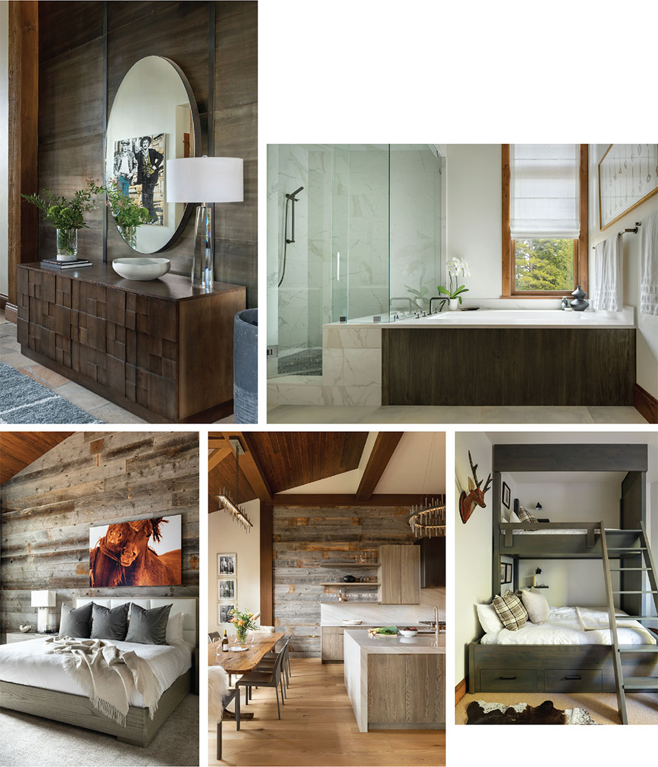
“These clients were amazing,” she says. “Some projects happen in phases – and with COVID – everything from craftsmen to materials can take a lot longer than you expect.” The first phase consisted of refinishing the floors, repainting, and updating the furnishings. “After the owners lived in it for a while, they realized they wanted to remodel the kitchen and the master bathroom for the next phase. There is a plus in living in a place to find out what is needed or wanted,” Lohss adds.
“After the owners lived in it for a while, they realized they wanted to remodel the kitchen and the master bathroom for the next phase.”
-Sharon Lohss, Owner & Principal Designer, Shelter Interiors

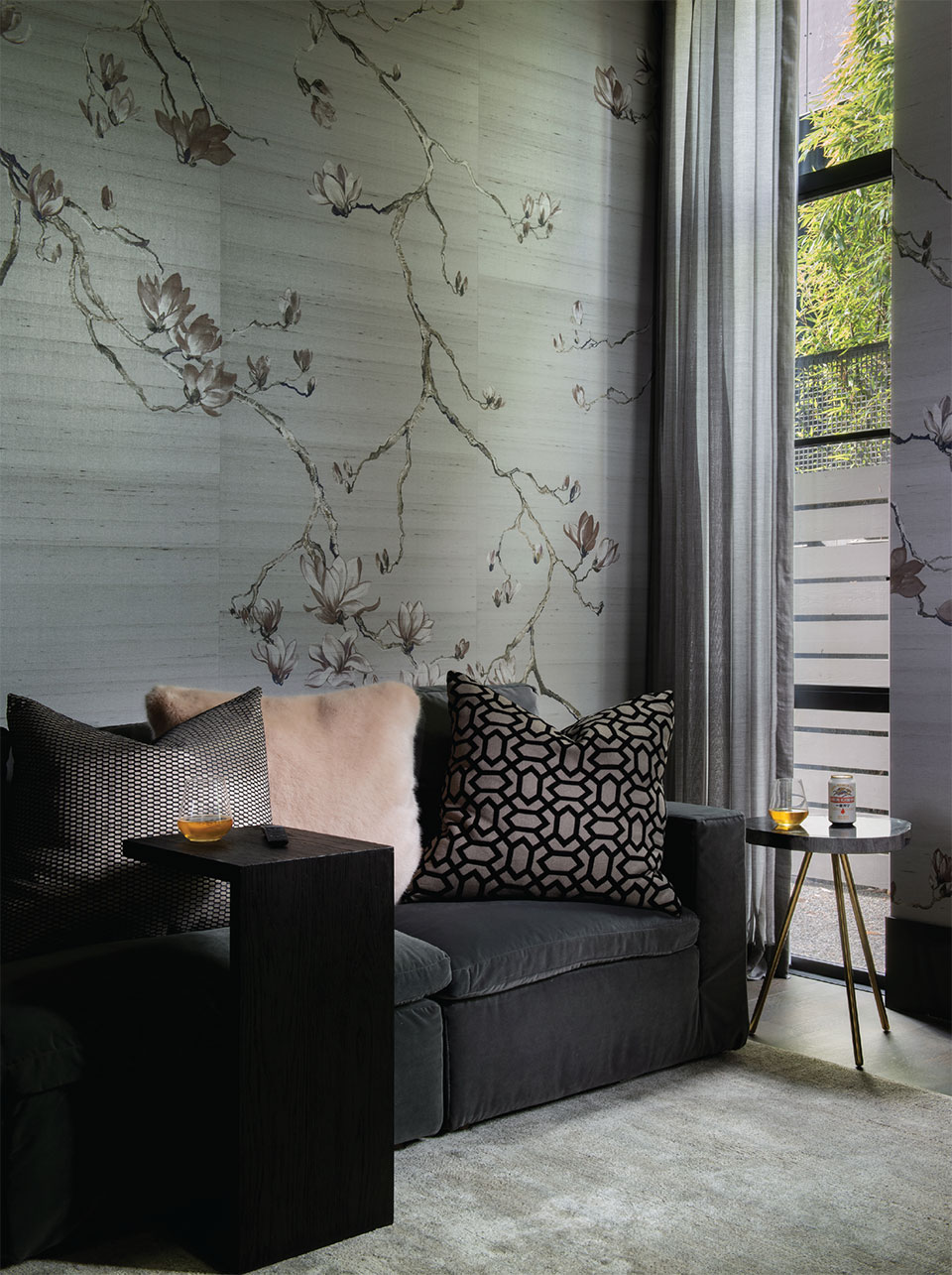
Another tool in her kit is wallpaper, which has come a long way in the last decade. “Wallpaper can be very artistic and it’s a great way to handle a wall that might be difficult to find a piece of art that works in that place,” Lohss says. “Wallpaper has been a fun way to cross over.” The bedroom wallpaper in this remodel incorporates magenta hive-shaped rivets in a modern shape, and, to Lohss’ eye, was just what that room needed.
When her clients first bought their home, they knew they wanted to create a living environment that was lighter and more current. The second phase was more specific to their personal lifestyle, needs, and taste.
Which led Lohss to the cool part – the art.
“These clients were really fun,” she says. “I love art, too. Some of the art selections came from our team, and some came from the clients. When we walked into Visions West Contemporary Gallery and saw the David Yarrow photograph, there was an immediate draw to it.”
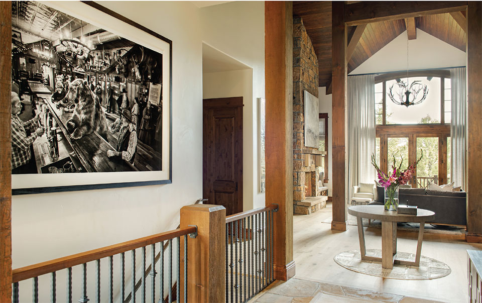
Yarrow, an internationally renowned photographer, uses his lens to create cinematic tableaus. He uses unlikely combinations of subjects in large-format black and white. His work is narrative, unexpected, bending the idea of stereotypes into fresh perspectives. This one features a large grizzly bear, his giant paws on the bar in an old-fashioned saloon complete with characters straight out of the Old West paying him no mind.
“Some of the art selections came from our team, and some came from the clients. When we walked into Visions West Contemporary Gallery and saw the David Yarrow photograph, there was an immediate draw to it.”
-Sharon Lohss, Owner & Principal Designer, Shelter Interiors
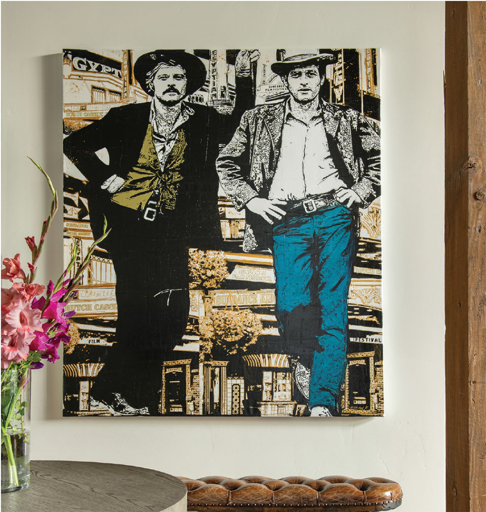
“One of the clients loved it and showed it to the other,” Lohss says. “The bear in the bar piece was perfect for the focal point when entering the home.” The Holly Manneck piece hung nearby is a mixed media painting combining pop culture and fine art. “It was great to incorporate the black and white photograph with the colorful nod to the West; it was a really fun mix.”
Lohss also believes that art can be situational. Placing art in a primary residence versus a secondary home, which is used a little less, comes down to a family’s priorities.
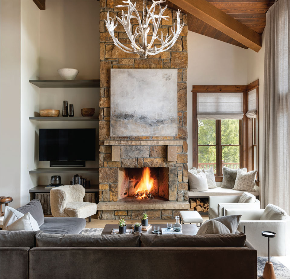
“On this project the homeowner was not a fan of the stone on the fireplaces, so we’ve been kicking around the idea of a phase three, which would encompass changing the color or covering the stone,” Lohss says. “The large abstract painting by Sabine Maes is very much scaled in size and color to cover as much of that stone as possible. Plus, I love that piece.”
For Lohss and her team at Shelter Interiors, the work is all about helping people. “I really feel that’s part of interior design. Many people need help or get overwhelmed with all the decisions. And that’s what I like about what I do – really helping people to see their own vision.”
At Shelter Interiors, the artistic vision comes through in the lines of a space, in the combinations of color, tone, and consideration of scale. With the eye of a designer, it all comes together via the clients’ vision and Lohss’ ability to turn the idea of a house into a home.
