In this summer’s art feature, four artists speak to place in a way that broadens our idea of the West. Their works invite viewers to see beyond the surface and delve into the emotions and stories embedded within. Four diverse mediums offer rich explorations and new insights into complex visions of the West.
Truck Hood | 60” x 60” | Metal | Brenda StredwickOne Strike | 48” x 60” | Mixed Media on Birch Panel | Dennis BredowPurple Mountain Majesty | 36” x 36” | Encaustic | Shima Shanti
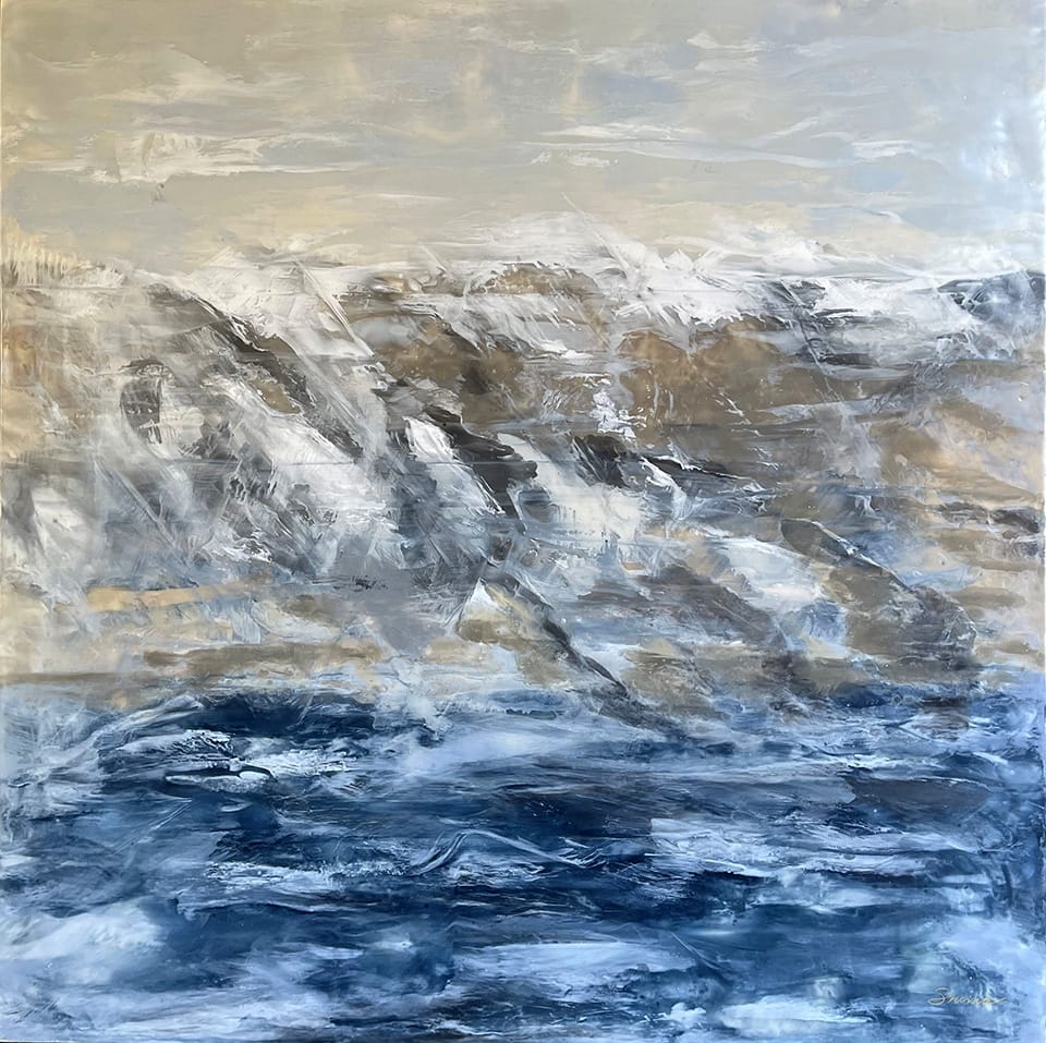
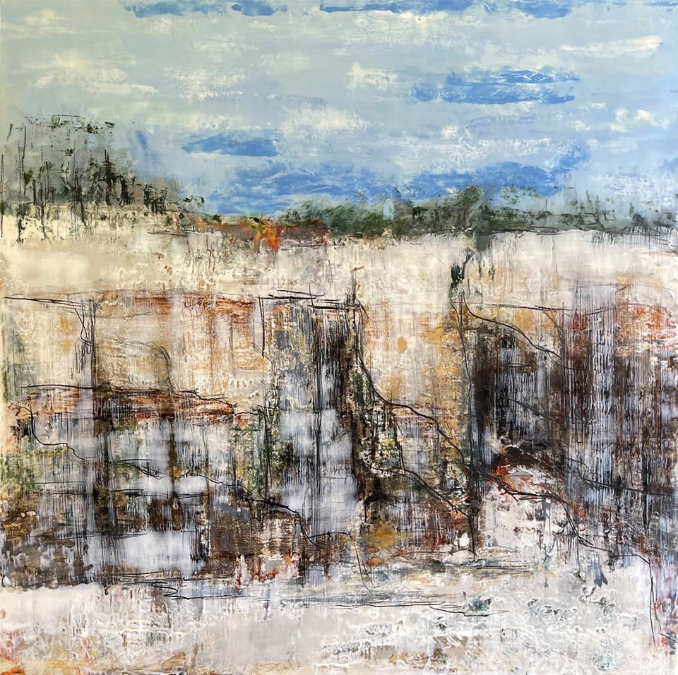
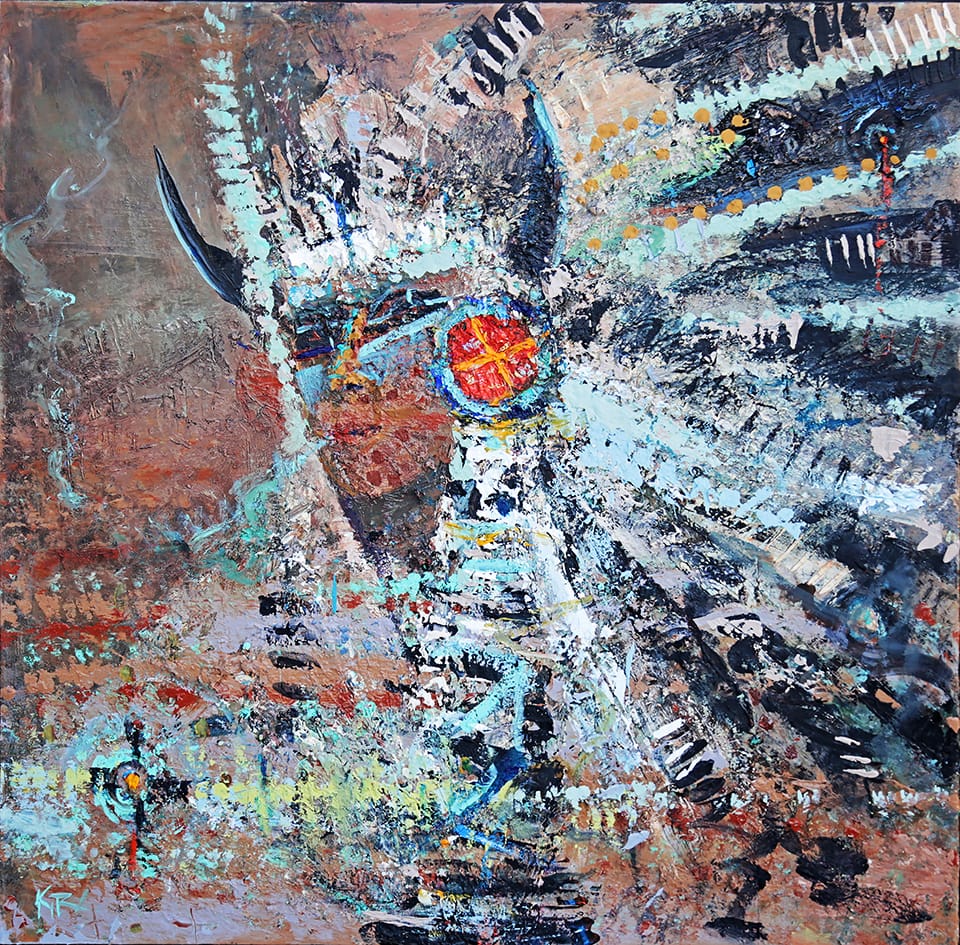
This season, Kira Fercho focuses on Glacier National Park and her connection with the topography that embodies an ancient spirituality going back to the Native people who have lived there for centuries and continue to have a presence. Working in an encaustic medium, Shima Shanti conveys the peaceful tableau of tides and skies. The Courtney Collins Fine Art Gallery showcases painter Dennis Bredow whose work overlays history with nostalgia, touching on our collective consciousness of the West. Brenda Stredwick repurposes discarded materials like old cars and milk cans, truck hoods and oil barrels, to create a new way to think of our own histories.
Together, these artists offer visions of place that are both familiar and fresh. Their unique perspectives and mediums open doors to conversations about nature and the transformative power of art.
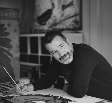
Dennis Bredow | Courtney Collins Fine Art
Dennis Bredow filters his fine art through the lens of commercial art, drawing inspiration from Madison Avenue mid-century advertising. His work embarks across the rich visual landscape of the West, blending iconic imagery with the white-spark gleaming wink of a hero.
“I have always loved art and assumed I would need a realistic career,” Bredow says. “At the time I still thought of fine art and commercial art as two separate things and so I studied graphic design and animation.”
The idea of coupling finely drawn artwork alongside bold sales slogans that fairly jumped from the page both unsettled and enamored him.
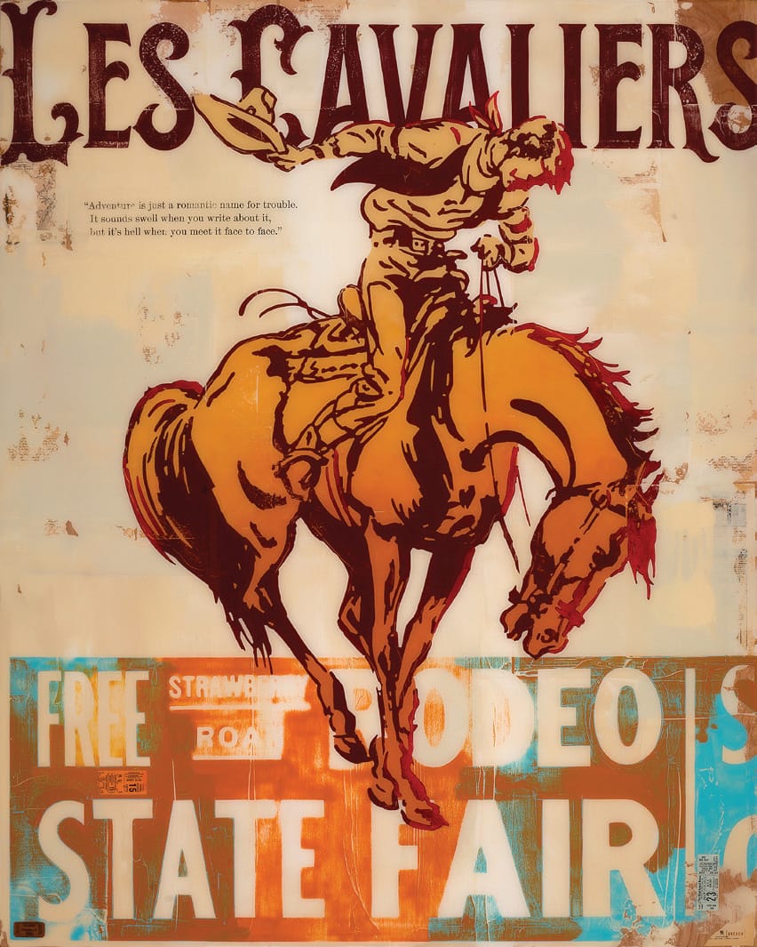
Les Cavaliers | 48” x 60”
“About 20 years ago I started painting for myself, and I found my love of advertising and illustration was rooted in this mid-century era,” he says. “I love Rockwell and Leyendecker – all those beautiful illustrations that were done for cigarettes and Coca-Cola. I fell in love with that.”
It’s not hard to draw the line from advertising to fine art in Bredow’s work. He seems to create a history in his art, by following the idea of a piece, whether he’s adding actual pages as an underpainting, or “painting”
folds and creases into the finished piece. His search for the real within the confines of the surreal challenges the viewer to come to terms with the idea of nostalgia.
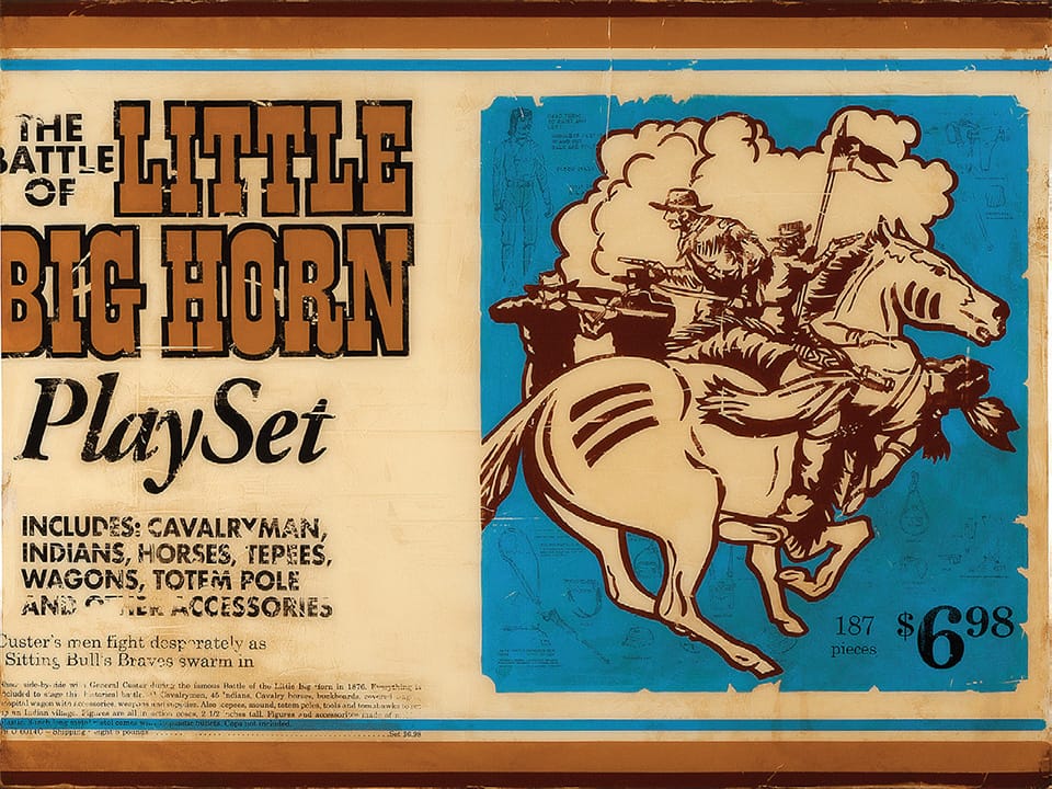
Little Big Horn | 48” x 36”
“I never thought about the marketability of it; I just painted what I liked,” he says. “But what I found is that era has a broad appeal. It combines fine art and commercial art in a way – some people want an abstract painting, on the wall – but these land in an area where people can picture it in their home or it calls back to some memory of growing up, or their childhood.”
However, when looking at a Bredow piece, don’t stop looking after the initial impression. There is so much more to the work. There might be old pages from newspapers underneath the first coat of paint, peeking through the colors. There might be a quote, or a title, an ad for Western Saddle, or old Daisy BB gun targets, hinting at the underlying impetus for the painting. There’s always a little bit more to discover.
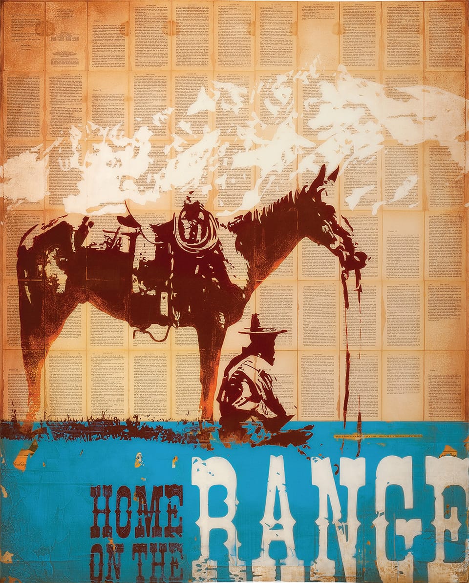
Home on the Range | 60” x 48” | Mixed Media on Birch Panel | Dennis Bredow
Despite his traditional background in graphic design, or perhaps because of it, Bredow’s artistic inspiration took a transformative turn upon visiting the Los Angeles County Museum of Art (LACMA). He found himself profoundly moved by the work he encountered.
The combination of photography and text by John Baldessari, the compelling wittiness of Barbara Kruger, and Shepard Fairey’s textile works left their mark on him.
“After I saw a show of Shepard Fairey’s textile work in person, his handmade paper with printed graphics on top, I found so much inspiration,” Bredow says. “I started playing with collage and painting with a trowel. I fell in love with it; it forced me to loosen up and embrace imperfection.”
“about 20 years ago I started painting for myself, and I found my love of advertising and illustration was rooted in this mid-century era.”
–Dennis Bredow, Artist
Looking at his practice through the idea of showing the vulnerability of his work opened him up to texture and depth and gave him a place where his art seemed to find a home. “When I started sanding it, I had this thought that this work could have been done in the ‘50s,” Bredow says. “I would sand it, touch it up again, aging it and giving it a past, a modern retelling.”
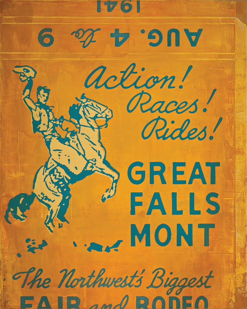
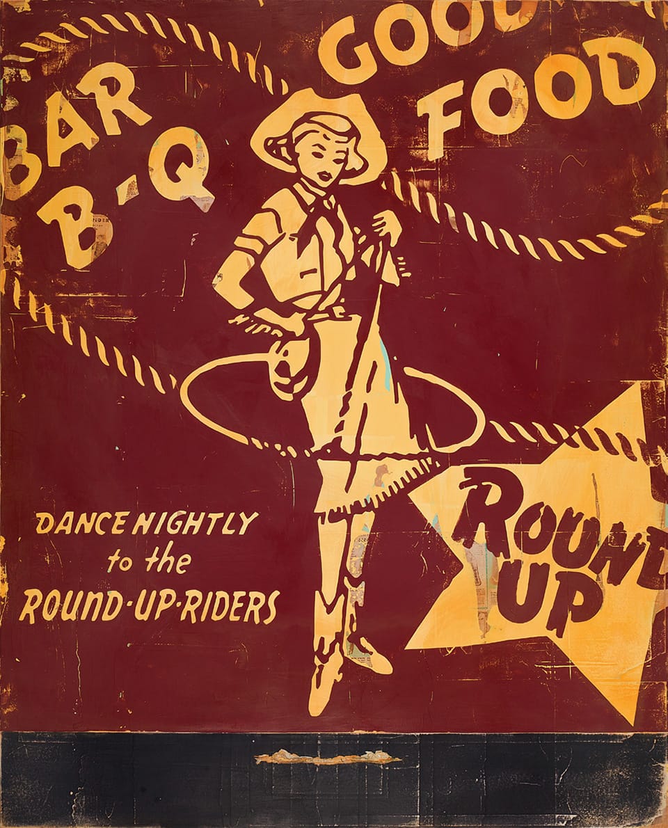
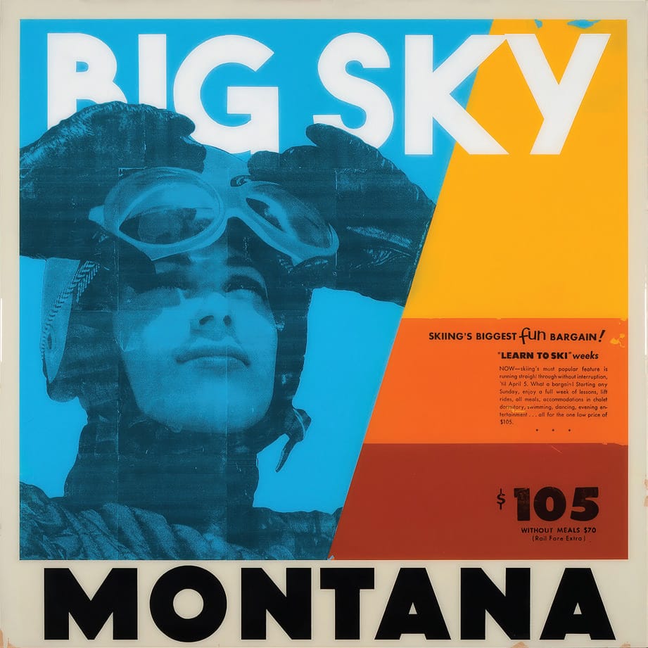
The show this summer at Courtney Collins Fine Art in Big Sky is titled Striking West. The gallery opening will be July 2. The show, based on vintage Western matchbooks (only much larger, 60” by 48”) speaks to a point in time when bars and restaurants all had bowls of matchbooks available to their customers.
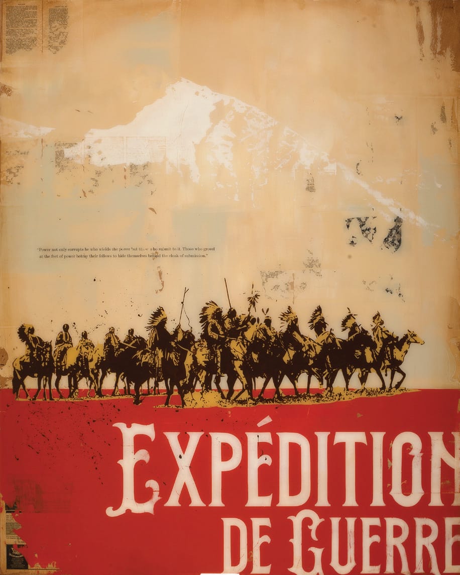
Round Up | 48” x 48”Expedition de Guerre | 48” x 60”
“I’m trying to use a lot of the elements, creases, folds, staple holes; I love vintage packaging and the idea of playing with scale,” he says. “Graphically, they are so appealing, they had to read quickly.”
Many of the paintings are Montana based, like One Strike, One Ride, inspired by a matchbook from the 1941 Great Falls Rodeo. The magic of Bedow’s works are the treasures beneath the paint. In this one there are advertisements from an old newspaper. The result is like stepping into a time warp. Of course, the painting is exponentially larger than an actual matchbook, but the color and the authenticity of imagery is transportive.
They all have what Bredow calls “that matchbook charm,” which might be translated into vinyl barstools and gouged wood tables, with a waitress serving bourbon and branch water, to keep company with the ashtray and matchbook sitting on the table.
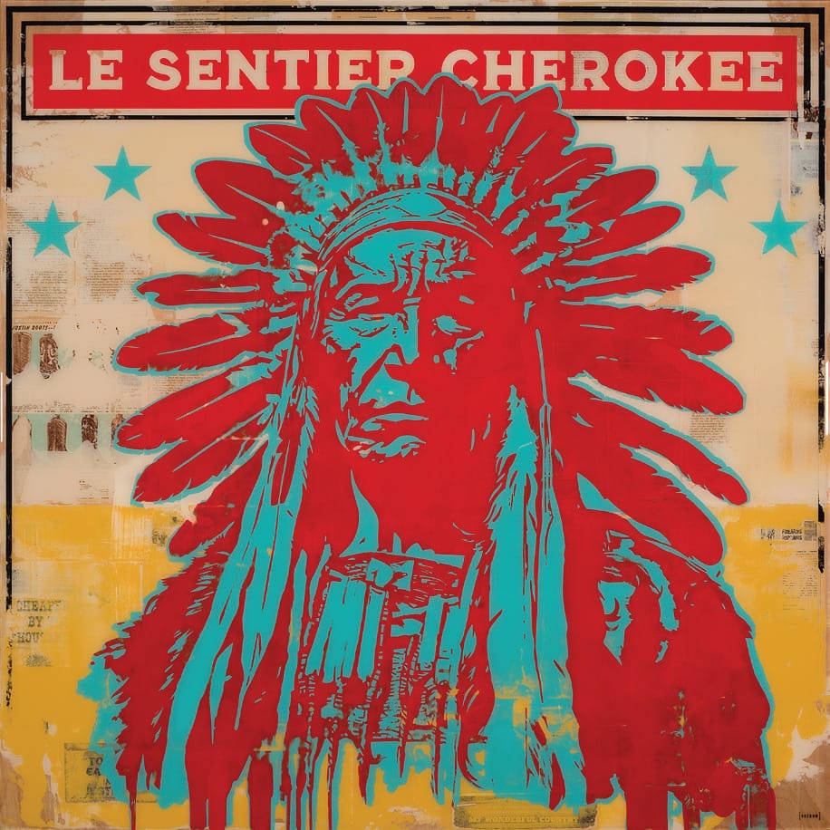
Le Sentier Cherokee | 48” x 48”
“I’m trying to use a lot of the elements, creases, folds, staple holes; I love vintage packaging and the idea of playing with scale.”
–Dennis Bredow, Artist
“My grandparents smoked, every restaurant had them, but there is something very nostalgic about it, to me, it’s the nexus of advertising and art,” Bredow says.
Courtney Collins, owner of Courtney Collins Fine Art, is impressed by how Bredow does his research for all his pieces. “He does have such an awareness of his own art in terms of the history of art,” she says. “He’s so thoughtful, he has so much content and information. He really does his homework.”
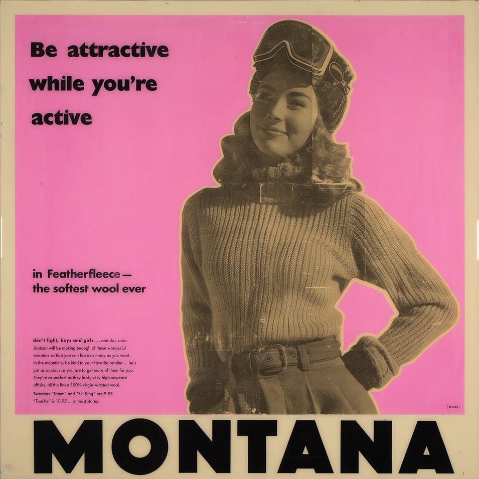
Ski in Featherfleece | 48” x 48”Learn to Ski | 48” x 48”
One of the things Collins loves about Bredlow is how his work sells itself. “I have a collector who collected 15 of his pieces,” she says. “That really speaks to the kind of appeal he evokes from viewers of his art. This collector bought five pieces and commissioned six more and then bought several more after that. People come into the gallery and it’s like something they’ve never seen before.”
She appreciates the complexity of his work, the layers, and the connotations that his work brings to mind. “His background in advertising and film are so important in his art,” Collins says. “It informs his work in an authentic way, and it gives his work substance. Last year he did a series based on Louis L’Amour books … he managed to capture the romance and grit of the American West.”
Five years ago, Bredow finally made it to Montana, a place he’d always wanted to visit. Walking around in Big Sky, he happened into Collins’ gallery.
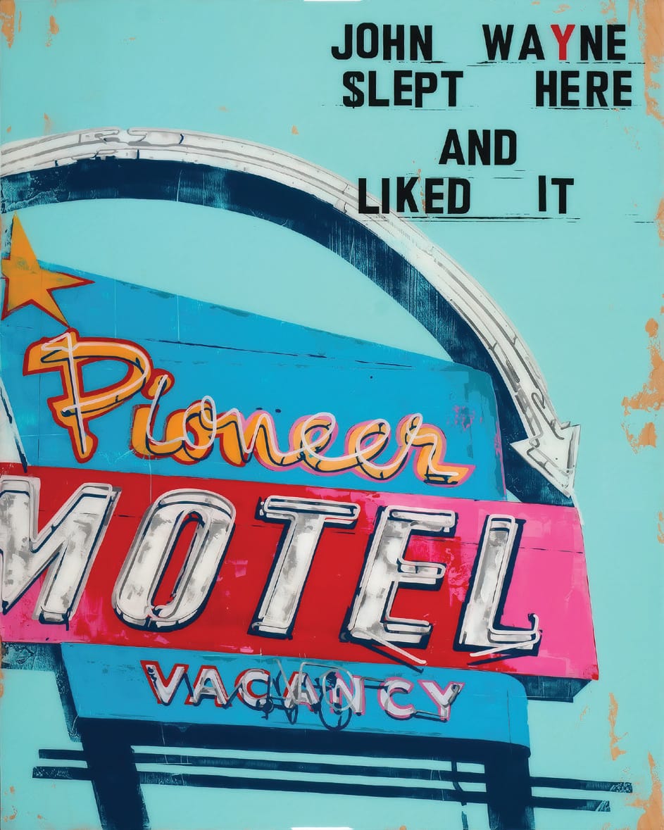
John Wayne Slept Here Pioneer | 48” x 60”
“I have a collector who collected 15 of his pieces. That really speaks to the kind of appeal he evokes from viewers of his art…people come into the gallery and it’s like something they’ve never seen before.”
–Courtney Collins, Owner, Courtney Collins Fine Art
“I spent an hour in there,” he recalls. “Then I started following her gallery on the socials. I told my wife if I ever get into a gallery in Montana, that’s the gallery I want to be in.”
Then opportunity knocked. Now Courtney Collins Fine Art represents all of Bredow’s work and is his only gallery on his website.
“I couldn’t ask for anything more,” Bredow says. “Courtney is passionate about art and has been a tremendous partner. It is truly a dream come true for me.”
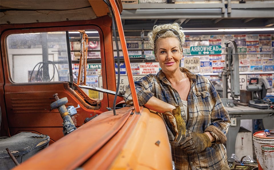
Brenda Stredwick | Following The Colors In Her Heart
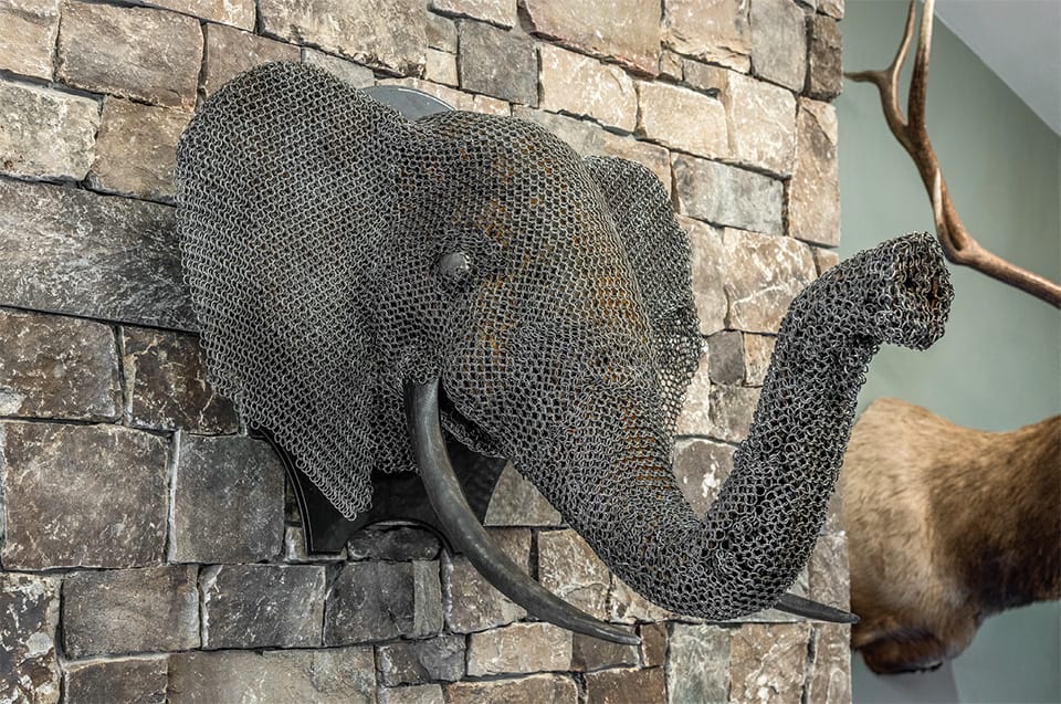
Rust and steel, old trucks, and cab overs: this is how Brenda Stredwick channels her artistic sense of design. Not everyone can make something exquisite from yesteryear’s discards. It takes a practiced eye and the talent (and courage) to create an intricate piece of art from an old wood saw.
The front of Iron Maiden Welding is a retail space with all kinds of metal welded objects, from butterflies to the front end of an International Harvester reimaged as a fireplace grate. But in the back is where the sparks fly – literally.
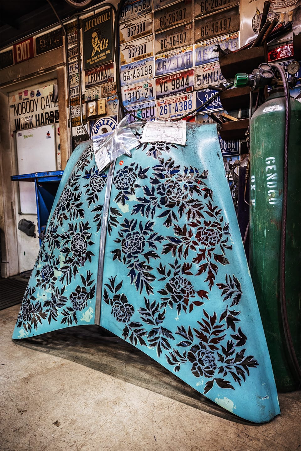
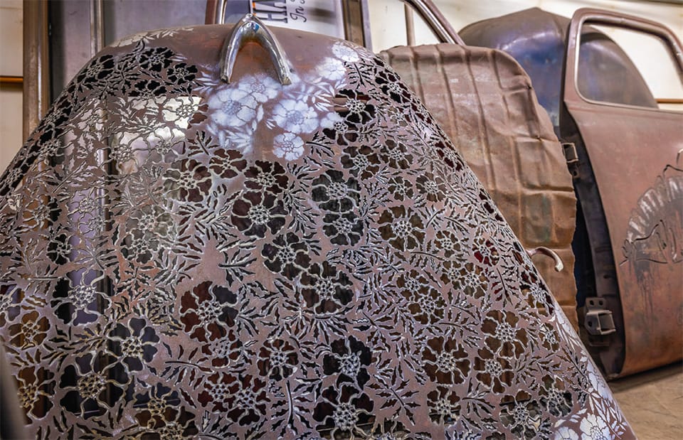
Teal Truck Hood | 60” x 60” | Brenda Stredwick
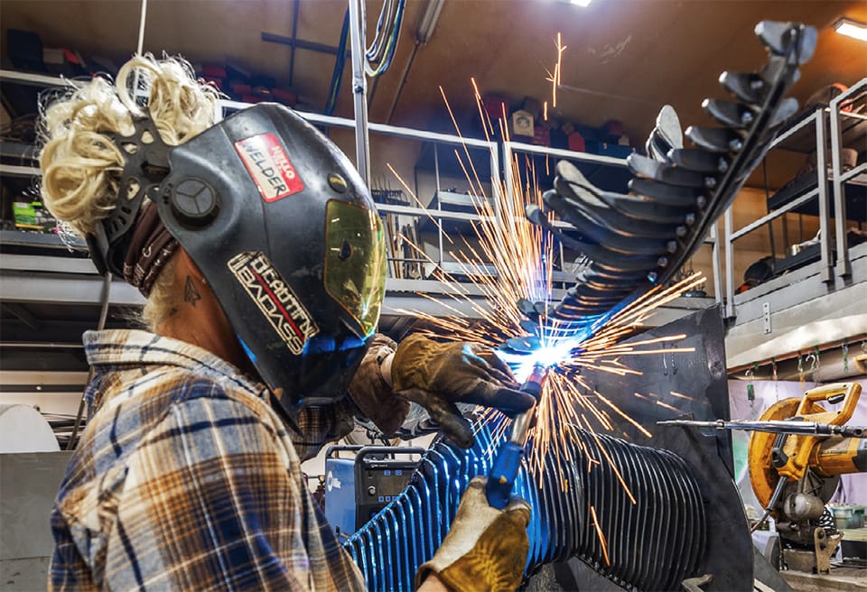
That’s where Brenda Stredwick hammers, plasma cuts, and spot welds. Where she lets her imagination loose.
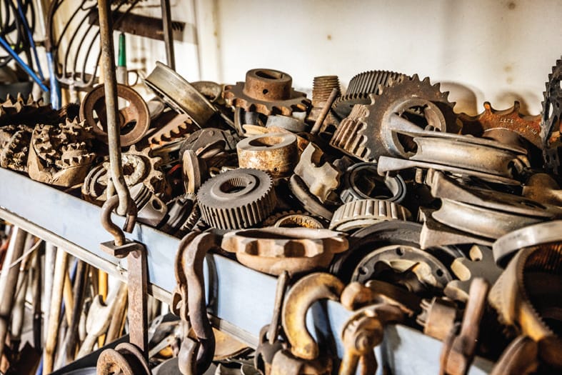
All along the walls are license plates, but in one corner is her treasure: piles of corroded and rusted steel.
“Every day there are piles of metal waiting for me in front of my shop,” Stredwick says. “People know I’ll take their scraps. I do auctions, yard sales, thrift stores, and even some antique stores looking for these gems.” She motions to the odd shapes in the corner stacked high with used and aged metal waiting on the side of the shop. “Now everybody is a picker,” she says. “I used to get those old steel milk cans for $25 now they’re $90.” She points out a Ford diesel cab-over, soon to be a DJ booth for a client in Big Sky.
Car Hood | 60” x 48” | MetalBrenda Stredwick, Artist
“The seats have to come out,” she says, pointing to the frayed leather seats inside. “And I’ll have to figure out how to make room for someone to play music in there.” When it isn’t being used as a DJ booth, she says it will stand in for a moveable bar.
No objects have outlived their usefulness; they are just waiting for Stredwick to discover them.
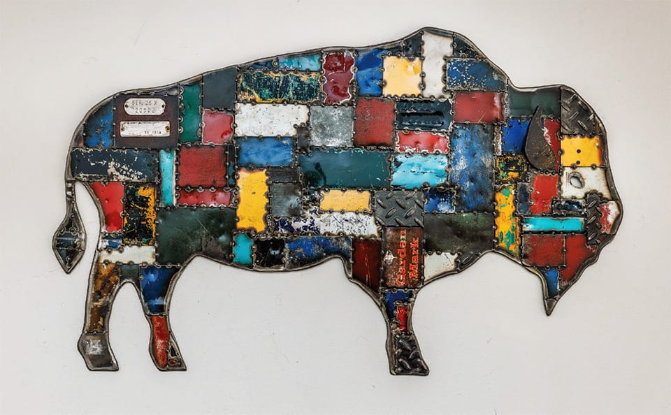
“There’s something about found objects that inspires me,” she says. “But I see inspiration in everything, especially in things that have been cast away … whoever threw it out never saw the beauty in it, but I bring a whole new light to it.”
“Everyday There Are Piles Of Metal Waiting For Me In Front Of My Shop. People Know I’ll Take Their Scraps.”
–Brenda Stredwick, Artist
Stredwick believes every piece of metal has a history, a story to tell. Her work transforms bits and pieces to grind out the hidden potential in the forsaken and forgotten.
On her workbench is a piece she’s shining up. Stars and stripes in the shape of Montana. The stripes made from oil drums: cut from red, white, and blue oil barrels, the stamped dates still visible. All of her work requires a second look. At first, the red, white, and blue of the familiar symbol of the flag can fly past without a thought. But upon further examination, the ingenuity of using oil barrels, plasma cut into stripes, is just fantastic.
Born in Oregon, Stredwick was raised moving frequently due to her father’s work as an electrician for logging machinery. Her father was known as “MacGyver” because he could fix anything, with various jerry-rigging. It feels as though nothing is impossible to Stredwick, taking on her father’s attitude about getting things done.
Car Hood | 36” x 36” | Metal
The oldest of her five siblings and drawn to the outdoors, she started “helping” her dad at an early age, when he finally gave in and gave her some real work to do.
“I was always under his feet,” she says. “So, he started me on welding when I was eight and I fell in love with it.”
After living in various places, they settled in Idaho, near a gold mine.
“At 15 I had my own full-blown welding business,” Stredwick says. “The mine welder was always busy with the gold mine work, so if anyone need a repair, they would come to me.”
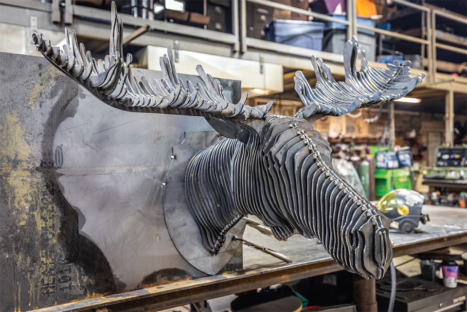
Moose | 60” x 48” | Steel
Once her business got going, her father helped her build her first welding shop, nailing up boards for walls, to get her out of the wind.
She also bartended to add to her paycheck. One thing about bars and the West is the ubiquitous number of horseshoes that tend to show up, either on the walls, over the doors, or underfoot.
“One day I started making horseshoe coat racks and it just took off,” she says. Aside from selling the coat racks, it also encouraged her to step a bit further from just welding repairs. She knew there was more to her talent.
Clamped onto the worktable in her shop is the beginning of a moose head. The base is cut from mild steel and laid over the skeleton is a piece of chainmail.
Bison | 36” x 24” | Scrap SteelMoose | 60” x 48” | Steel
She walks over to the scrap pile and selects a small piece that is just about the right color for a moose. “I usually use squares because they’re easy to fit together,” she says, walking over to the plasma cutting station. “This should work.”
Fitting her tinted safety glasses over her eyes, and pulling the heavy-duty gloves on her hands, she takes the two ends of the ground clamp terminal and attaches it to a large piece of equipment. She grasps the plasma torch and cuts a rectangle into small strips.
Orange sparks zing up and fall into the water trench beneath. The air is acrid, slightly sweet from the ozone.
Taking the cut piece to the moose’s “antlers,” she tack welds it with her Mig welder and then hammers it into place.
“there’s something about found objects that inspires me. But I see inspiration in everything, especially in things that have been cast away …whoever threw it out never saw the beauty in it, but I bring a whole new light to it.”
–Brenda Stredwick, Artist
This moose is bound for Big Sky, once she hammers all of the rusty pieces into place and burnishes the chainmail so the metallic sheen is gone.
Stredwick’s work evolved from simple coat racks to intricate sculptures and functional art pieces. Each project involves her meticulous process of design, cutting, welding, and finishing. Her dedication to her work is evident in every detail, from the precision of her welds to the thoughtful placement of each element.
Her art is not just about creating something new; it’s about breathing life into the old and forgotten. Stredwick’s pieces tell stories of past endeavors and histories reimagined and transformed.
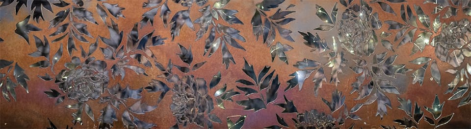
Shima Shanti | Encaustic Purist
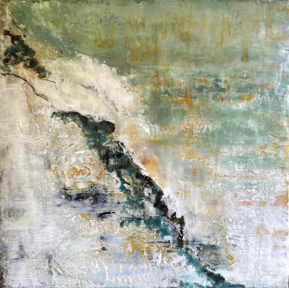
Encaustic art, painting with beeswax and fusing with fire, is one of the oldest art forms dating back 2,500 years to Egypt and Greece. Shima Shanti is a purist encaustic painter. From simple observation to deeper contemplative meditation, her impression-istic paintings explore the rhythmic, fluid, and steadfast consistency of nature.
“With my studio door open, bees are drawn to the scent of wax,” Shima observes. “It’s a sensual and tactile medium.”
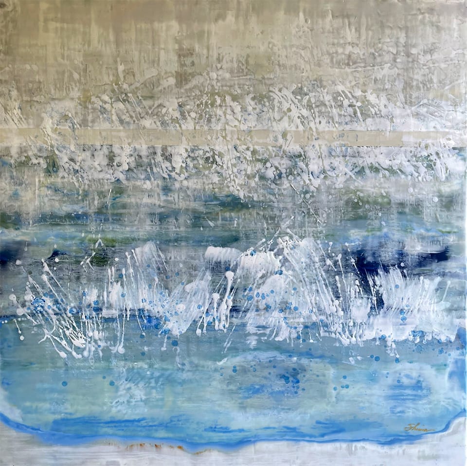
Beneath as it Were | 36” x 36” | Encaustic | Shima Shanti
In the pre-dawn hours when the outside world has yet to awaken, Shima begins each day walking to her studio in the lake-side hamlet of Del Dios. Before sunrise, the neighboring owls, coyotes, and unseen bobcats are retreating from a raucous night and the waking call of dove, quail, hummingbird, and woodpecker is tuning up. “I am alone with my thoughts. In this absence of distraction, I am free with no boundaries. My art develops in colorless silence free of my ego’s interpretation,” she muses.
“Art is a language that speaks to those who listen with their heart” is Shima’s unifying and universal philosophy. Her paintings are refined. Her art is pure. There is an understated elegance and a sense of luxury that can be felt as much as seen.
“I did not realize I was undertaking such a challenging medium. I am drawn to the luminous translucence of light and all-organic elements, its historical significance and the importance of bees in nature.”
–Shima Shanti, Artist
Light reflecting through beeswax suggests movement unique to encaustic work. The tactile bubbles, ripples, and markings tempt you to touch. For those brave enough to ask, Shima invites them to run their hands across the high-gloss surfaces. Her signature palette of earth-tone hues, neutral whites, and teal blues conveys visions of peace. Upon entering her fine art fair salons, viewers comment on the palpable calm and sense of ease.
Shima is often asked why she chooses to paint with beeswax; known as one of the most difficult, expensive, and complex processes. “I did not realize I was undertaking such a challenging medium,” she responds. “I am drawn to the luminous translucence of light and all-organic elements, its historical significance and the importance of bees in nature.”
And then Shima is asked where her inspiration comes from. “Growing up with the abundance of water and endless blue sky of Montana has forever connected me to nature,” Shima says. “It has gifted me with an innate sense of color and composition.”
Staccato | 36” x 36”
An off-hand comment from her collector, who compared her work to Richard Diebenkorn, inspired Shima to explore Diebenkorn, the California painter who defined the California school of Abstract Expressionism during the early 1950s through 1960s.
Georgia O’Keeffe’s free-spirited independence guided Shima deeper into her own painting. “I decided to start anew, to strip away what I had been taught, to accept as true my own thinking,” said O’Keeffe.
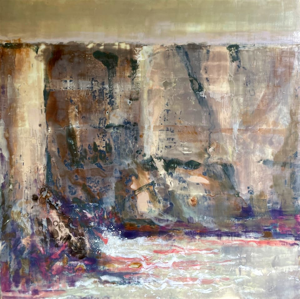
Trying to Buy Love | 36” x 36”
Shima followed a similar path in her own artistic journey where she, too, surrendered all she had been taught in her upbringing and corporate career to the way of being an artist. “I paint to be true to myself,” she says.
Edgar Payne’s rugged beauty and shimmering light impressionism is Shima’s North Star. Largely self-taught, he, too, found inspiration in nature. Payne became even more kindred when Shima learned that in 1913, he painted the mural in the historic Northern Hotel in her hometown of Billings, Montana.
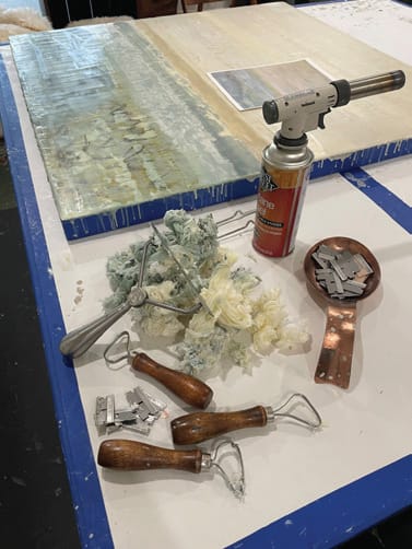
“I’m a purist encaustic painter,” she says. “I paint with molten beeswax mixed with the highest quality pigment on custom crafted Baltic Birch panels. I spare no expense in my materials. It speaks of the impeccability and reverence I infuse in my work. It’s a precious feeling for me, a sense of value.”
Before the first brushstroke, Shima spends days preparing. First, she masks the sides of the panel, then paints and sands the surface with encaustic gesso, a white chalk-based paint, followed by 3-5 layers of clear wax fused with the torch. These primary steps imbue special care that adds depth and translucence to her painting.
Each artwork guides Shima in a personal way, taking shape on its own. “Often it is only after a painting is finished that I feel its emotion. Other times, its meaning remains hidden even from me, patiently waiting to be reflected in the eye of the beholder; a private message meant for their eyes only.”
Shima’s aesthetic is minimal. Her earth-tone palette is neutral, deep, and rich. In this simplicity, unexpected levels of complexity surface.
She paints flat on a table, not on an easel. She has an idea of where to start, yet she’s never quite certain of the outcome. As the process unfolds, she is unexpectedly surprised.
Cold is the Color of Crystal | 36” x 36”Side by Side | 36” x 36”
Every brushstroke and pass of the torch asks for a choice; as in life, each choice affects the whole, creating patina and texture that is storied, translucent, and luminous. It has taught Shima to treasure imperfection and the spontaneity of life.
Next to the panel are hot plates heated to 200 degrees lined with mini-loaf pans. Each pan holds the custom-created color that is distinctly Shima. Her palette strongly guides her in a certain direction. “My choice of all-natural earth elements – organic beeswax, earth pigments, the fir tree sap Damar, and birch panels – is a quiet whisper to the authenticity and integrity of my work,” she explains.
Using large natural bristle brushes, she paints the molten wax onto the panel layer upon layer, lightly fusing each layer to the one beneath it. There can easily be 50 layers of wax in a painting. “I paint with the subtlety of flame. How I use the torch marks my work uniquely mine. How heavy is my hand, how fast my motion, how high the heat; they all influence the outcome. I’ve mastered how to paint with fire,” she says.
Trying to Buy Love | 36” x 36”
Using ceramic tools, Shima scrapes back the top layers to reveal the buried colors and expose the hidden designs. Through this sculptural process of adding and redacting, the composition unfolds.
“I hold a special reverence for the unseen details in the complex and labor-intensive encaustic process,” she muses. “I believe the energy I infuse into each painting stirs something within us, awakens us, and beckons us to linger a moment longer in our shared appreciation of art.”
Finally, she polishes the beeswax surface with a soft cloth to bring out its natural luster. The revelation is mystical. “When the rhythmic pulse of water and waves synchronize with each brushstroke and beat of my heart; that’s when my encaustic painting is masterful,” she adds. “I know the painting is done when I see what I feel in my heart.”
“I hold a special reverence for the unseen details in the complex and labor-intensive encaustic process. I believe the energy I infuse into each painting stirs something within us, awakens us, and beckons us to linger a moment longer in our shared appreciation of art.”
–Shima Shanti, Artist
Shima’s art is nationally recognized and celebrated at some of the most prestigious contemporary fine art fairs in Palm Beach and the Hamptons, New York, West Coast Los Angeles, and Scottsdale. Select galleries display her work in Bozeman, Scottsdale, Palm Beach, Washington, D.C., and Rochester, New York.
Shima is both artist and author. Her beautifully crafted art book is now available. One hundred twenty-eight pages, large-scale full-bleed imagery and well-crafted typography, with open breathing space, guide you inward to your own reflective thoughts and mindful conclusions. “I write to create an exact image with my words. When words are too defined to describe the depths of my soul, I turn to painting without any degree of exactness,” she says. “Each in their own language is guided by my heart and voiced from my soul.”
Kira Fercho | Rooted In The Big Sky
This summer, Kira Fercho, renowned for her vivid portrayal of Montana, turns her palette to the stark and imposing lands of Glacier National Park. Fercho’s deep connection to these lands and their rich histories is evident in the respectful way she portrays her subjects.
Her journey as an artist began in her childhood, where the expansive forests and valleys of Yellowstone National Park and the majestic landscapes of Glacier served as her muse and playground. At the age of 13, Kira’s mother would take her to Yellowstone Park, where she learned to listen to her heart, how to reach for a visual vocabulary, and to translate the sounds of the natural world through her brushstrokes.
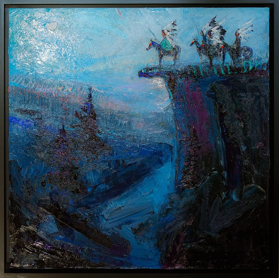
Crazy Horse | 53” x 53” | oil on canvas | Kira Fercho
Through her art, she aims to capture the spirit and stories of the places she cherishes and the people she has encountered along the way. “These paintings are my everything,” Fercho says. “My higher power gifted me the ability to paint and it’s my job to make them and protect them and find the rightful owners for them.”
Unlike a lot of painters, Fercho doesn’t make prints from her oil paintings. She paints using thick layers, in an impasto style, and the translation to prints would not convey the authenticity of her work.
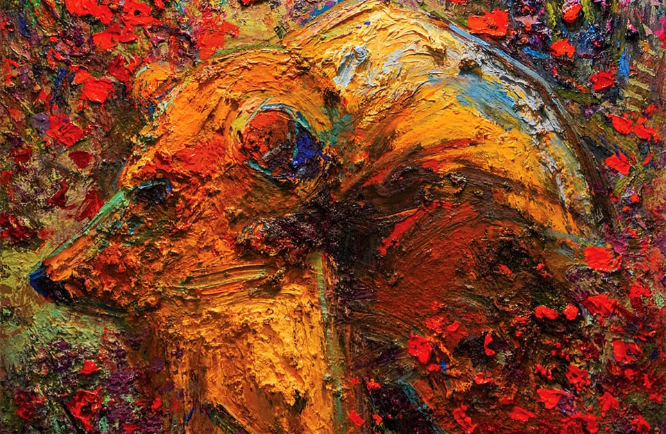
My Heros have always been Cow Dogs | 30” x 60”
“A large part of my show this summer is connecting people with the history of place. It’s important that these locations are revered as sacred lands, not just a beautiful place to visit. I hope people enjoy the added educational experience.”
–Kira Fercho, Artist
“The pieces are largely about where I’m from, my life, and the people I’ve met and had relationships with,” she says. “I love sharing these little bits of stories.”
Aside from painting plein air in the park, Kira will also have a show in Whitefish at the Dick Idol Gallery. The show will be open for the entire month of July.
“It’s such a huge honor to get a one person show in the middle of summer,” Fercho says. “The Dick Idol Gallery has always been so good to me. They get what I do. They’re very good at the client/artist relationship.”
Contemplation | 40” x 40”
To watch as the stories unfold, check out Kira’s website as she plans to update it in real time with the paintings that will be shown this summer. Fercho is hoping that her show will help tourists and nontourists alike to appreciate their surroundings.
“A large part of my show this summer is connecting people with the history of place,” Fercho says. “It’s important that these locations are revered as sacred lands, not just a beautiful place to visit. I hope people enjoy the added educational experience.”
Going to the Sun | 60” X 60”
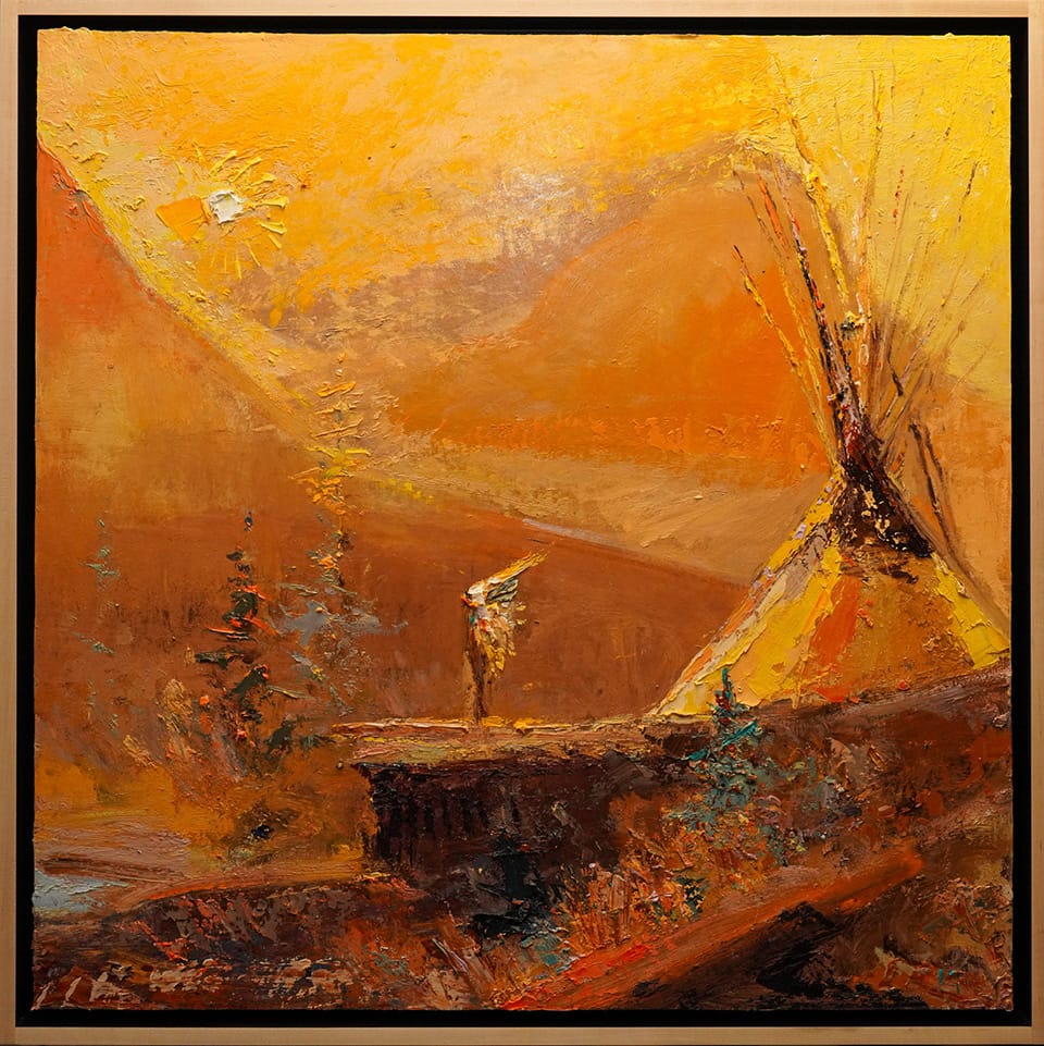
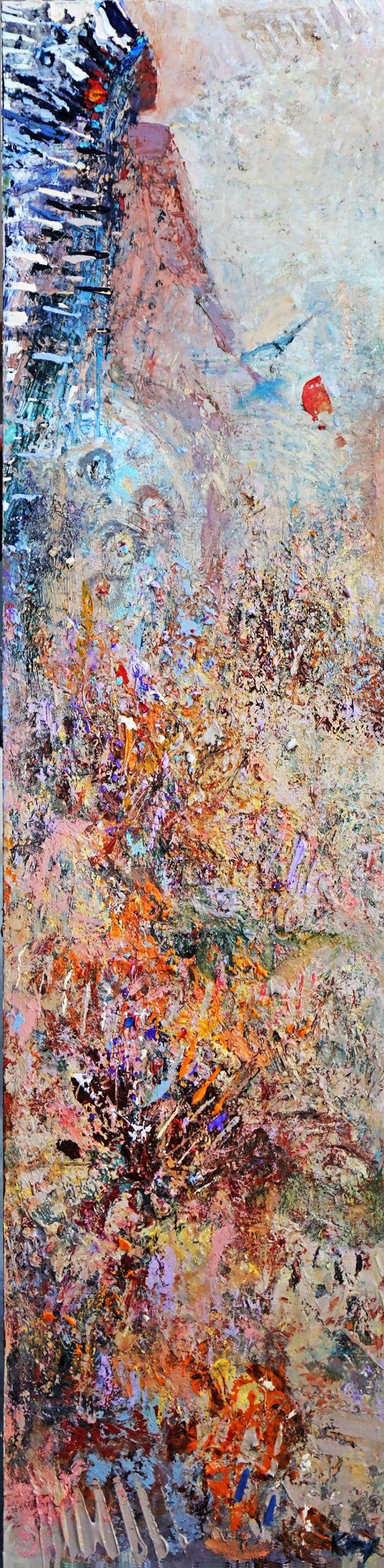
◄ Going to the Sun | 60” X 60” The Going to the Sun Road is the only road that transverses Glacier National Park. At an elevation of 6,646 feet (which is the highest point of the road), it crosses the Continental Divide through Logan Pass. Construction began in 1921 and was completed in 1932.
“The road borrows its name from nearby Going-to-the-Sun Mountain,” Fercho says. “Local legend, along with a 1933 press release issued by the Department of the Interior, relayed the story of the deity, Sour Spirit, who came down from the sun to teach Blackfoot braves the rudiments of the hunt. Going to the Sun is my homage to the Blackfoot side of Glacier. The warrior stands by himself, between his Heaven and Earth.”
Crow Country | 48” X 48” ► Fercho grew up in the Billings area and still lives there. “The Crow Nation is a sovereign nation in south central Montana. The Crow Tribe, whose original name is Apsaalooke, is the indigenous people of the Crow Nation,” she says.
“Crow Fair is held the third week of August each year,” Fercho says. “My dad’s birthday was August 18th. We would celebrate by going to the Crow Fair. Sometimes we would go for the parade, other times for the dancers and his favorite—the horse races. It’s a spectacular sight to see, with thousands of tipis. No wonder it is called, ‘The Tipi Capital of the World.’”
Crow Country | 48” X 48”
Into the Sun: Two Medicine | 18” X 72”
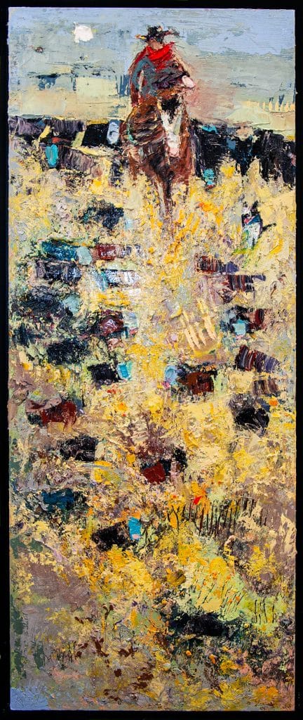
◄ Into the Sun: Two Medicine | 18” X 72” (Right) This piece has a design that brings the viewer’s eye up from the natural grasses to the horse/rider, and eventually to his final destination. Two Medicine is sacred to the Blackfoot tribe native to Glacier National Park. According to the common lore that gets passed around national parks, Two Medicine was a spot where the Blackfoot underwent their individual vision quests, a time of contemplation, solitude, and spiritual searching to discover one’s purpose and destiny in life.
“I am not Blackfoot. But I feel a spiritual pull whenever I am in Glacier National Park,” Fercho says. “As an artist, I celebrate the beauty and healing power of this area. I also feel the importance of sharing that this is still a Holy Land for the Blackfoot, and we must tread with respect.”
Turquoise World | 6” x 60”
◄Turquoise World | 6” x 60” “I like taking a more traditional subject matter and making it more modern with the shape of the canvas and the design of the painting,” Fercho says. “In this painting, the viewer’s eye starts off with the horse and rider with a bluejay sky backdrop. The viewer ends up at the bottom with the earthly grasses. It’s important to me to have movement in a piece whether it is created with texture or composition. I like my pieces to be interactive.”
“I like taking a more traditional subject matter and making it more modern with the shape of the canvas and the design of the painting.”
–Kira Fercho, Artist
Horses on a Hill | 50” X 50” ► An homage to the “Bleu Horses” by artist Jim Dolan, Fercho’s painting offers a two-dimensional interpretation of Dolan’s three-dimensional, outdoor sculptures. “Every time I pass through this area, just north of Three Forks, Montana, I stop to enjoy a moment of peace,” she says. “My youngest daughter enjoys walking up to the 39-horse sculpture installation, located off of Highway 287. In this piece, I tried to capture the gestures and movement of the blue roans. For me, painting is one third process, one third product, and one third story.”.
Crow Country | 48” X 48”
Grain Castles | 48” X 48”
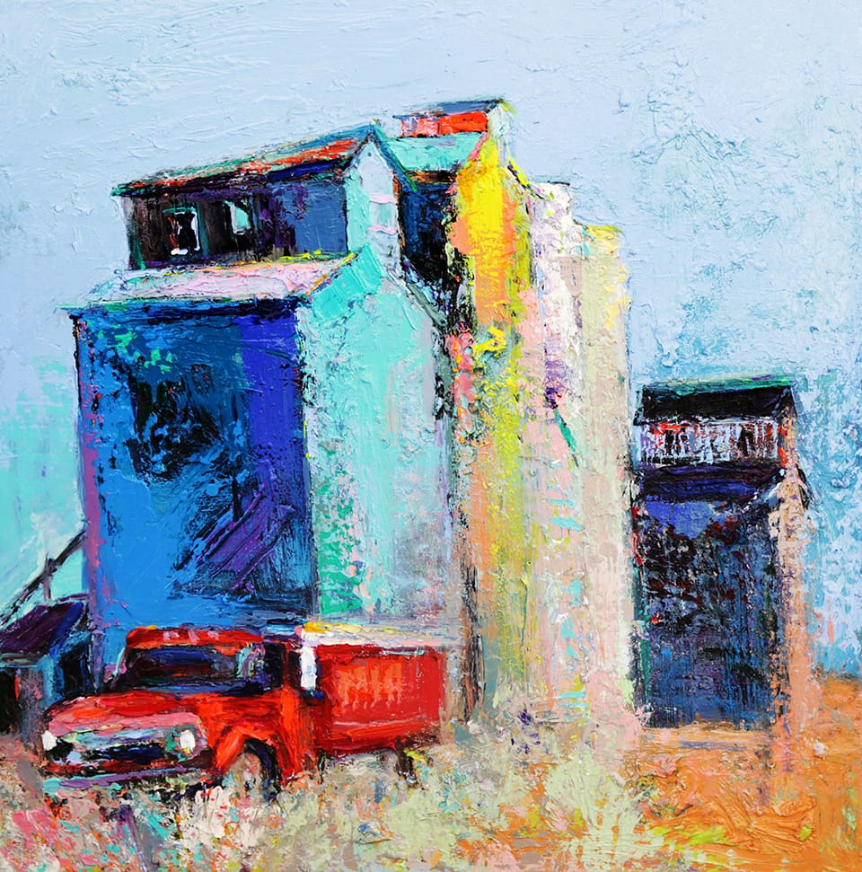
◄ Grain Castles | 48” X 48” “The French-Canadian side of my family rode their horses into the United States and settled into remote areas of North Dakota,” Fercho says. “They eventually crossed into Montana.” She was raised amongst irrigated wheat and corn fields. They had horses and cattle and lived largely off of their own garden. “In this culture, roles were not clearly defined. Whatever needed to be done, got done. Growing up, my sister and I usually tagged along with my dad and grandpa. As a little girl, I would call grain elevators ‘grain castles.’ They were the only tall buildings that I ever saw!”
Glacier at Dusk | 50” X 50” ► Fercho says that whenever she paints on location in Glacier National Park, she goes at the end of the day. “I get there around 2pm; most visitors are leaving as my truck passes to catch the very last of the light,” she says. “It’s when we have the most beautiful/dramatic sunsets. The mountains are so steep that you get to actually see the sun fall across the tops and through the valleys. As the spectator, you stand somewhere in the middle. It’s a literal Heaven and Earth experience. It’s so magnificent that my mere mortal nature is quieted.”
Glacier at Dusk | 50” X 50”
“I believe that it’s important to recognize and respect that this is a ‘holy land’ for the blackfoot tribe. In summer months, visitors can book tours directly with the tribe and gain their own insight to this powerful place.”
–Kira Fercho, Artist
Fercho has been painting in Glacier for over 20 years. She goes to what she refers to as the “Native side” of the mountain where she can feel the ancients’ presence surrounding her as she paints.
“Today, you can see present/local Blackfoot culture with prayer flags and personal items of recently passed loved ones wrapped around tree trunks,” she says. “I believe that it’s important to recognize and respect that this is a ‘holy land’ for the Blackfoot tribe. In summer months, visitors can book tours directly with the tribe and gain their own insight to this powerful place.” “My work really does have a lifelong impression on people,” she continues. “Montana is iconic, with monumental places. Growing up under the big sky, I understood that.”


