Transforming
A 1990s Log Cabin with Hunter & Company Interior Design
“The effect of modernizing a log home is that you become more connected to the structure’s textural elements. Log homes are challenging in making them look more modern without completely rebuilding the house.”
–Hunter Dominick, Owner | Designer
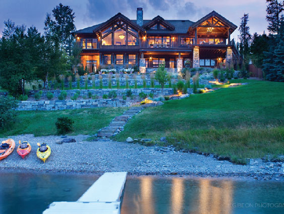
This is the second Hunter & Company remodel for the log cabin at Lake View Landing on Whitefish Lake. The original remodel was about five years ago when the owners bought the home from its previous owner. This time, the owners wanted a fresh feel that was a departure from the rustic look they had embraced for the past five years.
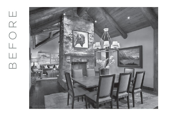
As owner and designer Hunter Dominick recalls, “We kept hardwood floors, cabinets, and certain structural elements intact. You notice the wood trim better this way. When the owners first remodeled the house five years ago, we were trying to create a beautiful interior that told the story of a log cabin.”
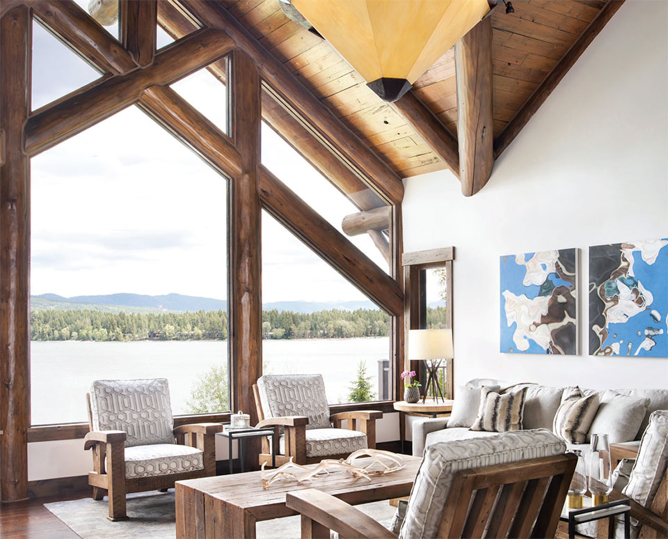
The new refresh focused on cleaner lines and lighter colors. The project took five months to complete. The owners wanted to lighten the space and transform their cabin into a warm and contemporary mountain modern home. The project was grounded in honoring the original structure and elements of the first remodeled design while also evolving into the owners’ vision for something new.
“The effect of modernizing a log home is that you become more connected to the structure’s textural elements. Log homes are challenging in making them look more modern without completely rebuilding the house,” explains Dominick. “Creating that contemporary contrast inside Lake View Landing actually helped focus on the exterior more in this style of home. We debated refinishing the entire wood ceiling and floors. We ultimately came back to the point that we were working with a log home and we were cognizant that it’s always going to be a log home.”
“Texture is my aesthetic. I think people respond to texture, but I don’t think they appreciate it until it’s done. The challenge in a remodel is how to get the effect you want within a balanced budget.”
–Hunter Dominick, Owner | Designer
To begin the process, Hunter & Company started with space planning. The team walked through the floor plan before the remodel to make sure their conceptual ideas would work functionally. After walk-throughs, Hunter & Company progressed to the specifications phase, which included completing all hard finishes, tile, slab, cabinets, hardware, lighting, stain colors, and construction. The whole space was pulled together in the final furnishing phase when texture was brought to life through bedding, window treatments, and accessories.
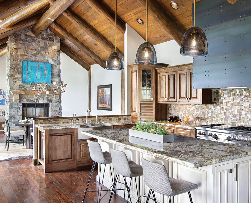
Lacquered nightstands and linen were two accessible ways Dominick updated texture in the Lake View Landing home. Hunter’s talent is in bringing out the parts of the structure that already have a strong textural perspective and complementing those inherent elements with new design ideas. “Texture is my aesthetic,” says Dominick. “I think people respond to texture, but I don’t think they appreciate it until it’s done. The challenge in a remodel is how to get the effect you want within a balanced budget.”
Hunter’s team achieved this creative and practical balance by using contrasting material selections. The most impactful overall transformation in the house was changing out lighting from a yellow hue to a clean and fresh bright white. A lot of the project updates were accomplished through new furniture, updated upholstery, new accent pieces, and well-placed art to highlight the overall refresh of the home.
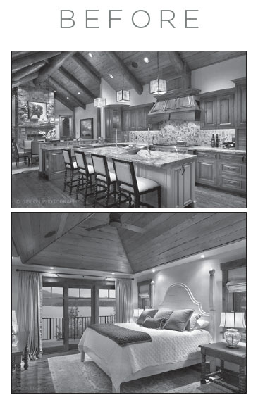
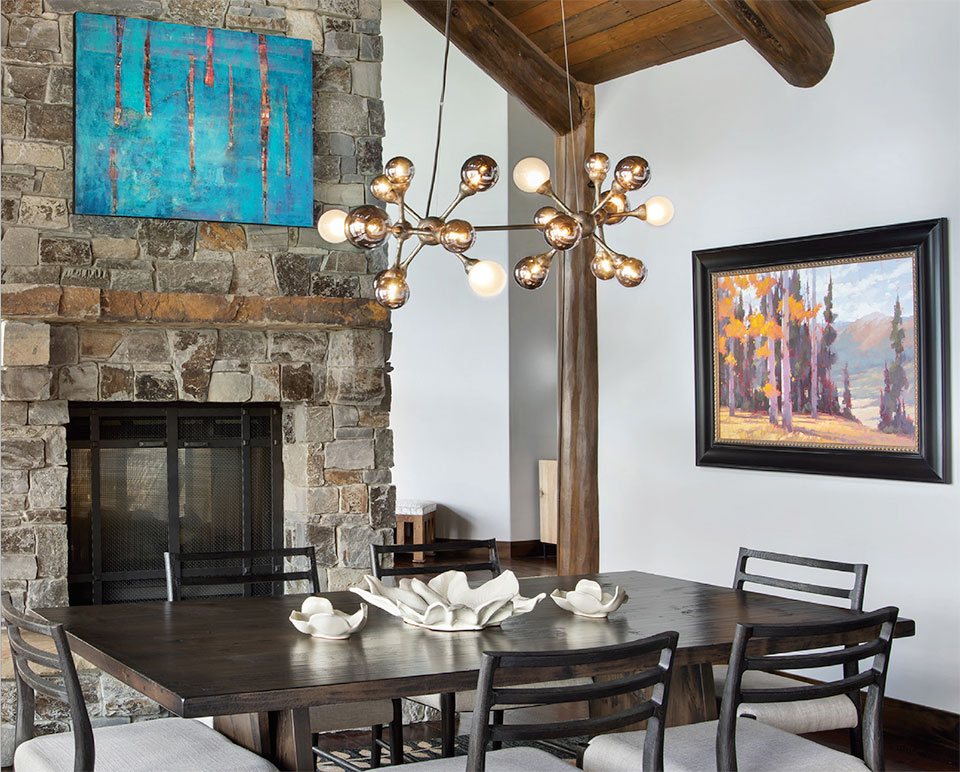
Lake View Landing was built true to the 1990s log cabin aesthetic with heavy, dark logs. Hunter’s team brought in a contemporary light fixture in the dining room to boldly communicate modernity. The fixture contrasted against the historical feel of the log cabin structure. The contrast helped the fixture pop and underscored the owners’ desire for a modern feel. As Dominick says, “We almost go to the extreme opposite of what the ‘before’ conditions are with our choices to meet in the middle. There are a lot of design challenges. It’s very rewarding to stand back at the end and see what we’ve changed.”
Hunter’s team updated the kitchen by putting a steel skin on the hood and lined it with rivets for a contemporary finish. The artisanal touch changed the character of the kitchen without any costly structural changes. Additionally, light fixtures were changed out to globed glass lights to help transform the room into a bright, fresh space.
Dominick says, “A project like this is extremely rewarding and challenging. With a remodel there is always an element of the ‘unknown’ and selections can shift mid-project. Part of the challenge that we love with remodels is working with the existing structure and finding creative solutions within that set of parameters. Here, it was working with the log cabin and deciding what elements we wanted to update and what we wanted to embrace.”
“We almost go to the extreme opposite of what the ‘before’ conditions are with our choices to meet in the middle. There are a lot of design challenges. It’s very rewarding to stand back at the end and see what we’ve changed.”
–Hunter Dominick, Owner | Designer
The great room was updated by reupholstering four chairs, introducing art from a local gallery in Whitefish, and repositioning furniture to make the room more symmetrical. Dominick adds, “The lighting was hugely impactful here too.”
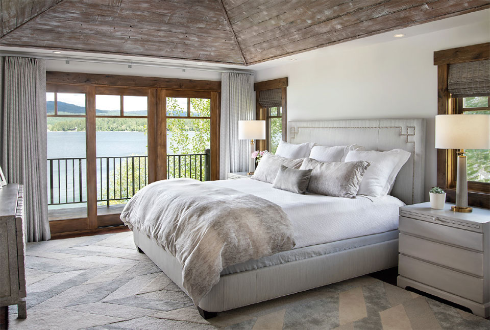
The bedroom was lightened by replacing window treatments and updating paint. Hunter’s team pickled the ceiling, which involves a surface treatment that significantly lightens up existing wood. The upholstered, nail-accented headboard complemented the new texture with an added herringbone wool carpet that introduced different tonalities to the room.
The powder room is an example of how to reuse existing materials with updates. Hunter’s team installed LED-lit glass bubble lights and replaced the mirror. The rest of the room features the same vanity, same backsplash, and same sink as the original, yet it looks drastically different. Hunter accomplished the transformation by painting the vanity and putting on a thick glass top to give it a more contemporary flair.
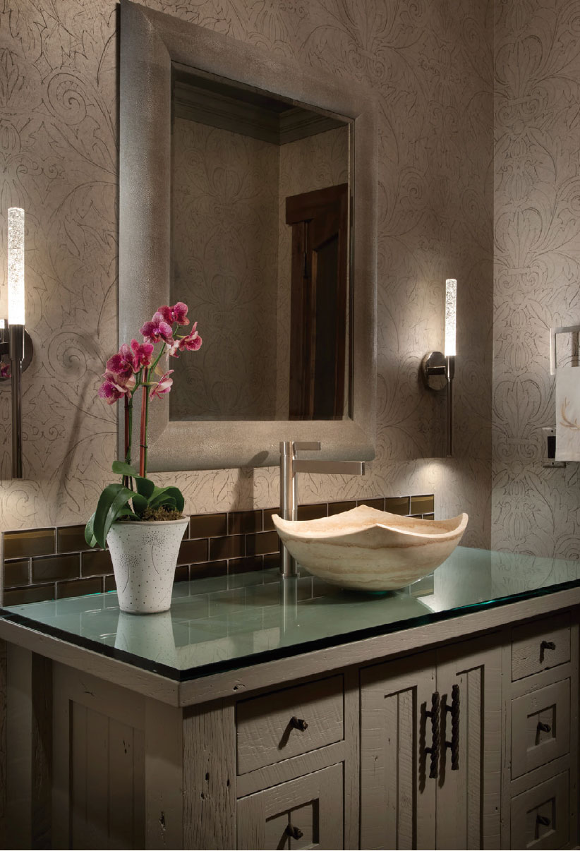
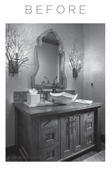
“With a remodel there is always an element of the ‘unknown’ and selections can shift mid-project. Part of the challenge that we love with remodels is working with the existing structure and finding creative solutions within that set of parameters.”
–Hunter Dominick, Owner | Designer
The owners originally wanted to replace their home’s old two-panel doors. Hunter worked with the existing structure by adding metal panels instead of replacing the doors. “We had metal cut to size and had it placed in the decorative profile of the door,” says Dominick. The end result communicates the contemporary modern feel sought after by the owners while also reusing the existing doors.
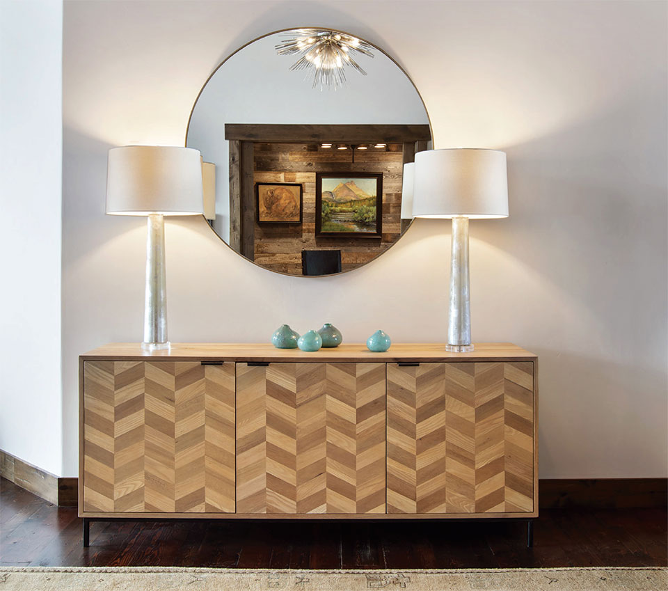
The entryway is Dominick’s favorite part of Lake View Landing. She says, “The entryway tells a lot about a house. We created a contemporary vignette with clean lines. It previews the interesting lighting story that we tell throughout the home. It’s clean but warm. It’s casual but also transitional. It encompasses a lot of different styles, which is a perfect introduction to the rest of the house that pays tribute to the ‘90s log history with a refreshed look and accessibility.”
Hunter & Company is an interior design firm that also has a boutique showroom open to the public. Bedding and accessories are available in the showroom and are a great way to explore Hunter & Company’s design perspective. Dominick says, “It’s awesome that people can pick and choose what they want to put in their spaces from our showroom.”
